After months of rumour and a week of waiting I finally have the iPhone 5. Technically the sixth iPhone (and my 4th after the 3G, 3GS and 4) I decided against queuing up and this time pre-ordered online and waited patiently for UPS to deliver mine on Friday. While it was great for me the UPS guy didn’t share my enthusiasm as they had thousands to deliver on Friday. Interestingly Apple still had phones to sell on Saturday in Glasgow despite the long queues. Seems to be a lot more stock than in previous years. After a few days use here are my thoughts on the iPhone 5.
Design
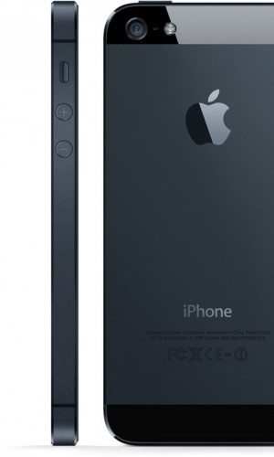
The metal back should make the iPhone more durable and also helps to reduce weight. The iPhone 5 comes in white or black and I chose black as it’s far less distracting when looking at the screen. It’s also all black. Everywhere. No silver antenna around the edge – all black. The buttons are all black. The Apple logo and text on the back – black. I should really do a fifty shades of black joke right now. No?
Some have described the iPhone 5 as jewel like. This is mostly down to the chamfered edge which does prettify the phone and helps the feel in the hand but one downside is the many reports of nicks and scuffs that the black iPhone 5 is now prone too. I detest scrapes, scratches and marks on my gadgets so I will admit to being a bit nervous about damage over time. Looks like a case is a necessity as I do take care of the phone and I will be looking to sell on in a couple of years time. I’ve been burnt before with cases that also scrape (looking at you iPhone bumper!) so I’ve ordered a sleeve for the iPhone 5 until I can sort out a decent non marking case. Annoying as I hate covering up such a great design.
The move to a slightly taller phone and a 4 inch screen has made the iPhone 5 feel narrower. It is exactly the same width as the 4S and 4 but looks and feels narrower. The screen has moved from 3 1/2 inches to 4 inches but the phone has only grown by 8.6mm. Even writing that makes the change seem small but it’s a noticeable change from the 4. It still fits in the pocket and I’m pleased it’s not got wider. I can still use the phone one handed without having to constantly re-adjust how I hold it.
I’ve said all that without mentioning it’s thickness – just 7.6mm. Not the thinnest phone out there but not far off it. The thickness coupled with the slight increase in height and decrease in weight makes it feel a smaller phone. A smaller phone with a bigger display. Quite a feat.
Screen
186 pixels. Thats what the move from 3 1/3 to 4 inch has given the iPhone 5. It sounds a small change but it does benefit one area greatly – video. Finally iPhone users have 16×9 playback of video. It also offers developers a chance to re-imagine their apps to take advantage of the screen. Calendar now show’s a full week view, e-mail and messages show an extra row and most importantly you get an extra row of app’s in the home screen. Joke.
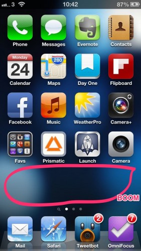
So the extra pixels will get most attention but the screen quality is much improved. Blacks are blacker. Colour is better. Certainly pops more than previous iPhones but not as vibrant as a couple of Android devices I’ve seen which appear over saturated to me. Going back to the blacks, when an app is running in letterbox mode as it’s not been updated to support the iPhone 5 I can’t tell where the screen stops and the facia starts. The blacks are that good. This is the main reason I’ve stayed away from white iPhones – the black facia disappears but the white one stands out.
Lightning
A controversial change is the new Lightning connector which replaces the 30 pin dock connector that Apple have used for 9 years. The current connector is everywhere – stereo’s, battery packs, cars, hotels. It’s so pervasive that any change was bound to stoke anger.
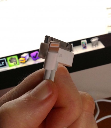
What I didn’t expect, even after seeing the new slot in the iPhone, was just how small the new Lightning connector is. It’s tiny! It’s like a lego version of the old connector. It’s obvious when you compare both as to why Apple had to change. It’s a painful and expensive upgrade for consumers though. A Lightning to 30 pin adaptor from Apple costs £25. A Lightning to USB cable costs £15. You get one of those cables with the iPhone but I’ll need another two. I’ll also still need the 30 pin cable for the iPad. Transitions like this are painful but necessary. It also makes me think that docks are a thing of the past and that a move to Bluetooth or Airplay for connecting to cars, speakers etc will be the way forward.
One other oddity – USB2. I’d have thought the Lightning cable would have at least made the jump to USB3 but it’s still USB2 only. Apple even made the joke in the keynote that they now have Thunderbolt and Lightning. Sync and charging speeds have improved though and no doubt we’ll see USB3 and Thunderbolt versions of the cable in the future.
Speed
The iPhone 5 is fast. Really fast. I’m moving from the iPhone 4 so it’s much more than a doubling of speed that I’m seeing (thats the improvement over the 4S). Across the board the iPhone 5 has been improved. App’s launch faster, wifi speeds have been improved, web browsing is super quick and if you are lucky enough to have LTE or 4G even wireless broadband speeds are excellent. The preliminary tests from Anandtech are showing the iPhone 5 is the quickest smartphone on the market by quite some margin. The video below shows the iPhone 5 (recorded via Reflection) browsing some web pages and launching a couple of apps. I don’t think the speed will get boring anytime soon.
3G or 4GEE
A surprise but welcome addition to the iPhone 5 was LTE aka 4G. This promises up to 100Mb down and 20Mb up, speeds which a lot of consumers in the UK would love for their home broadband connection. 4G in the UK will launch later this year from EE and it will support the iPhone 5. That left me with a choice – stick with O2, move to Orange in anticipation of EE or move to Three. 4G isn’t yet available and there are no details on the cost of the service apart from it will be more expensive than 3G or if there will be any data caps. Orange currently has data caps and while it will be limiting I can’t see EE offering an affordable but unlimited data plan.
As I wanted to move to iTunes Match and also use the iPhone for tethering moving to Three was the sensible option. As I don’t do that many calls I’ve moved to a low cost but unlimited data monthly plan from Three. If EE ends up offering a competitive service in the UK then I can easily switch. Speeds so far on Three have been excellent with download speeds consistently around 7Mb, uploads around 2Mb. One other point with Three is they support HD Voice with the iPhone 5. The call quality certainly seems to be better than with O2 using the iPhone 4.
Camera, Siri and Battery
The camera hasn’t changed much since the 4S but it does have better lowlight capability and it now supports panaroma’s. While many third party app’s have supported this for a while I’ve not seen one quite so well implemented.

The camera app guides you when panning so you don’t go too fast or slow and also directs you to follow a line when panning to give you the best results. I’ve been really pleased with the panorama’s I’ve taken so far. The shot above was from a sunny Glasgow University overlooking Glasgow. The quality when looking at the full size image is good – it only took a couple of seconds to produce that image as well. I’ve been impressed with other pictures I’ve taken and the speed of launching the camera app and taking a picture on the iPhone is fantastic.
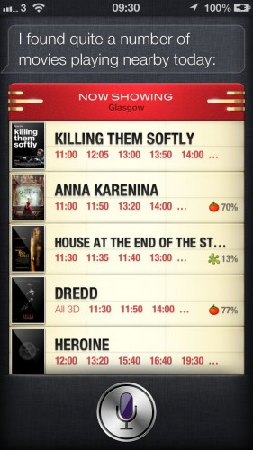
This is my first phone with Siri (been using Siri on the iPad for a couple of months) and it’s working pretty well. Some words I say seem impossible for Siri to understand no matter how slow I say them but in most cases it works well. It’s a shame that third party app’s can’t tap into Siri as that would really make it a lot more powerful but for even just asking ‘what movies are playing’ and seeing all the movies in the local area with playtimes and links to reviews Siri gets a thumbs up from me.
With all these improvements and a smaller size thankfully battery life is the same if not better than with the 4S. I’m getting around 36 hours out of a charge and that involves quite a lot of activity – streaming music from iTunes Match, gaming, browsing, e-mail, messages and watching video’s. After a few days I’m satisfied that battery life has improved although I would have traded the thinness for a bigger battery.
Earpods
The new earbuds that Apple now box with iPhones, iPods etc are called EarPods and have taken three years of research and design to develop. They are an improvement over the old earbuds but that shouldn’t be much of a surprise. Sound quality was ok but for me missing good bass that I have with my current earphones. The EarPods sit in the ear and don’t need pushing in so initially comfort seemed good but after an hour or so I found my left ear was getting uncomfortable. They also lacked volume for me compared to what I’m used to. So a nice upgrade but if you need to replace your current earphones I’d say there are better earbuds on the market for £25 and The Wirecutter has some great advice if your looking to upgrade your earphones.
iOS6
Before I wrap this up, here’s my thoughts on iOS 6 which is the most incremental update so far. By far the most controversial change is Maps. Plus points for me are the better graphics and turn by turn navigation. The maps look better (colour and design) when compared to Google maps. They are also vector based so draw and render more quickly than the old bitmap tiles. Turn by turn has been reliable so far for me although the journeys have been fairly short and not the most complex. However it’s clear that the Maps app is serving up maps that are sparse, old and in many cases just wrong. Maps isn’t easy and Google has a many year, resource and data advantage over Apple. However Apple have been building this tool for three years so they don’t get a pass just because the app is new.
It’s a worse user experience and thats what disappoints. Over time the maps will get better. The amount of data that Apple will now be capturing is huge. I can’t see the gap to Google being met anytime soon but it’s clear that maps are a strategic asset for Google, Nokia, Microsoft and now Apple and Amazon. Each have or are developing their own mapping service. Apple’s will improve as money, resource, time and also feedback from users improve the service. I just hope Apple focus on getting the basics right rather than spending effort on gimmicks like Flyover.
Amongst the new features I like are Do Not Disturb. I can finally set a time when I won’t be disturbed by Notifications from games and app’s. Used to bug the hell out of me that I couldn’t set a quiet time. Updated Siri is really nice as are the tweaks to Safari. I like how iCloud Tabs work by sharing whats being browsed on each device rather than syncing the actual tabset. Far more useful than Chrome’s tab syncing. I also like the Facebook integration which works similarly to Twitters. My final notable improvement is on the phone app – you can easily send a call to voicemail, set reminders based on the call or send a quick message that you are busy. Handy.
It’s too early to tell how useful Passbook will be. This should integrate store cards, flight, hotel and cinema bookings into one app. Passbook will then present the appropriate card or ticket based on times and locations. It demo’d really well but in practice there is very little support right now.
Unfortunately it’s time for a couple of grumbles. First up – the status bar changes colour to try and match the currently running app. Who in their tiny little mind thought this was a good idea? It is a small change but to me interferes with the purpose of the status bar. I was used to the change in colour meaning something. Why did Apple spend time implementing this?
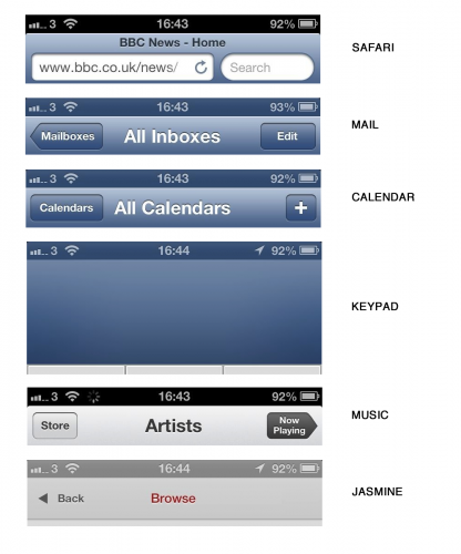
The colour change isn’t even consistent across Apple’s own app’s. Grumble grumble grumble.
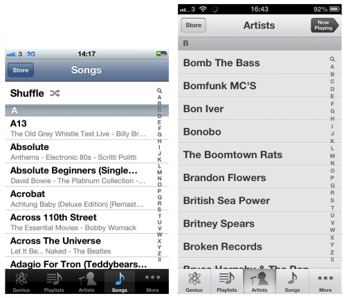
I also hate the look of the music app and also the dialer on the phone. Very little consistency and it just feels a bit out of place. The phone app could have done a lot more to take advantage of the extra pixels but alas, they just made the top section bigger while slightly increasing the button size. Lame.
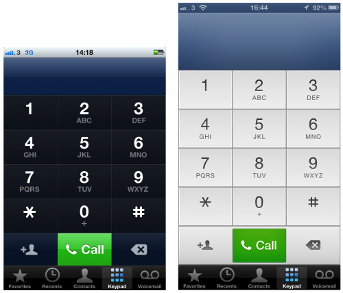
The keypad above shows that in iOS 6 they have kept the same button style at the bottom. Yet in Music, the style has changed. It’s those little details and lack of overall consistency thats becoming more and more frequent. The attention to detail given to the iPhone 5’s hardware is clearly lacking in iOS 6.
iOS 6 feels like a missed opportunity. Why can’t I change the default app’s for Mail, Calendar and Browser? Widgets in the notification screen? Coupled with the Map issues and the lack of Passbook support it all feels a bit of a damp squid. There’s no major usability changes between iOS 5 and 6 and really no innovation thats makes the iPhone or iPad easier or better for it’s users. Disappointing.
Wrap-up
The iPhone 5 is a triumph in design and specification. It looks great and in day to day use feels just right. The extra pixels are welcome and do make a real difference to applications. Apple rarely get involved in the performance race but everything points to this being the fastest phone on the market today by quite some margin. The speed of the iPhone 5 is for me the most impressive aspect. Web pages fly, app’s load really quickly and tasks like searching in Evernote or checking in on Foursquare are surprisingly rapid.
If anything it’s iOS that’s looking long in the tooth…even boring, not the iPhone. It’s reached a level of maturity as has the app ecosystem that there is little new here to excite users. Apple has proven in the past with the early death of the floppy disk, the DVD, the switch to Intel and now the move to Lightning that it doesn’t shy away from radical change but iOS is evolving at a slower pace than the hardware it supports. Maybe iOS and the hardware will take yearly turns at making major moves forward? Only time will tell.
I don’t see much if any revolution in the smartphone market but Apple has again produced an update to the iPhone that has produced one, if not the, best smartphone around today.