Just over a year ago I upgraded to the 10.5 iPad Pro with folio keyboard and Apple Pencil. I was convinced this iPad would do me for another 3-4 years…until Apple brought out a brand new iPad Pro design and a version 2 Apple Pencil. The message from Apple this year is the iPad Pro will make you rethink what an iPad and hence a computer is capable of. Does it?
New Design
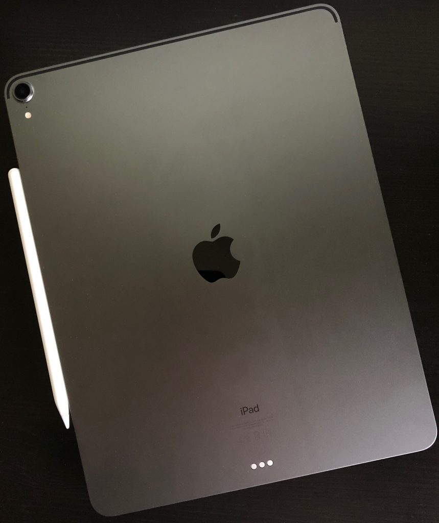
I love the new design of the iPad Pro. Flat edges and thin across the whole iPad it feels great in the hand. I wondered if the flat edge would feel uncomfortable when holding the iPad for a while but I’ve had no issues so far. The design reminds me of the iPhone 4 & 5 which were a favourite of mine. I’d love to see a similar design introduced for next years iPhone’s.
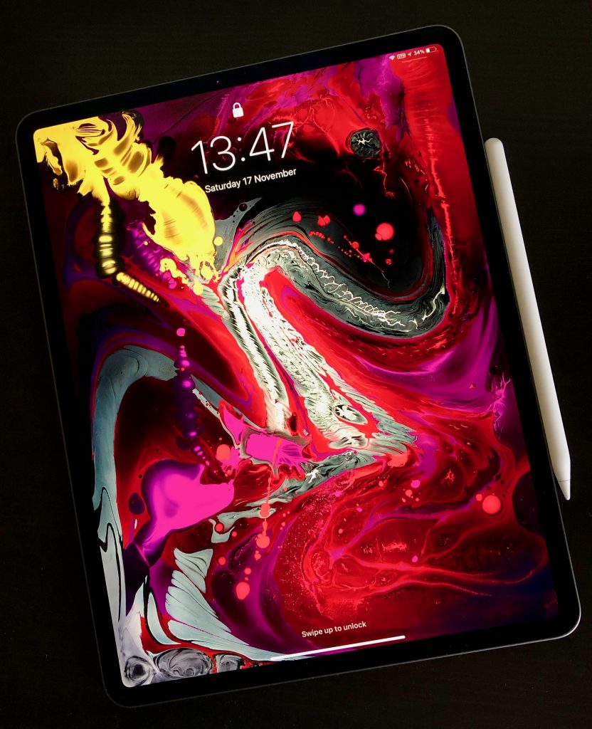
The rounded corners are now matched with rounded screen corners. Apple have brought their Liquid Retina LCD to the iPad – Liquid Retina seems to indicate rounded corners – and it looks fantastic. Despite it not being an OLED I struggle to see the difference in playback of videos when I compare the iPad to the iPhone X. The screen still has all the new tech that was introduced last year including ProMotion and TrueTone which ensures a fantastic image at all times.
Many have said this is a borderless iPad and the screen is edge to edge…but it’s not. It’s close to the edge but there’s an undeniable border that runs around the whole screen. The difference is that it’s constant and you really can’t tell which way is up unless you look at the back and see the Apple logo. The thinner border also houses the main difference from every other iPad so far as there is no home button or Touch ID.
Face ID is now tucked into the iPad Pro (no notch!) and so far it’s been better in use than the iPhone. It works in any orientation, it’s faster than my iPhone X and if you do have your hand covering the front facing camera it will alert you with an on screen dialogue. It also feels more frictionless than Touch ID. I will be working on the iPad and when something needs to unlock like 1Password it just happens assuming camera isn’t blocked. Face ID has really speeded up my iPad usage.
The removal of Touch ID has lead to Apple tweaking both iPad Pro design’s. The smaller iPad is no longer a 10.5″ screen but moves to 11″. The larger iPad 12.9″ screen stays the same but the footprint of the iPad has now shrunk. Due to this shrinking and the overall thinning the 12.9″ now takes up 25% less volume than last years model. This lead to a tough choice. I didn’t pre-order the iPad Pro as I wanted to see the new models in the flesh. Last years 10.5″ iPad Pro was great as a consumption device and was OK as a laptop replacement but there were times when the keyboard felt small and multi-tasking two apps was a bit tight on size. Could I move to this years 12.9?
Yes. On comparing the 11″ and 12.9″ I much preferred the bigger screen and felt the compromise in weight was one I could make. In practice over the last week it’s been the right choice for me. Using the iPad with the keyboard has been far more comfortable, video watching on the larger screen has been great and general browsing and reading is a bit more clearer. Yes it’s more weighty and slightly more cumbersome but it’s not been enough to make me think about swapping back to the 11″.
Faster and Louder
Powering this years iPad Pro’s is the new A12X chip. The performance of this is pretty astounding. I’ve ran a Geekbench test against the new iPad Pro and my current 2017 iMac and iPhone.
The iMac is more than 2.5 times the cost of the iPad Pro and has a noisy fan at times when you stress it unlike the iPad Pro but the Geekbench scores are close. App’s fly on the iPad – it’s faster than last years model which was already a really good performer. It feels like Apple could replace Intel with ARM chips in Mac’s now, especially for the MacBook Air and Pro’s.
The other significant change is in the connector – lightning has been dropped for USB C. USB C is more capable than lightning, it can supply more power for example. There are also thousands of USB C peripherals out there but at the moment it’s trial and error if the iPad Pro supports it thanks to iOS.
Worse is the limitations around files. Plug in a camera or an SD card via an adaptor and it will be recognised and allow photos or videos to be imported. Anything else however is ignored. Plug in a flash drive with a Word or Pages file – ignored. Zip file – ignored. Music files – ignored. Support for browsing of external drives seems trivial to add to iOS especially with the Files app that arrived with iOS 12. This shouldn’t need to wait until iOS 13 – why not a 12.2 or 12.3 feature? It would bolster Apple’s claims about rethinking what an iPad can do and would have silenced a lot of negativity if it had came alongside the iPad Pro release.
Always the butt of jokes, the camera’s have seen some upgrades too. The rear camera is new and unique to the iPad, isn’t as good as the new iPhones but does take a good picture and is also great for scan’s. The camera bump is pretty large but doesn’t cause the iPad to rock when placed flat. The front facing camera is the same as the XS and XR (thanks Face ID) so unlike the rear supports portrait mode.
Something that has been dropped is the headphone jack. This feels mean especially for something advertised as a Pro machine. Yes you can buy USB C adapters (and unlike the phones no adapter was included with the iPad Pro) but it feels like a mistake to me. However the 4 speakers are improved over last year. Louder and clearer the sound on the new iPad is excellent for something so thin.
Final point is on battery life. Apple change each year how they define battery life. 10 hours, full day etc. I’ve found the battery life to be much the same as previous iPad’s. Long lasting especially when compared to a laptop, so a full day of work is easy to achieve.
Folio Keyboard
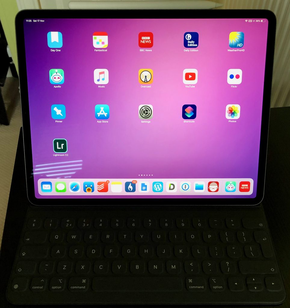
So far, so positive. The new Folio Keyboard has also seen some design changes. There is a new smart connector for the keyboard and rather than attach at the side of the iPad the new folio covers the entire back. In fact the back of the iPad plays an important role in aligning the keyboard via magnets. On the back of the iPad Pro there are over 100 magnets used to align the folio when connecting. This works so well. Easy to take the keyboard off an on and no worry about whether it’s on and aligned properly.
The outside material of the folio feels a little different to the last model. It feels a bit softer but it also picks up fluff and dirt easily which is annoying. It’s also a shame that the new iPad is then wrapped in a solid flat grey case – there’s not even an Apple logo on show. In some ways it matches the industrial design of the iPad but it is bland compared to the naked iPad.
The folio is far more comfortable to type on my lap. Little movement, and the wider keyboard is far more comfortable than the older 10.5. The majority of this post was written using the new keyboard and it’s far less cramped than the 10.5 version. However the keyboard itself feels a missed opportunity. There are still no backlit keys – not even a caps lock indicator. There are also no media or shortcut keys which seems lacking for a Pro device.
They new folio allows for two positions, desk and lap. It’s nice to have two options but it’s nowhere near as flexible as something like the Surface Pro. I’ve had no major issues with the angles provided but I’ve seen others complain about neck strain as neither angle is exactly right.
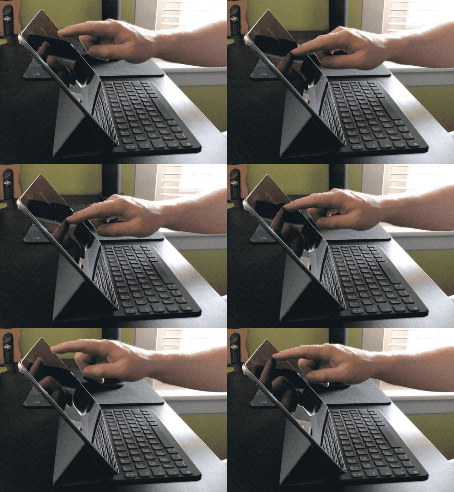
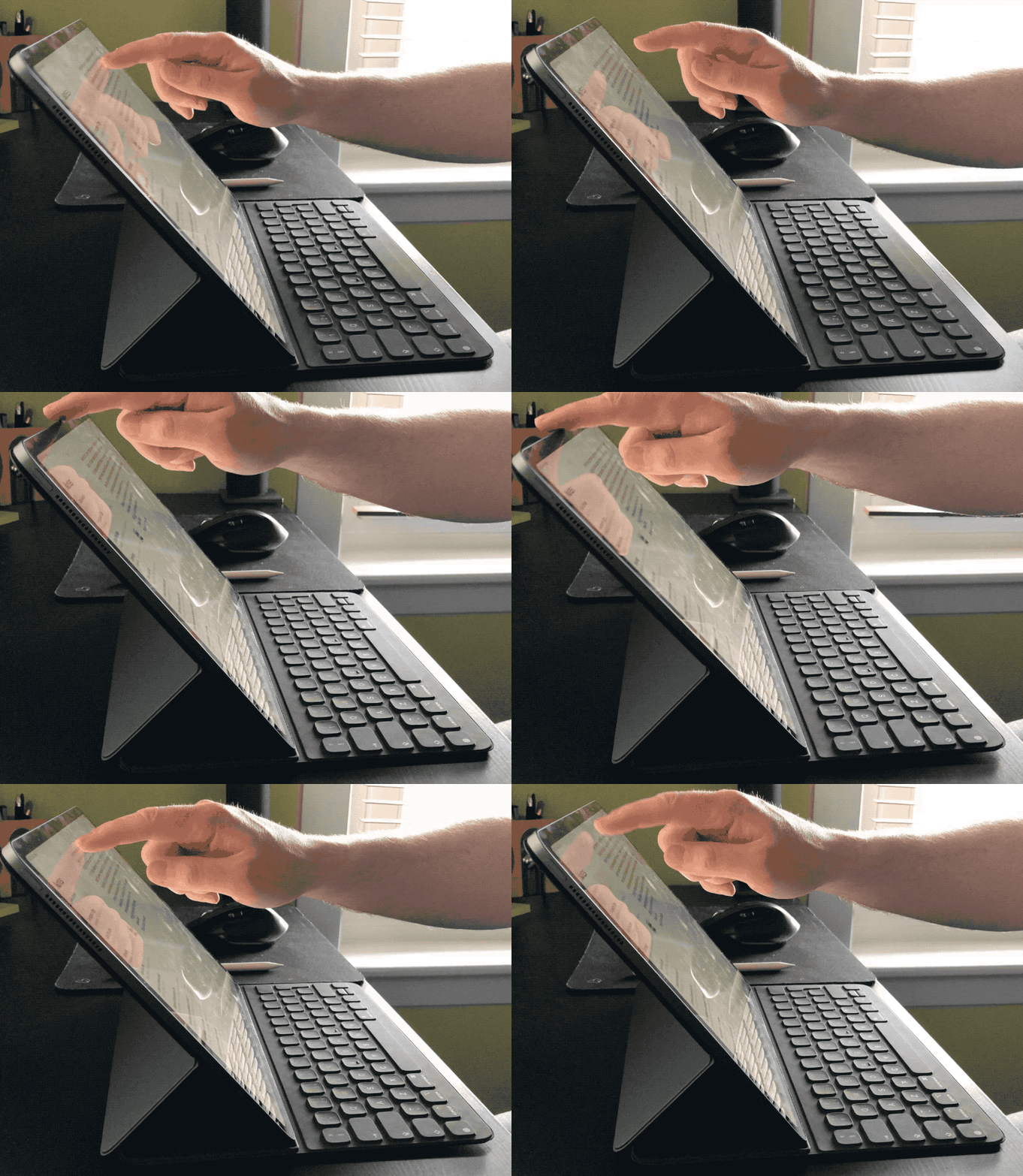
While the keyboard is more stable in general the iPad on the folio seems to flex more than with the last design. The image below shows the 2017 iPad Pro 10.5″. There’s a bit of movement when you poke the screen.
The second image shows the 2017 iPad Pro 12.9″. There’s much more movement including the keyboard itself. Not sure if that’s a symptom of the new design, it’s due to the bigger iPad or just that the keyboard is new and needs time to settle.
So the folio keyboard isn’t bad, but it’s not great either. Worse – it costs £200. Like most Apple products this year they’ve all went up by around 20%. I can justify that to myself when I see new features or technology but there is nothing in this keyboard that shouts new…or Pro. I felt a bit wronged when buying the folio and I’m looking forward to seeing some third party options appear in the coming months that address the folio’s shortfalls.
Apple Pencil
Unlike the folio, the new Apple Pencil has been totally redesigned and address’s all the issues with the first version. The first difference is the matte finish. It feels much more comfortable in the hand aided by the second noticeable change. Instead of being totally round the pencil now has a flat edge that serves two purposes – it magnetically connects to the edge of the iPad and it also stops the pencil from rolling. I also find it more comfortable to hold.
While magnetically connected to the iPad the pencil wirelessly charges. This means unlike the older pencil which you could never find and if you did it was usually not charged, the new pencil is always to hand and charged and ready for action. The wireless charging means there’s no more awkward charging via a port and the pencil is slightly shorter, feeling more balanced in hand.
The final change is a button. An Apple product with a button? Don’t be daft, it’s a double tap in the lower third of the pencil that activates an alternate function which is set per app. So in Notes you are drawing with the pencil and a double tap swaps to the eraser. I’ve found it a bit awkward to use but easier the more I do it.
The Apple Pencil has also seen a 20% increase in price which for me is more justifiable compared to the old design as it includes gesture support and wireless charging. However Apple no longer supply a spare tip with the pencil. That’s tight.
In the last week I’ve used the pencil far more regularly. Comments on a PDF, signature on a doc, editing photo’s in Lightroom and just general navigation. A fantastic update.
Elephant in the Room
Apple want to class the iPad as a computer and given the power it has that’s no surprise. However reviews to date have identified one major flaw – iOS – and I have to agree. I use my iPad every day and it replaced the MacBook Air that I had. However I couldn’t give up on my Mac as iOS doesn’t let me do what I can easily do on the Mac. There are also tasks that despite the improvement in iOS 11 and 12 are faster and easier on the Mac either down to the maturity and flexibility that macOS offers or the support of things like a mouse, trackpad or large monitors.
I’d like to see iOS improve in a number of area’s:
- Let me pick default apps. There are great mail, calendar, task management and browsers in the App Store all hampered by the fact that you can’t make them the system default.
- Let me browse attached storage. Seems a no brainier to add and soon.
- Make better use of the large tablet interface. An 11″ or 12.9″ screen should let me do far more than the default iOS springboard currently does. It really is just a bigger iPhone.
- Mobile Safari doesn’t cut it anymore. Give us the same functionality and power as desktop Safari…or let me default to Chrome.
- Multi user? I don’t need it but the iPad has everything from a hardware perspective that would allow multi user support and it seems more important to add with the price of the devices now.
Will we see any of this in iOS 13? No idea and undoubtedly won’t see them all if any. If you are picking up an iPad Pro hoping that these features come in the next 12 months then prepare for some disappointment. One last ding on Apple and software – where are the pro apps? They paraded Adobe at the iPad Pro launch and talked up Autodesk but where’s Logic? Where’s Final Cut? Pro users need Pro software and not seeing Apple’s Pro app’s on the iPad is a real negative.
Verdict
I love the new iPad Pro. The design is great – a thin all screen slab that is also a really fast computer. It feels more like the device Jobs promised in 2010 when he showed the iPad for the first time. The screen increase to 11″ and shrinking of the 12.9″ body will lead to more moving to the larger iPad. The keyboard is a kludge but the gen 2 Apple Pencil is a fantastic step up and improves in every area.
Will it replace you current computer?
Maybe.
It totally depends on what you use your current computer for. I fallback often to the iMac and I couldn’t move to being iPad only right now not due to the hardware but solely down to iOS. 2019 is a big year for software on the iPad. Real Photoshop from Adobe will land and there will be much speculation on what iOS 13 will deliver for the iPad. For too long the iPad has seen little attention to differentiate it from the iPhone. Apple, it’s time to unlock the iPads potential.

One thought on “2018 iPad Pro”