I’ve been an Apple Watch user sine it first came out in 2015. It was no surprise as I love my Apple products and I’ve been interested in wearables for years importing the very first Fitbit to track my steps.
However I resisted upgrading from the original Series 0 waiting for a bit of a redesign which the Series 4 finally delivered. I’ve been using the new watch for just over a month so how has it performed?
Hardware
The new watch comes in a slightly bigger size along with a far bigger screen. It’s not quite edge to edge but the bigger screen makes for a far more readable display. I plumped for the 44mm and it’s really comfortable on my wrist. Now that I’ve seen both sizes I prefer it over the 40mm.
It also feels comfy to wear. Like all smartwatches it’s pretty thick but not ridiculousy so. I went for the Cellular version this time and thankfully the red crown has been replaced with a small red line around the crown instead which is far more pleasing on the eye.
Cellular has worked well. I’ve streamed music and podcasts while out and about around Glasgow listening via AirPods and without the phone. Speeds are good, easy to select content and calls have come through with clear audio.
Speaking of speed, the Series 4 is really quick. Apps launch quickly, taps are recognised without a pause…it makes for such a different experience compared with the older watch.
Couple of other points. Battery life is excellent. I use the watch all day, keep it on overnight for sleep tracking and charge it for an hour while getting ready for work. Around once a week I need to do a top up at night but I’m fine with that. For an overnight trip I no longer need to pack a charger.
The crown – it’s digital but the haptic feedback is so good. The sport loop straps are more comfortable than the sport bands…although there are far too many colour choices. Damn you Apple.
Despite all that’s great about the hardware it’s hard to avoid the obvious miss – the always on screen. Will come one day but still feels a few years away which is a shame. Can never truly call it a watch until it’s always on and you don’t need to flick your wrist to trigger the screen.
It’s also a shame that that ECG feature isn’t available anywhere yet and hasn’t been cleared for UK use. It’s that breakthrough that made this watch so appealing.
Software
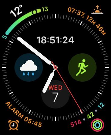
While the hardware delivers I can’t say the same for the software. The most noticeable addition is the new watch faces in particular Infograph and Infograph Modular. Infograph is the face seen in most of the adverts for the new watch as it shows of the increase in the size of the screen. You can customise the hell out of this face and can show up to 8 complications.
 My current Infograph face
New in Series 4 are complications around the edge of the clock face. Some of the new ones are great like weather showing upper, lower and current temperatures or the activity rings that show the individual totals as you progress through the day. We are also seeing more and more third party complications that can take advantage of the new display.
However it’s hard to get an Infograph setup that looks clean and elegant. It’s informationally dense but you can’t say it looks nice. There’s also a lot of complications that you can’t use on other faces like Utility or if you can they look out of place.
Other new faces like Fire and Water are nice but you’ll use them once and then swap back to something more useful. Series 4 has more watch faces available than before but the choice in some ways feels more limiting. With the extra hardware and complications you want to be able to do more not less. The watch is your most personal device but Apple really limit what you can do.
I’d expected Apple to open up watch faces to developers by now. You can on Android and it feels an obvious step for them to take, but when? Others are impatient as well – see this post from Marco Arment and some watch face fakery from Steve Troughton-Smith.
It feels like there’s a really small team working on watch faces at Apple. Each new release has a new watch face or two with the others hardly touched and worse it will be almost a year until we see Watch OS6 assuming Apple do address these issues in the next update.
Other improvements – workouts auto detects activity and offers to start or stop monitoring. Walkie Talkie is now there which is basically an always on audio chat. Works well but be warned that if you have one enabled with someone and they send you a message it will play automatically – be careful who’s listening.
Siri hasn’t changed much in this release but you can now ask it things without saying ‘Hey Siri’. I’ve found it really hit and miss to work though. When it works it’s great – fast and sometimes reliable answers but it is Siri so what do you expect. However there’s too many times where I’ve had to try 2 or 3 times before it triggers and that unreliability stops me from using it at all.
There’s also some issues elsewhere in Watch OS5.
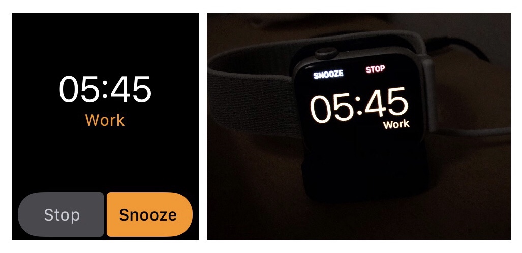
I use the watch as an alarm – when it’s on the wrist the alarm appears like the screen on the left. When it’s on the charger it appears like the screen on the right. Why are stop and snooze the opposite way round on each screen?
I’ve also has some days where complications just don’t update until you click on them and the app is launched. Worse, I’ve clicked on an alert or notification and the watch resets showing only the Apple logo for a minute until it has rebooted. Hopping the 5.1 update that came out last week addresses some of the instability.
Verdict
Was this a good upgrade? Yes. Watch OS5 isn’t supported on Series 0 and the faster hardware coupled with much better battery life has delivered a fantastic platform – I’ve finally given up on the Fitbit too.
However the watch feels like some other Apple products right now. The hardware is far better than the software allows it to be. Here’s hoping that Apple are listening to their community.