Default Apps 2023

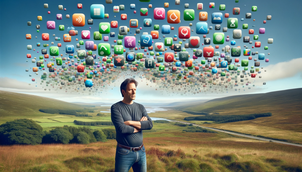
A man standing in the hills of Scotland being invaded by apps

If there’s anything thats going to kick start my blog it’s a trend talking about app’s. I first saw a post from Matt Birchler a couple of weeks back and it turns out it’s inspired by Hemispheric Views 097 – Duel of the Defaults! with Robb Knight going above and beyond tracking a list of people taking part.

Anyway, on with the list: 

The takeaway for me is I use many more default Apple services than before and I’m looking at Apple Podcasts to replace Overcast and Keychain/iCloud Passwords as the enshitification of 1Password continues. iCloud replaced Dropbox in the last 18 months, Apple Mail instead of Spark although Word, Excel and Powerpoint are safe as Apple’s office tools have never clicked for me. So why the shift?

App subscription fatigue is definitely a factor as there’s only so many subscriptions that I’m willing to do that deliver value. There’s also a narrowing of capability over time and ease of use just using defaults when you’re all in on one ecosystem. If only friends could actually use just one messaging platform!

If you do like trying out new apps the full list of participants is a mine of information…and I’ve found quite a few new blogs to follow. Good old RSS. Next up, I really should setup an uses page to make this easier to reference.

2021 Apple Report Card

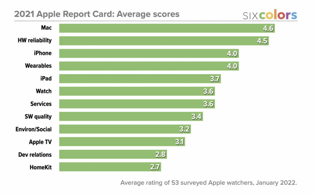
Earlier this week Jason Snell published his 2021 Apple Report Card. His annual report is a great read for anyone in or around the Apple ecosystem.

The scores don’t highlight any surprises but the comments from those surveyed do highlight a few issues. iPad is hampered by it’s operating system, not the hardware which is industry leading and matches much of the new Mac’s. Apple TV is the biggest rise year on year and thats thanks to the new remote. Its still too expensive and limiting for what it is. As for HomeKit it feels like it’s been abandoned.

Apple’s hardware is in a great place…but it’s software is letting it down.

WWDC 2021

Tomorrow see’s the start of the Apple year – WWDC. I always look forward to the event as it sets out the direction for all of Apple’s platforms and hints at future hardware. We are 9 months into the transition to Apple silicon so lots of hardware rumours, iOS is mature so what will be new this year and will we see anything hardware related with AR/VR?

What I expect to see:

  • New MacBook Pro’s with faster Apple chips.
  • iPadOS will surely see some improvements. The new IPad’s have so much power and the platform is let down by the software. Question is what? Hopefully a widget system that matches iOS as last year it was strangely hampered compared to the new powerful widgets you could use on the iPhone. Productivity improvements? Windowing? Better external display support? Some more borrowing/sharing features between MacOS? Not sure but if there’s not a focus on iPadOS that will be a major disappointment.
  • iOS – improved customisation after last years widget hit. So widgets improved, more flexibility across the whole of iOS as well. Expect to see improvements to Messages and FaceTime as well as they’ve been used so heavily through the pandemic.
  • watchOS – improved customisation perhaps? More around complications rather than full custom watch faces. That feels like a dream that will never land. Also expect to see more on health although that may need new hardware later in the year.
  • macOS – the first WWDC with Apple Silicon in the wild so what improvements will we see here? I’m hoping Control Centre will see further work including letting third parties use it. Maybe Shortcuts will make an appearance to further blur iOS and macOS?
  • Music – still think there’s more to come around audio. Apple made their lossless announcement but listen back options are limited. So surely there’s a part 2?

What I want to see:

  • New Mac Mini and the larger iMac. I’m plotting to upgrade to Apple Silicon this year from Intel so I’d like to see my options rather than plump for a device and then have regrets. However with iMac’s only recently being released I can’t see the bigger one launching.
  • Apple Monitor – one that isn’t > £5k
  • Let me customise Apple One and pick the services in the low to middle tier
  • iCloud – backup my Mac and also increase the storage limits without increasing cost – feels very tight when Apple is the richest company in the world
  • Apple Card in the UK
  • Apple address developer discontent and drop App Store charges…and throws them a bone around payment services
  • homeOS – lots of rumours around this and it’s something Apple could really do with improving. But what’s it for? HomePod’s? Apple TV? New devices?
  • A glimpse at the AR/VR hardware

24 hours from now we’ll have all the answers. Can’t wait.

A Week with the iPhone 12 Pro

I’ve had the iPhone X for just under 3 years. At the time Apple said it was the future of the iPhone and looking back they were right. It aged really well and is still fast, the screen is great with no burn in and the only area it’s started to lag is in the camera. But I’d planned for a while that 2020 was an upgrade year, mostly due to the incremental nature in phone changes and also that an iPhone Pro is a four figure purchase. 

So last Friday I picked up an iPhone 12 Pro in Pacific Blue and since then I’ve given it a good kicking…here’s my one week thoughts on the new device.

Design

Since the iPad Pro came out in 2018 I’ve wanted an iPhone with a similar design. I’ve always considered the iPhone 4 and 5 as classics and high points of iPhone design over the last 10 years. The iPhone 12 Pro references the 4 and 5 in adopting the iPad Pro industrial design. Squared stainless steel edges, glass back and a great range of colours.

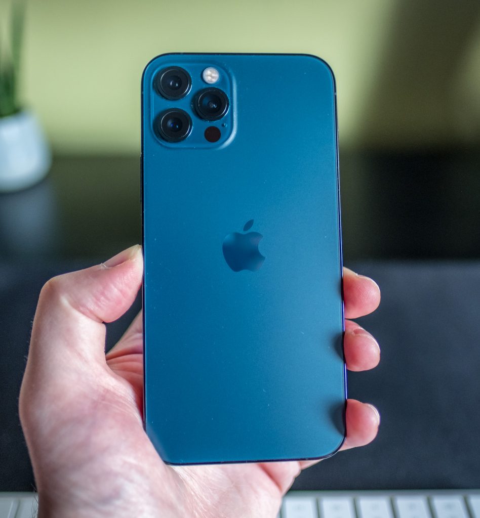
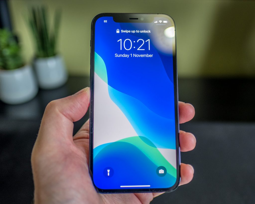
iPhone 12 Pro Pacific Blue

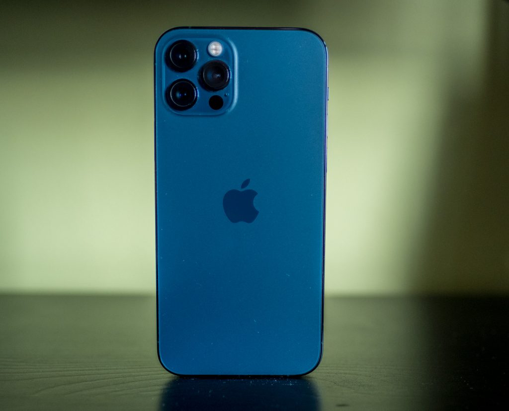
I went for the Pacific Blue – it looks gorgeous in the flesh and for me is one of the best designed phones from Apple in years. The frosted back also doesn’t pick up fingerprints like previous years models.

The square edge means it can stand on it’s own
Love the screen

The screen is also slightly bigger than last years Pro’s at 6.1”. However thanks to the design and the ever narrowing bezels its not too much bigger in the hand than the iPhone X. The screen itself is HDR, looks great and is also featuring the strongest finish yet – Ceramic Shield glass. Hopefully I’ll never find out if it is stronger but if it reduce screen smashes then great. 

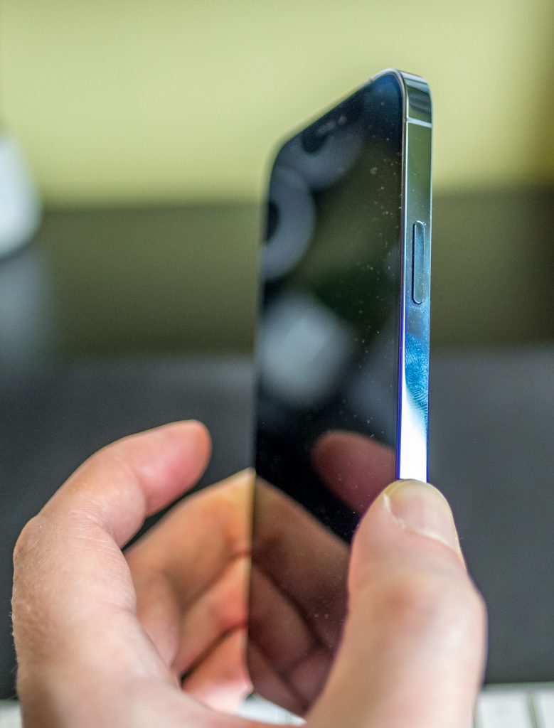
No hiding the fingerprints on the Pro

While I love the design the stainless steel band is a finger print magnet. It’s also quite slippy but with the squared off edges I find it pretty easy to hold case less if that’s how you want to role. If I’m honest I prefer the look of the iPhone 12 aluminium band over the stainless steel but much prefer the 12 Pro’s frosted back….you can’t win them all.

5G

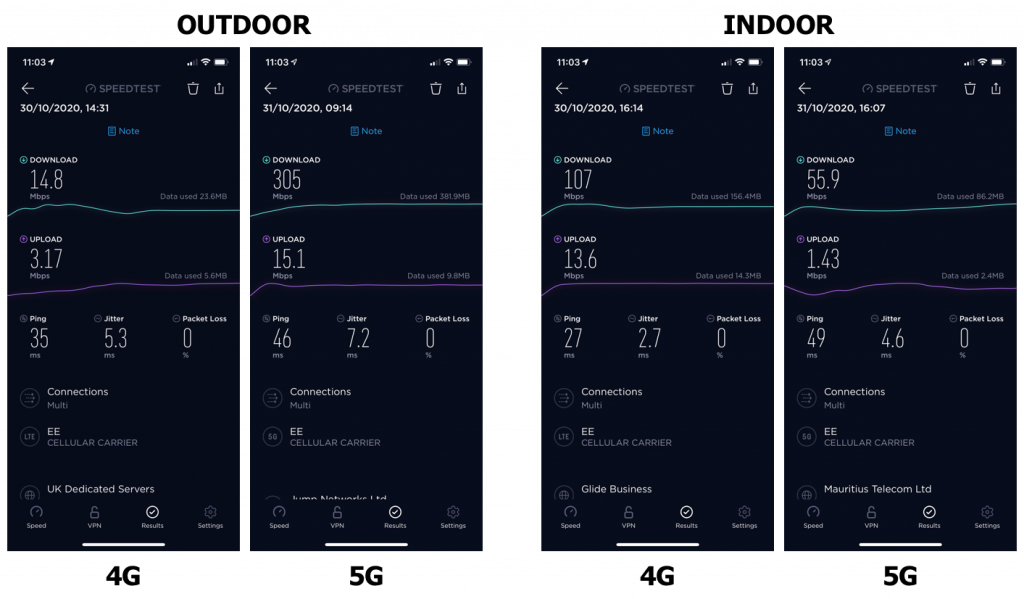
Apple spent a long time in their advert keynote talking about 5G, 5G, 5G, 5G, Verizon, 5G, 5G, Verizon. I’m with EE in the UK so wasn’t sure what to expect. I only upgraded my contract in the last couple of days and results in my parts of Glasgow are mixed.

Outdoors I’m seeing much better download and upload speeds but worse pings. Indoors is much worse. So much for the speed upgrade! Cellular speeds are affected by so many factors though so will need to spend a bit of time understanding if it makes any difference in practice and also how the 5G rollout across the UK matures over time. At the moment though it’s unclear as to what benefit 5G is really delivering although my new contract has more data for less. Win!

Camera

There’s very little difference between the 11 and 12 Pro…but for me moving from the iPhone X there is significant difference in the camera’s. There’s an extra lens, the telephoto and the sensors and lens themselves are much improved. 

Thanks Sky for playing ball – no edits on this photo
The ultrawide delivered some great shots
Again, straight out of the phone – love the Autumnal colours

Pixel peeking on similar photos show quite the upgrade. Apple also look to be adding more pop to their photo’s. None of the photos here have been edited – straight out the phone. The ultra wide also performs far better than I expected. The following shots are from the same position with each of the lens.

Telephoto
Wide
Ultrawide

Night mode is also…amazing. I know this is old news for 11 owners but the difference is massive over the X. So little noise in a night mode photo and it defies belief in the few times I’ve tried it so far. As well as taking cracking photos the 12 allows you to record in Dolby Vision HDR. Looks great on the iPhone and on screens that support HDR and feels like another important future proofing feature in this phone.

Video straight out of the iPhone

Final new features is Lidar. I’ve not noticed a difference when taking photos but it’s pretty amazing that you can 3D scan an object or room with your phone with ease. My only niggle – I’d have loved the improved camera features in the iPhone 12 Pro Max to have featured in the iPhone 12 Pro. Looks a significant step up but we’ll know for sure in a couple of weeks.

Speed

This iPhone flies. I’m coming from a few generations back and an A11 but apps are just so much snappier than the iPhone X. I’m also finding that apps remain loaded in memory far more than what I was seeing with the X recently. There’s more RAM in the iPhone 12 Pro at 6GB but noticed more with iOS 14 that apps would need to restart more quickly than I’d seen in the past.

Misc

Speakers – considerably louder and clearer than the iPhone X. Not sure if its better than the 11 Pro but it was a nice surprise.

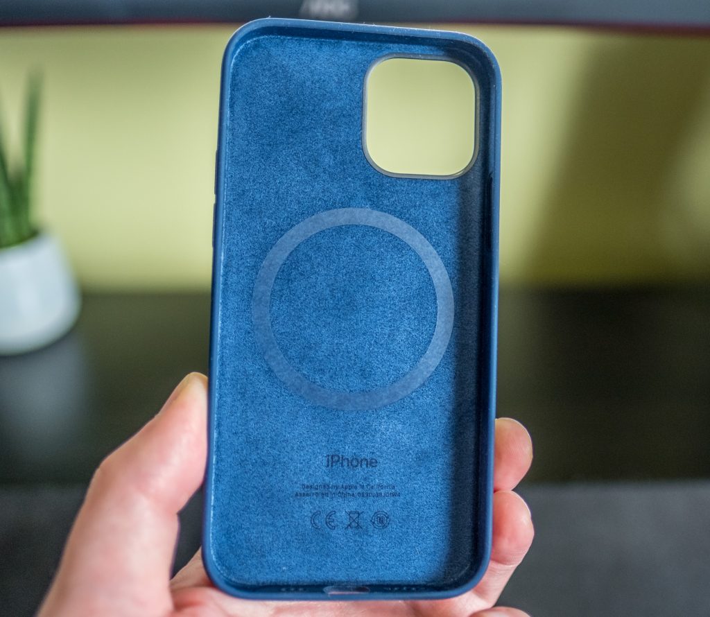
Case – usually pick up the Apple Leather case but that isn’t available. Picked up the synthetic case and pretty disappointed with it. Total fluff magnet, and it has a lip all the way around the screen unlike the leather which is lipless at the bottom. It’s also £50 probably due to the MagSafe additions…but when you put the phone in the case it knows its a blue case. Mmm.

I really can’t recommend the silicon case – overpriced and a fluff gatherer

MagSafe – I’m staying away from MagSafe. The wireless charging takes twice as long and costs more and the magnet strength is pretty weak.

No plug/EarPods – The size of the box is pretty surprising at first. Small and you can see the difference the plug makes. While Apple can tout greener credentials its money that’s driving this decision. I picked up an Anker power supply and cable – cheaper and better than what Apple sells.

Migration process – usually pretty painless, this year my apps, data and settings migrated over without passwords so I had a lot of setting up to do. 

Pick up – due to ordering taking longer than expected delivery had slipped by a couple of weeks so I opted for in store pickup. Kudos to Apple Braehead for a safe and quick in store experience.

Wrap Up

It’s only a week but I’m loving the iPhone 12 Pro. The design is a step up on previous models and the increased performance and features compared to my old iPhone X are significant. I really do love the design language of the iPhones and iPads from Apple right now.

However there isn’t much to choose between the iPhone 12 and the 12 Pro – a telephoto lens, 6GB vs 4GB, different finishes and the capacity – the 12 starts at 64GB vs the Pro at 128GB. So while I heartily recommend the iPhone 12 Pro, look carefully at what you really use the phone for as there isn’t much to choose between phones right now from Apple. And if you value the camera over everything else the iPhone 12 Pro Max is probably for you. For me I value my pockets and usability over the camera so the 12 Pro was the one for me.

Magic Keyboard for iPad Pro

When Apple announced 2020’s iPad Pro’s I had zero interest in upgrading from my 2018 model but I really wanted the Magic Keyboard. So it was with some relief after reading the blurb about the new keyboard that it also worked with my 2018 model. It was due out May but ended up launching in April. Instant purchase even though it cost £349. For a keyboard.

The one niggle I had was the lack of any mention of weight on the Apple website. Apple is really good at listing weight spec’s and shouting from the rooftops about thinness and lightness…unless it wants to keep something hidden.

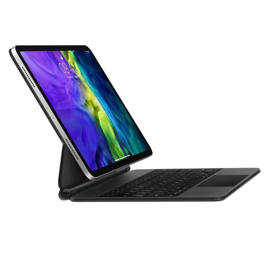
iPad Magic Keyboard

When the keyboard finally arrived I was surprised at the small packaging. I opened the box, took out the keyboard, ripped of the packaging and my first reaction was…this is pretty heavy. Heavier than iPad Pro heavy. Uncomfortably heavy. Mmmm. I then opened the keyboard and the hinge mechanism felt stiff and awkward. Mmmm. Not the best of starts and one of the few products I’ve bought where my immediate thoughts were this is getting returned.

I then snapped on the iPad Pro and I do mean snap. The magnets really grip the iPad in place. Opening and closing the keyboard with the iPad Pro attached was initially awkward. Unlike most devices of the last 20 years, the weight is in the top and not the bottom. Usually you lift open a light screen in a laptop. The iPad weighs more than just a screen and is thicker so it feels counter intuitive. However after a couple of days it feels fine and you get used to finding out the convenient ways of opening and closing the keyboard.

Those initial impressions were just over three weeks ago so I’ve had plenty time to pull together some thoughts. First, the positives:

  • The keyboard is great. A real step up from the Smart Keyboard folio, the keys have proper travel and are also backlit. Far more comfortable to use for extended periods. The base is rock solid too and doesn’t flex at all when typing no matter the surface it’s on. Didn’t realise how much I missed backlit keys until I got this keyboard.
  • The trackpad although small is a great addition to the iPad. Coupled with the new cursor support it makes text editing far easier and app’s as they add support take on a new feel. Only time I notice the size is vertical scrolling. One oddity is that the trackpad is a return to a physical click rather than the haptics in the Magic Trackpad. I also found it better to visit Settings > General > Trackpad and increase the tracking speed.
  • The trackpad supports a nice range of gestures that are well worth getting to know to help with usability day to day.
  • Love the floating iPad Pro. The viewing angle is the same as the Smart Keyboard folio…and I think I’d have liked another 5 degrees or so to tilt it back but I’m being picky. Now that I’ve got used to top being heavier, it’s easy to use and the hinge is super strong and doesn’t flex.
  • One aspect of the Magic Keyboard is you can’t fold the keyboard around the back of the iPad so I’m taking the iPad off the case more often than not. Never did that with the folio…and it makes for a more comfortable reading/relaxing device that way too.
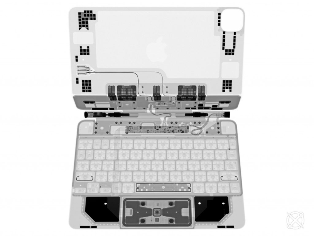
  • Taking the iPad off the keyboard can be done with one hand like most have said but I usually hold the keyboard and pull off the iPad. The magnets are really strong and the photo below shows just how many are being used to snap the iPad into place. There’s also a lot of engineering in the keyboard and hinge mechanism.

X-ray of the Magic Keyboard thanks to iFixit

There are however a few con’s to this new design that are worth considering.

  • For sketching there’s no perfect angle. Would have liked somehow to get an angle of around 170 so you can sketch with a bit of weight behind it but unless you turn the whole keyboard over….which looks ridiculous…then there’s no real solution. Maybe v2 in a couple of years time will address this.
  • The USB-C while useful charges at a slower rate than if you plug directly into the iPad which is a shame. It also is a charging port only – no accessory support which is a bummer.
  • It does make the overall iPad Pro a lot heavier – up there with laptop sizes so you may want to think through what you really want from a mobile device before going down the iPad Pro + Magic Keyboard route.
  • At £349 it still feels really expensive. Even £249 would feel expensive.

Should you buy one?

If you do any typing on the iPad Pro then yes pick one up despite the price. If you want the iPad to be more laptop like then it’s another yes. However the combined price would get you a cracking laptop so it really comes down to what you do day to day with your laptop or iPad and whether the Magic Keyboard add’s value.

The Magic Keyboard has really improved the way I use the iPad Pro. I could argue thats its transformational. The keyboard and trackpad coupled with the software changes in iPadOS to add cursor support really do add another dimension to the iPad. Cursor support has only been around for a few month but it feels so natural in iOS and so well integrated it feels like its always been there. The keyboard looks and feels great, which it really should for the price, and if you are making use of your iPad for an hour or two a day I’m sure you’ll like the Magic Keyboard as much as I do.

Apple Arcade

Apple Arcade launched with iOS 13 and I’ve come to the end of my free trial month. It’s been much talked about…will it change mobile gaming? Will the quality of games encourage sign-ups? Is it just Apple trying to grab another slice of service revenue?

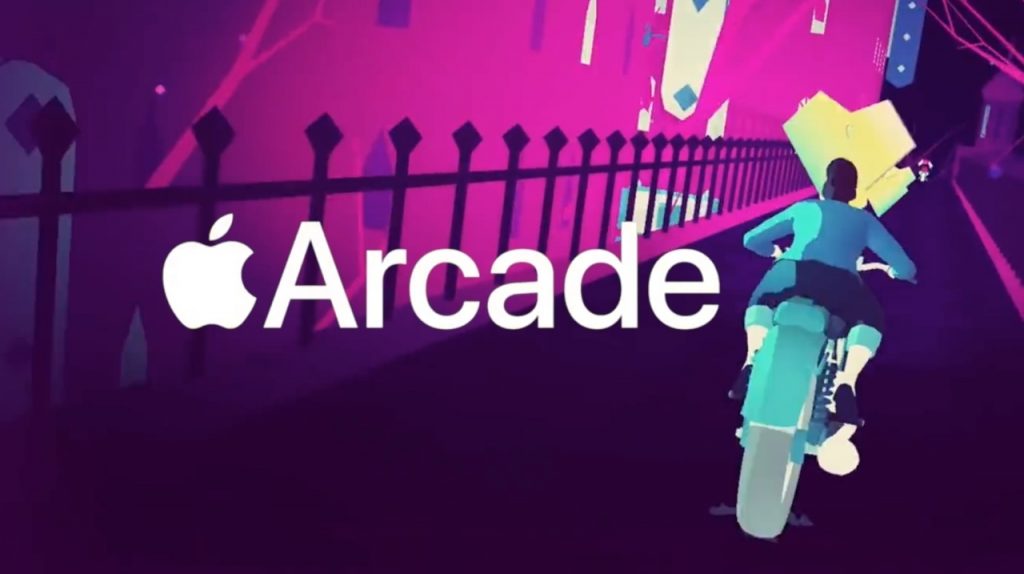
Sayonara Wild Hearts
100 Games

Apple Arcade promised 100 games at launch but like many products Apple launch now the details were opaque. On day one there were around 70 titles and after a couple of days they added another 3-4. Since then they’ve dropped around 5 new titles every week and on Friday 8th Nov they’ve hit 100. Impressive considering the variety of titles available.

Play Anywhere

While cloud saving meant an easy shared gaming experience on iPhone and iPad Pad, Arcade extends that to Apple TV and the Mac. For some games this works well and means you can continue that favourite game wherever you are.

However the platforms can offer really different experiences. iOS is driven by touch unlike the other two. There are games like Mini Motorways that while you can play them on the Mac or Apple TV just aren’t as good and that’s purely down to the interface. Conversely Sayonara Wild Hearts shines on the Apple TV when used with a controller while on iOS it feels a different game as the touch controls are lacking.

Of course you can pair a controller with iOS and with 13 now supporting Xbox and PS4 gamepads Apple are finally taking gaming + controllers seriously, but you are more likely to pair a pad on the Apple TV and Mac.

Value

Apple Arcade costs £4.99 a month. £60 a year. One full priced digital title on Xbox or PS4 costs £60 so do you get value for money? Yes. Will I have the same opinion in 6 months time? Not so sure.

Today’s mobile games are full of in-app purchases, adverts or a grind of some sort to get more coins to unlock some special move or worse multiple in-app currencies to unlock various things. I’m looking at you Mario Kart which is so unlike a Nintendo game it hurts. Apple Arcade games guarantee no in-app purchasing. No adverts. No grinding either – just a clean experience which is far from what we see in mobile gaming today.

Value would also be questionable if Arcade was all full of the one type of game but the initial launch is packed with a variety of genres and each type has one or two hits in their category. There’s no doubt there’s a few stinkers in there. Sonic Racing is surprisingly poor and there’s a couple of other games that have been written with microtransations in mind and had them quickly stripped for Arcade.

Guildlings on Apple Arcade

The main challenge around value is how many titles keep coming to Apple Arcade? How long do existing titles stay in Arcade? Arcade’s value would diminish if Mini Motorways or Grindstone which have a lot of repeatability disappeared from the service after 9 months. While thats an unknown we are seeing great new titles like Guildlings appear more than 6 weeks after Arcade launched so I’ve a good feeling that we’ll see more enjoyable titles into the new year.

One other aspect of value is to the developers. There’s not been much said on how developers are rewarded for titles in the Arcade store. Does it depend on number of downloads? Number of plays? Paid up front? Hopefully the first developers and studios making games for Arcade are being rewarded by Apple – they’ve certainly got the money to ensure developers get what’s due but the App Store shows it’s often a race to the bottom.

The Games

All the above doesn’t matter a jot if there aren’t games worth playing. Some of my favourites so far:

  • What the Golf – You think you are getting a golf game set in weird places, instead you are getting a more anarchic version of golf that’s so much fun. Love this.
  • Assemble with Care – A short but beautiful game in which you fix objects. Reminds me of The Reassembler with James May.
  • Grindstone – First class puzzle game. Simple at first but the more you play the more complex it gets where you have to apply more strategy to get through the round. First Apple Arcade title to get an Edge 9.
  • Super Impossible Road – I loved Impossible Road and this is a deeper version of the original that first came out on the PS4 a few years ago. It’s now on iOS and it’s very good. Has a career more and multiplayer too so a lot more depth.
  • Mini Motorways – Follow up to Mini Metro swapping trains for cars. It’s got a bit more complexity and while good, I’m not enjoying it as much as Mini Metro.
  • Where Cards Fall – It’s a puzzle game but relaxing at the same time. You play a character looking back on his life so far and it does make you think about events in your life too.
  • Guildlings – Only just out but a really enjoyable RPG/puzzle game. Seemingly short again but this is Chapter One so more planned in the future.
What the Golf

There are so many that I’ve yet to try out of the 100, but also worth a shout are Sayonara Wild Hearts and Frogger in Toy Town. Frogger was previewed at an earlier Apple event and looked a bit rough but the gameplay gets quite tricky at times and the graphics are really well done.

Should you subscribe?

For me Apple Arcade is well worth the £4.99 a month it currently costs. Should there be a dearth of new titles or favourites disappear then I might have second thoughts but so far it delivers a great gaming experience thats free of adverts, in app purchases and the grinds that have killed much of the good in mobile games.

There’s a definite focus on smaller more unique games compared to AAA titles seen elsewhere but it also introduces, for me anyway, games that I might not have bought had they appeared in the normal App Store especially if the developers were forced to cram in adverts or IAP’s. I’m looking forward to seeing what other titles land over the coming months and whether Apple can keep up this strong start. The games so far have been a nice contrast to what we usually see on the App Store or on the major consoles. Well played Apple.

Need vs Want

It’s September. It’s Autumn. It’s Apple release time. Not only do we get OS update’s across the ecosystem and this year Apple really are spoiling us with multiple iOS updates in September alone (bugs!) but we get the annual launch of new iPhones.

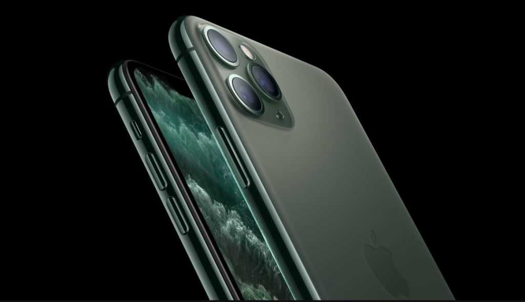
This years updates focus on the camera and extra battery life. I’m not triggered by the three camera’s as some were but there’s no denying the bump is getting…large. However visiting the Apple Store yesterday the design certainly camouflage’s the bump better than I expected from the pictures. I also love the smoky glass on the back compared to previous years.

The camera’s though are special. The new ultra-wide is a really nice addition to the iPhone. The clarity and tones from testing in the store today were impressive. Didn’t try the video but the embed below from Andy To is so good. For a more detailed review of the camera, Austin Mann’s write up is well worth spending time on.

One other tiny change is a slightly thicker case alongside a drop of 3D Touch but coupled with a redesigned battery gives a 4 or 5 hour increase in life if you go for a Pro model. Compelling changes…and don’t forget that new Pro colour. More speed, better screen, what’s there not to like?

Love the midnight green

Well…the price for one. My iPhone X is 2 years old and was by far the most expensive phone purchase I’d made. I said at the time I’d be moving to at least a 2 year upgrade cycle so now’s the time to move to a new phone.

But the X is still doing well. Fast, good battery life and the design hasn’t really moved on since the X. Looks exactly the same from the front and sides.

So I want a new iPhone.

I don’t need a new iPhone.

And at £1200, I’ll be giving the iPhone 11 Pro a miss this year.

Need vs want.

In the past I’d upgrade yearly and enjoy those incremental, sometimes large incremental, improvements especially in years 1-5. Now the changes are smaller and not enough to see me change yearly, even every other year. I’m also surprised that both Glasgow Apple stores still have stock of the Pro models three days after launch. Mmmmm.

Need vs want.

Still very tempted…but the credit card will stay locked away for another year.

2018 iPad Pro

Just over a year ago I upgraded to the 10.5 iPad Pro with folio keyboard and Apple Pencil. I was convinced this iPad would do me for another 3-4 years…until Apple brought out a brand new iPad Pro design and a version 2 Apple Pencil. The message from Apple this year is the iPad Pro will make you rethink what an iPad and hence a computer is capable of. Does it?

New Design
I love the new design of the iPad Pro. Flat edges and thin across the whole iPad it feels great in the hand. I wondered if the flat edge would feel uncomfortable when holding the iPad for a while but I’ve had no issues so far. The design reminds me of the iPhone 4 & 5 which were a favourite of mine. I’d love to see a similar design introduced for next years iPhone’s.

The rounded corners are now matched with rounded screen corners. Apple have brought their Liquid Retina LCD to the iPad – Liquid Retina seems to indicate rounded corners – and it looks fantastic. Despite it not being an OLED I struggle to see the difference in playback of videos when I compare the iPad to the iPhone X. The screen still has all the new tech that was introduced last year including ProMotion and TrueTone which ensures a fantastic image at all times.

Many have said this is a borderless iPad and the screen is edge to edge…but it’s not. It’s close to the edge but there’s an undeniable border that runs around the whole screen. The difference is that it’s constant and you really can’t tell which way is up unless you look at the back and see the Apple logo. The thinner border also houses the main difference from every other iPad so far as there is no home button or Touch ID.

Face ID is now tucked into the iPad Pro (no notch!) and so far it’s been better in use than the iPhone. It works in any orientation, it’s faster than my iPhone X and if you do have your hand covering the front facing camera it will alert you with an on screen dialogue. It also feels more frictionless than Touch ID. I will be working on the iPad and when something needs to unlock like 1Password it just happens assuming camera isn’t blocked. Face ID has really speeded up my iPad usage.

The removal of Touch ID has lead to Apple tweaking both iPad Pro design’s. The smaller iPad is no longer a 10.5″ screen but moves to 11″. The larger iPad 12.9″ screen stays the same but the footprint of the iPad has now shrunk. Due to this shrinking and the overall thinning the 12.9″ now takes up 25% less volume than last years model. This lead to a tough choice. I didn’t pre-order the iPad Pro as I wanted to see the new models in the flesh. Last years 10.5″ iPad Pro was great as a consumption device and was OK as a laptop replacement but there were times when the keyboard felt small and multi-tasking two apps was a bit tight on size. Could I move to this years 12.9?

Yes. On comparing the 11″ and 12.9″ I much preferred the bigger screen and felt the compromise in weight was one I could make. In practice over the last week it’s been the right choice for me. Using the iPad with the keyboard has been far more comfortable, video watching on the larger screen has been great and general browsing and reading is a bit more clearer. Yes it’s more weighty and slightly more cumbersome but it’s not been enough to make me think about swapping back to the 11″.

Faster and Louder
Powering this years iPad Pro’s is the new A12X chip. The performance of this is pretty astounding. I’ve ran a Geekbench test against the new iPad Pro and my current 2017 iMac and iPhone.

The iMac is more than 2.5 times the cost of the iPad Pro and has a noisy fan at times when you stress it unlike the iPad Pro but the Geekbench scores are close. App’s fly on the iPad – it’s faster than last years model which was already a really good performer. It feels like Apple could replace Intel with ARM chips in Mac’s now, especially for the MacBook Air and Pro’s.

The other significant change is in the connector – lightning has been dropped for USB C. USB C is more capable than lightning, it can supply more power for example. There are also thousands of USB C peripherals out there but at the moment it’s trial and error if the iPad Pro supports it thanks to iOS.

Worse is the limitations around files. Plug in a camera or an SD card via an adaptor and it will be recognised and allow photos or videos to be imported. Anything else however is ignored. Plug in a flash drive with a Word or Pages file – ignored. Zip file – ignored. Music files – ignored. Support for browsing of external drives seems trivial to add to iOS especially with the Files app that arrived with iOS 12. This shouldn’t need to wait until iOS 13 – why not a 12.2 or 12.3 feature? It would bolster Apple’s claims about rethinking what an iPad can do and would have silenced a lot of negativity if it had came alongside the iPad Pro release.

Always the butt of jokes, the camera’s have seen some upgrades too. The rear camera is new and unique to the iPad, isn’t as good as the new iPhones but does take a good picture and is also great for scan’s. The camera bump is pretty large but doesn’t cause the iPad to rock when placed flat. The front facing camera is the same as the XS and XR (thanks Face ID) so unlike the rear supports portrait mode.

Something that has been dropped is the headphone jack. This feels mean especially for something advertised as a Pro machine. Yes you can buy USB C adapters (and unlike the phones no adapter was included with the iPad Pro) but it feels like a mistake to me. However the 4 speakers are improved over last year. Louder and clearer the sound on the new iPad is excellent for something so thin.

Final point is on battery life. Apple change each year how they define battery life. 10 hours, full day etc. I’ve found the battery life to be much the same as previous iPad’s. Long lasting especially when compared to a laptop, so a full day of work is easy to achieve.

Folio Keyboard
So far, so positive. The new Folio Keyboard has also seen some design changes. There is a new smart connector for the keyboard and rather than attach at the side of the iPad the new folio covers the entire back. In fact the back of the iPad plays an important role in aligning the keyboard via magnets. On the back of the iPad Pro there are over 100 magnets used to align the folio when connecting. This works so well. Easy to take the keyboard off an on and no worry about whether it’s on and aligned properly.

The outside material of the folio feels a little different to the last model. It feels a bit softer but it also picks up fluff and dirt easily which is annoying. It’s also a shame that the new iPad is then wrapped in a solid flat grey case – there’s not even an Apple logo on show. In some ways it matches the industrial design of the iPad but it is bland compared to the naked iPad.

The folio is far more comfortable to type on my lap. Little movement, and the wider keyboard is far more comfortable than the older 10.5. The majority of this post was written using the new keyboard and it’s far less cramped than the 10.5 version. However the keyboard itself feels a missed opportunity. There are still no backlit keys – not even a caps lock indicator. There are also no media or shortcut keys which seems lacking for a Pro device.

They new folio allows for two positions, desk and lap. It’s nice to have two options but it’s nowhere near as flexible as something like the Surface Pro. I’ve had no major issues with the angles provided but I’ve seen others complain about neck strain as neither angle is exactly right.

While the keyboard is more stable in general the iPad on the folio seems to flex more than with the last design. The image below shows the 2017 iPad Pro 10.5″. There’s a bit of movement when you poke the screen.

The second image shows the 2017 iPad Pro 12.9″. There’s much more movement including the keyboard itself. Not sure if that’s a symptom of the new design, it’s due to the bigger iPad or just that the keyboard is new and needs time to settle.

So the folio keyboard isn’t bad, but it’s not great either. Worse – it costs £200. Like most Apple products this year they’ve all went up by around 20%. I can justify that to myself when I see new features or technology but there is nothing in this keyboard that shouts new…or Pro. I felt a bit wronged when buying the folio and I’m looking forward to seeing some third party options appear in the coming months that address the folio’s shortfalls.

Apple Pencil
Unlike the folio, the new Apple Pencil has been totally redesigned and address’s all the issues with the first version. The first difference is the matte finish. It feels much more comfortable in the hand aided by the second noticeable change. Instead of being totally round the pencil now has a flat edge that serves two purposes – it magnetically connects to the edge of the iPad and it also stops the pencil from rolling. I also find it more comfortable to hold.

While magnetically connected to the iPad the pencil wirelessly charges. This means unlike the older pencil which you could never find and if you did it was usually not charged, the new pencil is always to hand and charged and ready for action. The wireless charging means there’s no more awkward charging via a port and the pencil is slightly shorter, feeling more balanced in hand.

The final change is a button. An Apple product with a button? Don’t be daft, it’s a double tap in the lower third of the pencil that activates an alternate function which is set per app. So in Notes you are drawing with the pencil and a double tap swaps to the eraser. I’ve found it a bit awkward to use but easier the more I do it.

The Apple Pencil has also seen a 20% increase in price which for me is more justifiable compared to the old design as it includes gesture support and wireless charging. However Apple no longer supply a spare tip with the pencil. That’s tight.

In the last week I’ve used the pencil far more regularly. Comments on a PDF, signature on a doc, editing photo’s in Lightroom and just general navigation. A fantastic update.

Elephant in the Room
Apple want to class the iPad as a computer and given the power it has that’s no surprise. However reviews to date have identified one major flaw – iOS – and I have to agree. I use my iPad every day and it replaced the MacBook Air that I had. However I couldn’t give up on my Mac as iOS doesn’t let me do what I can easily do on the Mac. There are also tasks that despite the improvement in iOS 11 and 12 are faster and easier on the Mac either down to the maturity and flexibility that macOS offers or the support of things like a mouse, trackpad or large monitors.

I’d like to see iOS improve in a number of area’s:

  • Let me pick default apps. There are great mail, calendar, task management and browsers in the App Store all hampered by the fact that you can’t make them the system default.
  • Let me browse attached storage. Seems a no brainier to add and soon.
  • Make better use of the large tablet interface. An 11″ or 12.9″ screen should let me do far more than the default iOS springboard currently does. It really is just a bigger iPhone.
  • Mobile Safari doesn’t cut it anymore. Give us the same functionality and power as desktop Safari…or let me default to Chrome.
  • Multi user? I don’t need it but the iPad has everything from a hardware perspective that would allow multi user support and it seems more important to add with the price of the devices now.

Will we see any of this in iOS 13? No idea and undoubtedly won’t see them all if any. If you are picking up an iPad Pro hoping that these features come in the next 12 months then prepare for some disappointment. One last ding on Apple and software – where are the pro apps? They paraded Adobe at the iPad Pro launch and talked up Autodesk but where’s Logic? Where’s Final Cut? Pro users need Pro software and not seeing Apple’s Pro app’s on the iPad is a real negative.

Verdict
I love the new iPad Pro. The design is great – a thin all screen slab that is also a really fast computer. It feels more like the device Jobs promised in 2010 when he showed the iPad for the first time. The screen increase to 11″ and shrinking of the 12.9″ body will lead to more moving to the larger iPad. The keyboard is a kludge but the gen 2 Apple Pencil is a fantastic step up and improves in every area.

Will it replace you current computer?

Maybe.

It totally depends on what you use your current computer for. I fallback often to the iMac and I couldn’t move to being iPad only right now not due to the hardware but solely down to iOS. 2019 is a big year for software on the iPad. Real Photoshop from Adobe will land and there will be much speculation on what iOS 13 will deliver for the iPad. For too long the iPad has seen little attention to differentiate it from the iPhone. Apple, it’s time to unlock the iPads potential.

Apple Watch Series 4

I’ve been an Apple Watch user sine it first came out in 2015. It was no surprise as I love my Apple products and I’ve been interested in wearables for years importing the very first Fitbit to track my steps.

However I resisted upgrading from the original Series 0 waiting for a bit of a redesign which the Series 4 finally delivered. I’ve been using the new watch for just over a month so how has it performed?

Hardware
The new watch comes in a slightly bigger size along with a far bigger screen. It’s not quite edge to edge but the bigger screen makes for a far more readable display. I plumped for the 44mm and it’s really comfortable on my wrist. Now that I’ve seen both sizes I prefer it over the 40mm.

It also feels comfy to wear. Like all smartwatches it’s pretty thick but not ridiculousy so. I went for the Cellular version this time and thankfully the red crown has been replaced with a small red line around the crown instead which is far more pleasing on the eye.

Cellular has worked well. I’ve streamed music and podcasts while out and about around Glasgow listening via AirPods and without the phone. Speeds are good, easy to select content and calls have come through with clear audio.

Speaking of speed, the Series 4 is really quick. Apps launch quickly, taps are recognised without a pause…it makes for such a different experience compared with the older watch.

Couple of other points. Battery life is excellent. I use the watch all day, keep it on overnight for sleep tracking and charge it for an hour while getting ready for work. Around once a week I need to do a top up at night but I’m fine with that. For an overnight trip I no longer need to pack a charger.

The crown – it’s digital but the haptic feedback is so good. The sport loop straps are more comfortable than the sport bands…although there are far too many colour choices. Damn you Apple.

Despite all that’s great about the hardware it’s hard to avoid the obvious miss – the always on screen. Will come one day but still feels a few years away which is a shame. Can never truly call it a watch until it’s always on and you don’t need to flick your wrist to trigger the screen.

It’s also a shame that that ECG feature isn’t available anywhere yet and hasn’t been cleared for UK use. It’s that breakthrough that made this watch so appealing.

Software
While the hardware delivers I can’t say the same for the software. The most noticeable addition is the new watch faces in particular Infograph and Infograph Modular. Infograph is the face seen in most of the adverts for the new watch as it shows of the increase in the size of the screen. You can customise the hell out of this face and can show up to 8 complications.

My current Infograph face

New in Series 4 are complications around the edge of the clock face. Some of the new ones are great like weather showing upper, lower and current temperatures or the activity rings that show the individual totals as you progress through the day. We are also seeing more and more third party complications that can take advantage of the new display.

However it’s hard to get an Infograph setup that looks clean and elegant. It’s informationally dense but you can’t say it looks nice. There’s also a lot of complications that you can’t use on other faces like Utility or if you can they look out of place.
Other new faces like Fire and Water are nice but you’ll use them once and then swap back to something more useful. Series 4 has more watch faces available than before but the choice in some ways feels more limiting. With the extra hardware and complications you want to be able to do more not less. The watch is your most personal device but Apple really limit what you can do.

I’d expected Apple to open up watch faces to developers by now. You can on Android and it feels an obvious step for them to take, but when? Others are impatient as well – see this post from Marco Arment and some watch face fakery from Steve Troughton-Smith.

It feels like there’s a really small team working on watch faces at Apple. Each new release has a new watch face or two with the others hardly touched and worse it will be almost a year until we see Watch OS6 assuming Apple do address these issues in the next update.

Other improvements – workouts auto detects activity and offers to start or stop monitoring. Walkie Talkie is now there which is basically an always on audio chat. Works well but be warned that if you have one enabled with someone and they send you a message it will play automatically – be careful who’s listening.

Siri hasn’t changed much in this release but you can now ask it things without saying ‘Hey Siri’. I’ve found it really hit and miss to work though. When it works it’s great – fast and sometimes reliable answers but it is Siri so what do you expect. However there’s too many times where I’ve had to try 2 or 3 times before it triggers and that unreliability stops me from using it at all.

There’s also some issues elsewhere in Watch OS5.

I use the watch as an alarm – when it’s on the wrist the alarm appears like the screen on the left. When it’s on the charger it appears like the screen on the right. Why are stop and snooze the opposite way round on each screen?

I’ve also has some days where complications just don’t update until you click on them and the app is launched. Worse, I’ve clicked on an alert or notification and the watch resets showing only the Apple logo for a minute until it has rebooted. Hopping the 5.1 update that came out last week addresses some of the instability.

Verdict
Was this a good upgrade? Yes. Watch OS5 isn’t supported on Series 0 and the faster hardware coupled with much better battery life has delivered a fantastic platform – I’ve finally given up on the Fitbit too.

However the watch feels like some other Apple products right now. The hardware is far better than the software allows it to be. Here’s hoping that Apple are listening to their community.