iOS 10, iPhone 7 and the Apple Watch

I’m a bit later than normal with iOS 10 impressions and iPhone 7 thoughts this year. I didn’t take part in any of the public beta’s so iOS 10 was new to me when it was released on September 13th and I wanted to use the new iPhone for a while before jotting down my thoughts. So without further ado…

iOS 10
iOS 10 features a number of updates, some big but most not so much. A few thoughts on the new features first.

  • The first noticeable change is to the lock screen. Raise to wake on iPhones changes the reliance on the home button. It means you can see notifications or interact with widgets with ease. There’s also a lot more information on the lock screen than before which I like. It also relies on swiping which may infuriate some people as features seem lost now – where’s the camera shortcut from before? No icon instead swipe to the right pane to access camera.
  • Today view is better as well, and widgets seem far stronger from app developers. Hue and Dark Sky are just two app’s that take great advantage of the Today view allowing me to see information far more quickly than I could in the past.
  • Control centre now has three screens/cards instead of one. Control, Music and Home. All makes sense and combining Raise to wake and accessing control centre makes Hue light control so simple. One weird button on Control screen – Night shift. Does it really need that massive button? Also nice to see 3D touch to alter settings like torch brightness, bulb brightness and camera options.
  • Siri supports third party app’s but hard to see much other improvement. Still lags to Google and Amazon.
  • Photo’s seems a bit broken. A couple of nice new features around creating video’s based on location, photo’s and it does a good job. However machine learning has now been added (surely just enhanced and not added) but it does this per device. So I’ve got 7,500 photo’s scanned on the iPhone but the iPad has only 6,000 photo’s scanned asking me to plug in and switch of the device to resume scanning. Seemingly when all devices have finished scanning a comparison is done via iCloud but this approach seems bonkers compared with Google. The intelligent searching, so asking for photo’s of tree’s, summer, dog’s etc, isn’t as good as Google’s. Apple made some big claims about computation on the devices as compared to computations on a cloud service but Google wins this pretty easily.
  • Third party dev’s can now take photo’s in RAW format which is impressive. Lightroom and a few other app’s have updated to allow this and it does help with editing.
  • Maps – still worse than Google Maps.
  • Music has seen a big UI change. Bold fonts, simplifying options and I prefer the new look. Makes getting to my music more easy. Playlist creation still sluggish, or is that just me?
  • News – similar UI change to Music. Nice.
  • Home – an app specifically for HomeKit applications. My only devices that support it are the Hue lights and they work really well with Home. A great update over previous iOS versions.
  • iMessage is now a platform. Massive emoji support, animations, effects, gif’s and it’s own app store mostly for stickers. I like it.
  • Upgrading to iOS 10 on my iPhone 6 was a pain. I use encrypted backups which helped but after upgrading my stored music had gone, my app’s aren’t installed so you have to wait a couple of hours for them to download and on day one the Apple server’s can’t really cope with demand so you get iCloud errors. Not the great user experience that it should be.

There’s some other small features elsewhere but overall a solid if unspectacular update. Performance on my iPad Air is a bit sluggish but other devices are all working fine.

iPhone 7
Tick-tock. Apple have followed the tick-tock model for phone design for a few years. iPhone 4 then 4S, 5 then 5S, 6 then 6S with each new number bringing a change in design while the S models were refinement. The iPhone 7 should have seen a new design but instead we got the ultimate refinement which see’s a slightly tweaked 6 design but given the iPhone 7 name. Most noticeable design changes were to do with colour finish of the phone. Jet black and black were the two stand outs for me. As I hadn’t upgraded in a couple of years I went with a black 128 GB iPhone 7. Some thoughts after 10 or so days with the phone…

  • Matt black looks really good. Love the finish of the phone although it does pick up fingerprints
  • It is so fast. App’s launch quickly, web pages render without issue. I’m still loving the speed increases after a number of days and considering the iPhone is my most used device this makes for a great reason to upgrade on it’s own.
  • Screen is slightly better than the 6 to my eye. The reviews talk endlessly about why it’s the best screen yet but it feels like diminishing returns with the current screen technology. Next year finally a move to OLED for Apple?
  • Crucially the battery is lasting longer than the 6 for me with everything running as it was before and my extra usage with the new device.
  • The camera is great. OIS (Optical Image Stabilisation) is so good on video’s. The first video I took to show my Hue lights working for a friend was so good compared to what I could shoot on the iPhone 6. The pictures out of the 7 are also getting closer to some really high end camera’s. I didn’t go for a plus as I find the size just too big (I have a plus as a work device) but the dual camera support on the 7 looks to be great as well.
  • Removing the headphone jack. So in the grand scheme of things it’s not that big a deal I guess and Apple did include an adapter in the box so you won’t be stuck with £1000 headphones that no longer work. People will lose the adapter though and bluetooth isn’t as reliable or as good (yet) as a wired connection. I’ve held off upgrading my headphones for the last year as I expected this was coming so some form of wireless headphones will be bought soon…not sold on the Airpods though so who knows what I will pick up.
  • The home button is no more. It’s a pretend button with your brain tricked by the Taptic engine that a button has been clicked. Does it work? Sometimes. I’m mostly used to it although it does feel weird switching between 7 and 6S, from Taptic button to real button. There are times though that it feels like the whole bottom of the iPhone is clicking, not just the button.
  • Use of Taptic engine through the rest of the O/S though is great. Neat little touches as you resize an image, scroll through a list are much improved thanks to the new engine and iOS 10. An unexpected win.
  • 3D touch is much improved compared to the iPhone 6S. Much better feeling and used in many more places. Another win.
  • Live photo’s are improved compared to previous iOS/hardware and there’s been a couple of great gif’s create already 🙂

The video above was from St Rules tower in St Andrews on a pretty windy day and apart from me taking the video in portrait I thought the OIS did a really good job of keeping things stable. On Monday I took a trip to Finnich Glen and despite some challenging conditions the iPhone performed really well.

Panorama from Finnich Glen
Finnich Glen
Finnich Glen

Overall I’m delighted with the iPhone 7. Fast, great camera and the haptic and 3D touch improvements are unexpectedly good. Shout out too for the Apple leather case which is a step up on previous versions. Metal buttons make all the difference.

Apple Watch
The Apple Watch has been out for around 18 months and the biggest step change is watchOS 3. It’s made my watch actually usable for third party apps and killed some of the other features like it’s focus on messaging to provide a dock which contains frequently accessed app’s. The change in day to day use is pretty startling. I can now access weather and news without waiting for 30 seconds while it refreshed. Activity stats are also readily to hand and messages is still there but as an app alongside the others not in its own unique place.

It’s also easier to swap watch faces so you can have one setup for work, one for activity, one for travelling. Along with the easy switching there’s a couple of new faces. One focussed on activity and one which is Numerals and a very simple display. Extra customisation with regards complications and third party watch faces are clearly for a future watchOS version.

The upgrade wasn’t without issue though. The first few days it felt like the display would take slightly longer to switch on. I also had a lot of hassle with third party complications but it looks like they were all third party developer issues as subsequent app updates have resolved all the issues. Overall watchOS 3 is a great update.

Apple also launched Apple Watch Series 2. It’s interesting to see Apple focus on sport and activity over timepiece and luxury which the first editions were all about. The new watches have far brighter displays, are now water resistant to 50 metres and now have a dual core processor which is twice as fast as the previous watch. While important upgrades the biggest for me is built in GPS. This means a run or walk no longer needs the iPhone to track it accurately. If I was running right now it would be an instant purchase but for now I’ll stick with my current watch.

The Future
Apple iPhone 7 and the Apple Watch Series 2 are great devices. iOS 10 is a strong mature platform and watchOS 3 proves that Apple isn’t scared to rip it up and start again. The reimagining of the device thanks to watchOS 3 is fantastic. However it’s clear that exploding batteries aside, Samsung have caught up and in many ways overtaken Apple from a design perspective and pushing new technologies out to consumers. Apple really have to pull out the stops for next years iPhone or risk seeing more people shift to Samsung and Android.

It also needs to up it’s gain with regards Siri as it looks tired when compared to it’s competitors. I also wonder if next year is when Apple shows it’s AR hand? 2017 feels like a year when Apple needs to knock it out of the park. Can it?

Placing Bets

We seem to be approaching a crossroads. Most of the big tech companies are focussing efforts on AI and bots. Just last week Google unveiled a raft of products, all currently unavailable but here in the fall, which are focussed on their AI technology and the amount of data amassed about their users. Google Home and Allo with Google Assistant at their core offer a compelling look at a voice or text driven future focussed on helping you do things easily or get to information without launching an app or taking much time.

Another key aspect is that you can do this on any mobile platform. For Google it’s not locked to Android and for Facebook and Microsoft they don’t have their own mobile hardware platform…sorry Microsoft.

So what next for Apple?

Marco Arment had a great post last week – If Google’s right about AI, that’s a problem for Apple. Could Apple really be the next Blackberry?

In some ways I fear it’s heading that way. They seem far behind with AI. Siri was fine when it first launched but it’s stagnated, many of it’s founders have left Apple and launched a new voice driven product with AI at it’s core, and as Marco’s post highlighted you just can’t simply catch up in a year or buy your way out of a hole. In many ways the focus on security and privacy puts Apple at a disadvantage compared to it’s rivals. Opening up Siri to third parties would help somewhat but it still feels flawed as a service to me.

Using voice feels awkward, especially in public. There are some things that I don’t want to say out loud or are easier just to type. Using voice in private is something completely different and I’ve wanted to try an Amazon Echo for a while although will probably end up picking up a Google Home when it releases. Could Apple release a similar product? Of course. Would it integrate with third parties as quickly or openly as Amazon has allowed?

These are challenging questions for Apple that it has to address. The phone and tablet market has matured and while it’s still an incredible revenue generator for Apple it won’t last forever. Just ask Blackberry.

Apple also seems to be out of the AR/VR loop. It’s computer hardware can’t drive an Oculus although on the mobile side it could easily launch AR support as the hardware in the iPhone is extremely capable.

The niggle in my head is that it looks like Apple is playing catchup and it’s in the area’s of the business which it’s softer in – services and software.

WWDC is just over two weeks away and I can’t wait to see what Apple do and the future bets it’s placing. It feels like this years announcements are more critical than ever.

A year with Apple Watch

Time flies and it’s been a year since I picked up an Apple Watch. There’s been quite a bit of negativity around the Apple Watch in recent months – is it really justified?

For me it’s been a mostly positive experience. The Apple Watch as a notification hub has worked well and stops me reaching for iPhone/iPad just to see what the latest ping sound meant. Quick replies to messages is also a real plus. At a glance I also get info on weather and activity which has pretty much replaced the Fitbit for me. Being able to set timers and reminders easily has been useful and Nightstand since Watch OS 2 has been perfect. Finally, having Apple Pay available on the Watch is more convenient than pulling out the phone but there’s been couple of odd times where using the Watch has been made difficult due to weird scanners, especially with boarding passes…looking at you British Airways.

Whats inescapable is that app’s are generally poor. They are slow or of little value on the small screen. With the news that Watch apps must be native by June 1st I can only assume that big changes to the OS and faster hardware is on it’s way. Siri has also been a miss on the Watch as it’s just too slow to be of practical use. I also think Apple have missed a trick with watch face customisations. There’s a quite a choice but you should be able to do more with complications and why do watch hands obscure some of the complications? It’s a digital watch and should act as such.

The negatives are all fixable which is why I still believe in the Watch platform. It’s been convenient to use, battery concerns proved unfounded and I miss it when it’s not on my wrist. While not essential I’ll be sticking with it for now. Time will tell if future upgrades will keep the platform alive.

Day One 2

One of my favourite app’s across Mac and iOS got a really nice update this week. Day One is a journaling app that I’ve used for the last few years and version 2 brings quite the upgrade.

On first launch on either platform you’ll notice that you can no longer sync using iCloud or Dropbox. Instead Day One uses it’s own sync platform. Import your entries from Day One, setup an account and then sync. I found the process to be fast considering I’ve over 800 entries within my current journal.

The previous version had support for only one journal and relied on tags to separate out entries. I had tags for work, movies and runs. Version 2 still supports tags but now supports up to ten journals which can be individually coloured so I’ve setup individual journals and it makes for a much better experience.

Journal entries haven’t seen much change but each entry can now have up to 10 photo’s which is Day One’s 2 ‘finally’ feature.

These are paid updates and both versions are available for 50% off for one week only. iOS is fairly priced but Mac feels a bit steep for relatively little change – £14.99 rising to £29.99 in a weeks time. Future upgrades are promised though.

Day One 2 is an admittedly pricey app but one I can’t do without. It’s polished and if you value journalling of any kind it’s well worth a look.

Apple TV

I’ve long been frustrated with Apple and it’s ‘hobby’, the Apple TV. While Amazon and Roku brought out devices that supported app’s and allowed you to install whatever you wanted Apple stuck with old hardware and annoyingly limited software. The announcement earlier this year of a new Apple TV with better hardware, a touch driven remote and more importantly an App Store and tvOS was the shot in the arm the platform needed. I couldn’t resist a purchase and it came through last Friday. Some thoughts follow on the first couple of days.

  • The hardware is the same footprint as the older Apple TV, just a little taller. It’s a shame that the optical out has been dropped but only a few will miss it I guess.
  • Setup was straightforward by using the iPhone to pair/setup the Apple TV.
  • Inputting a password is p a i n f u l. Especially in this day and age of long and strong passwords. You can’t use a bluetooth keyboard or any other iOS device to input the password. Ouch.
  • The new remote feels quite cheap for an Apple product. The touch/swipe is fine and it has more buttons than expected but the click feels…cheap. Strange.
  • The remote has been reliable in use though as a remote and also as a controller for apps and games. It’s bluetooth as well so no line of sight worries.
  • Siri does work well as an input method and the universal searching support is impressive. Can’t wait for Apple to open up the API for this…but fear it could be a long time for some app’s like Plex.
  • On first launch the Apple TV feels a bit empty compared to the old model which came preinstalled with lots of apps/channels. To the App Store!
  • The App Store is easy to browse and install app’s and there’s lots of titles on day one, a few hundred by the looks of it. However discoverability is awful. No categories, no charts so you are left with Apple’s picks on the front page or searching for apps. It feels rushed and incomplete. Unless you search for Youtube you wouldn’t know the app existed. Shocker.
  • So much hidden functionality with the Apple TV so it’s well worth reading through the user guide.
  • The UK has very little video content at launch. No BBC, no ITV, no Channel 4, 5 or Sky apart from Sky News. Surprising but I expect that to pick up over the coming weeks and months – BBC have already confirmed iPlayer is coming.
  • Games are very much iPhone and iPad staples but some play very well on the big screen. Crossy Road and Geometry Wars are really good.
  • No Amazon Video which is a shame. Is this Amazon playing hardball and saying to customers pick up a Fire if you want to view video on your TV? You can Airplay from an iOS device but it’s not as convenient.
  • I picked up a SteelSeries Nimbus Wireless Gaming Controller and it does make a big difference to gaming on the Apple TV. There’s a real opportunity for Apple to be the kings of casual gaming over the coming years.
  • Surprised the Remote app for iOS hasn’t been updated to support the new Apple TV.
  • Another issue – Siri can’t be used for Apple Music. Seriously, WTF? It’s coming next year according to Apple but again it feels like Apple have released the Apple TV ahead of when it really should have been and the software has suffered. Siri is also quite dumb compared to Siri on iOS. Weird.
  • The Apple Music app is pretty bad by the way. So much great content hidden by a clunky app.
  • The Apple TV front end looks really nice and it’s easy to navigate around quickly. You can put your most used app’s in the top bar too, not just Apple’s own ones which is good to see.
  • No Plex on day one. Sad face. It’s coming soon though, just a victim of the app review process.

The Apple TV has great potential but it will need a software update to unlock it. I still can’t believe that a company with so much experience of App Stores has dropped the ball so badly. The discoverability is that bad. Same with Siri and Apple Music. I guess holiday sales are important after all.

If you are in no rush then wait six months for the updates to drop and hopefully resolve some of the obvious issues. For me it’s a great step up on the previous Apple TV and it will soon be my platform of choice for Plex, streaming video and probably quite a few casual games. Is it the future of TV? Maybe but not yet.

Apple Music

I’m into the first month of Apple Music as a paid product and it’s starting to annoy me. Mostly it works fine and I can stream any music at any time as advertised. However there are definite issues with new releases and their catalogue isn’t as great as I thought.

1 missing tracks

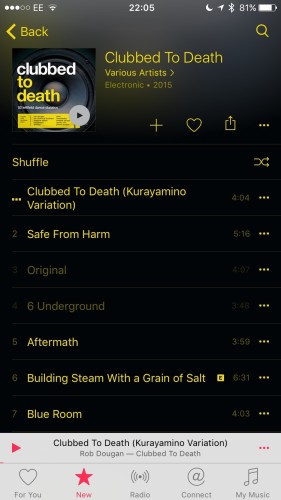
Clubbed to Death was launched on Friday and looked to be a fairly good compilation album but like most from the 90’s and 00’s I probably had most of the tracks already. I fired up Apple Music and it was there but I could only stream around half the tracks. Disappointing especially as many of the unplayable tracks I had in my library. I’ve since checked and they aren’t special editions, so it looks like Apple doesn’t have the licence to stream the tracks…but couldn’t it see I owned some of them already and made them playable? I don’t think thats much of an ask.

Not For You?
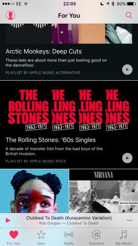
What’s more disappointing is the For You recommendation section in Apple Music. I listen to a fairly wide range of music, probably more Electronic than anything else but some of the recommendations I get from Apple are a bit, well, weird. They are predominantly rock and they have an obsession with The Rolling Stones.

2 poor rec

IMG_3988

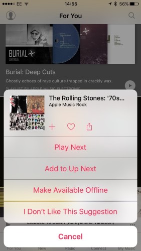
Every couple of days I’ll get a new Rolling Stones recommendation in For You and thats despite saying “I Don’t Like This Suggestion”. The same suggestions get made and they just seem to roll around again after a few weeks. I kept hoping it was teething trouble during the trial but it still persists today.

3 radio

4 chem

5 chvrches

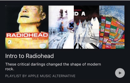
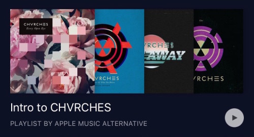
Equally annoying is the ‘Intro to…’ recommendations. The three above are available in my For You section and are for Radiohead, Chemical Brothers and Chvrches. Not only are they three of my favourite artists but I have bought all their albums so why do I get a recommendation introducing them to me? Surely those playlists should introduce me to artists that I’d potentially like that aren’t in my library based on my listening habits?

If this doesn’t improve over the coming weeks then I’ll probably cancel Apple Music as it’s not helping much with discovery right now after initial good impressions.

Small Steps

Apple released iOS 9, watchOS 2 and OS X El Capitan over the last couple of weeks. What’s remarkable about the updates, and it looks to be the same for the upcoming version of Android, is the lack of much new in iOS or Mac OS X. There’s much under the hood but for end users there’s little to get excited about.

El Capitan
A couple of the biggest changes are really for laptop users – split view and mission control. Split view lets you focus on two apps easily at the same time. Nothing you couldn’t do before but maximises focus on the job in hand. Mission control makes it easier to work with multiple screens and desktops and the changes are much welcomed – it’s far improved over Yosemite.

Spotlight improvements are OK but won’t replace Alfred for me. Notes is much improved and really is quite the credible competitor to Evernote which is something I need to look at going forward and Photo’s finally add’s some much needed editing features plus support for extension. For me the best new features are a couple of the smallest.

Pinned tabs but oh so drab

Apple have stolen pinned tabs from Chrome and also the ability to see which tab is currently ‘speaking’ and allowing you to quickly mute Safari. However the pinned tabs are so drab looking – why Apple? Also it’s criminal that Safari updates, and many of the App updates, are now tied to a yearly OS update from Apple, especially when the App updates are so small. I doubt Apple will change that strategy as it’s the same across all their platforms. It’s also criminal that Safari really feels like the new IE.

Anyway, it’s free and it’s been stable for me so far so it gets a grudging thumbs up.

iOS 9
I didn’t take part in any of the open beta’s or put on a developer build this year so iOS 9 is relatively new for me but again there is very little to get excited about. It says it all when much of the talk was of a new system font, San Fransisco, which is nice but isn’t really ‘a feature’.

Notes see’s a good upgrade and there is also now a News app but only in the USA right now, seemingly 9.1 will bring that to the UK. Passcode is now Wallet which makes more sense although there still isn’t much support for it.

The iPad updates are probably the most interesting. Slide Over allows a second app to be running at the same time as a main app is visible. It works well but I have a couple of issues with it. You can’t search for an app so you need to scroll through a list of apps that support Slide Over which is only going to grow. I also tend to launch Slide Over when I’m reading on the iPad accidentally. I’m sure it’s just muscle memory but it niggles.

Split View is an extension of Slide Over and allows two apps to run concurrently. For app’s that support it this is excellent but I’m surprised at how many Apple app’s don’t currently work in this mode. The final iPad nicety is picture in picture meaning iPlayer can run in a small window while you work on a document. Works well but again not all apps support it.

Siri has seen a few new features but I still struggle to get into the habit of using it, mostly due to it not working reliably. When it does it can be quite magical but when it doesn’t I just feel frustrated.

The best new feature for me so far has been app linking and slightly behind deep linking. App linking shows when you jump to Safari from an app, say Facebook. In Safari you get a link to jump back to Facebook so rather than double tapping home you just click the link and back to the app you go. Makes for far quicker navigating through iOS. Deep linking is for certain app developers only like Twitter. A tweet link will now open in the main Twitter app rather than in Safari. Better experience although I’d have preferred there to be an option to pick third party apps like Tweetbot instead of the main Twitter app.

So lots to like in iOS 9 but quite an incremental update. If it allows Apple to focus on stability and improving iCloud then all the better.

watchOS 2
This was probably the most anticipated Apple release – could watchOS 2 unlock third party apps and make the watch more usable? Kind off.

Watch faces have a few new options. There are now time lapses which do look great but don’t support any complications. Equally you can now pick a photo or photo album to be used as a watchface background. These can look great but again lack complications. The photo option has also spawned Apple Faces which has a great set of custom photos that can look really good on the watch. I really like the see through watch.

The other tweak to watchfaces is to add some colour. Utility now shows activity rings with colour and I love that change. However it’s caused much angst among some Apple fan’s due to the lack of control they now have in setting the colour in the Utility watchface. I’m surprised Apple didn’t add a multicolour option so that everyone would be happy – maybe watchOS 3. Speaking of complications we’ve now got third party complications which means I can now have Dark Sky instead of the default weather app and I’m sure there will be more from other dev’s going forward.

I’m really liking Nightstand – turn your watch onto it’s side and it turns into an alarm clock. The watch will display the time and alarm then switch off the screen. Touch/move the watch through the night and the screen lights up for a few seconds. Simple but effective.

Other features like Time Travel and improved Siri are welcome but the most anticipated, app’s running natively, has proven to be a bit of a false dawn. Certainly Dark Skies and PCalc now run a lot faster. PCalc in particular is a handy app to have on the watch now that it runs so quickly. Many others though are still relatively slow and I’m not sure if this is as good as this hardware will allow or wether we’ll see further improvements.

So some nice updates but I’m left wanting more. I’d love to see custom watch faces, I’d love to have fuller control over a watch face as well. I want better performance. But the watch for me has been really useful as a notification device and for that alone I wouldn’t want to lose it. watchOS 2 is a definite step up and hopefully we’ll see some more from dev’s over the coming months.

Abundance of Apple

The Apple keynote this week was one of it’s bigger events in a while and was also notable for it’s lack of store updates, dad dancing and anything to do with OS X. What was covered was Apple’s bet on the future…or was it?

Apple Watch
We saw brief mention of whats coming this Wednesday with watchOS 2 and it can’t come soon enough really. My third party app usage is almost non-existent so I’ve got a fairly big expectation that app’s running natively on the watch will deliver a big benefit, not only in speed but in taking advantage of the on board sensors. Third party complications will be a welcome addition alongside the upgrade in app’s – just a shame that third party watch faces aren’t a thing. Yet. Next year methinks.

The other new additions in watchOS 2 are nice but the rest of the keynote focussed on new bands, colours and a special edition from Hermes. 16 official sport band colours alongside a couple of new colour bands elsewhere. In time for Christmas or trying to bump sales? The Watch is a companion for the iPhone so huge sales were never going to happen but I do wonder if the Apple Watch and wearables in general aren’t the big sellers that the tech companies expected. 3D TV anyone?

iPad Pro
iPad Big. iPad Surface. It’s just a big iPad. Blah blah blah. While the iPad Pro isn’t for me I really want to use one. To have that much performance from a tablet coupled with iOS 9 improvements and all the benefits from a stylus thats been built to work hand in hand with the iPad Pro not just a third party add-on? Pretty compelling and the demo’s from the keynote and afterwards have done nothing to quell my enthusiasm. But I won’t be buying one.

The interesting quote from Tim Cook was the iPad Pro is ‘The future of personal computing’. That’s a pretty bold statement considering the iPad is 5 years old and Apple still sell many many laptops. It’s down to use cases but right now I’d rather have an iPad Air with Apple Pencil support rather than an iPad Pro. Maybe next year? Sales of the Pro will be interesting to watch as will the impact of iOS 9 on iPad sales in general.

apple_tv

Apple TV
Finally. Always described as a hobby, the Apple TV has finally grown up. The future of TV is app’s according to Apple and it’s hard to argue with that. Dropping Sky/Virgin for app’s is the way to go and finally the Apple TV has an app store to support that. Siri integration looks very strong and supports searching across app’s, but only for certain key partners at the moment. I’d love a Plex app to have that level of integration but I can’t see Apple allowing that. Pity.

As for gaming on the Apple TV, it’s not a console killer but who knows what an Apple TV version in 2020 will be like…and if it will still have three home console competitors? I can see some casual gaming opportunities but not in the same scale as gaming on iOS. If Apple were serious they would have released their own gamepad, not rely on third parties.

Still, Apple TV is a definite buy from me – can’t wait to replace the current one and finally get Apple Music support as well.

iPhone 6S
While the design hasn’t changed there are many hardware changes and one in particular that makes fundamental change to how you interact on iOS. 3D Touch. Basically a fancier Force Touch that was introduced with the Apple Watch and seen on the Macbook you can use 3D Touch as a right click on icons and app’s to allow for another level of interaction throughout iOS. Apple have also introduced Peek and Pop to allow you to peek into content briefly or press harder to pop into it. All very clever and I’m sure there will be some great app’s over the coming months taking advantage of 3D Touch which Apple have also used to highlight Live Photo’s. Basically a photo with a couple of seconds of movie and audio content either side. Not entirely convinced about them but time will tell if they become popular. I do wonder though if 3D Touch will hide a lot of features for people? Will my Mum know to use 3D Touch to pull up a menu in an app? Some of the criticism around the Apple Watch was that while Force Touch worked well it’s function was hidden and non-obvious to most users.

A 12K camera supporting 4K video is the other standout feature alongside faster processor, wifi and Touch ID. Although tempting I’m giving the yearly upgrade a miss this year as there isn’t enough for me to spend money on. I would be interested in the monthly rental scheme that Apple have launched in the US though. UK next year? Hopefully the pricing still makes sense if/when it comes to these shores.

iOS 9
Out this Wednesday and unlike previous years I’ve not tried any beta’s so it will be entirely new to me. Updated Apple app’s like Notes and Maps look like good upgrades alongside the new – iCloud Drive, News and Wallet. Improved multitasking and better keyboard options alongside a smarter Siri and deep searching capabilities means that there’s no massive changes but hopefully a slew of everyday improvements. Roll on the mass update of the five iOS devices in the house.

Closing Thoughts
A really long but packed keynote which was far better than the mess that was WWDC and Apple Music. Some good products launched and I think my only real negative was that OS X was reduced to a gag during a 3D Touch demo. With iOS, watchOS and tvOS launched it’s not a big reach to think the coming years will see macOS replacing OS X. Bigger question – will iOS and OS X ever merge?

There’s still a market for OS X. How do I download files and where do I store them in iOS? iCloud? While there are iOS app’s that are powerful there are still compromises that I would need to make to replace OS X computers with something like the iPad Pro. Maybe in two years the market will have changed again but this post on Stratechery by Ben Thompson struck a chord:

Apple could best improve the iPad by making it a better platform for developers. Specifically, being a great platform for developers is about more than having a well-developed SDK, or an App Store: what is most important is ensuring that said developers have access to sustainable business models that justify building the sort of complicated apps that transform the iPad’s glass into something indispensable

A perfect example is this response to a users demand for Sketch on the iPad Pro. Until the iOS ecosystem is reset to meet developers needs there will always be gaps in the platform that are currently met easily on OS X.

While Apple make great hardware platforms and there’s no doubt their ecosystems are some of the best around, there’s many improvements they could make for developers and on current form they seem to be the hardest changes for Apple to make. Just how good a platform would Apple have if their software quality and platform matched their hardware? Hopefully we’ll find out over the coming years. In the meantime, enjoy those new toys…there’s an expensive few months ahead.

A month with the Apple Watch

It’s been well over a month since I started using the Apple Watch and after reading Dan Frommer’s post last week on his one month thoughts here’s my take so far.

Under Promise, Over Deliver
A lot of the talk prior to the Apple Watch release was battery life. 18 hours sounded pretty short but the reality is that battery isn’t an issue. Charging overnight is fine and even if I didn’t I’d still get a good few hours out of the next day.

I’ve worn the Watch every day and it’s been comfortable and sweat free despite the plastic feeling strap and also the doubts expressed in some reviews. In fact I’m surprised how normal the Apple Watch feels. It’s become part of my day to day and I’ve never not thought about wearing it. I always did wear a watch during the week (hardly ever at weekends) but this has changed with the Apple Watch and it’s primarily down to one thing – activity tracking.

Activities during May

Activity tracking is addictive
I’ve used a Fitbit for three years so no stranger to the addictiveness of tracking steps and activity but the Apple Watch makes it easy to see visually how you are doing. It’s very clever (apart form the stand metric) and for the first part of May I was determined to complete my circles each day. Extra runs, walks at work, walking to the underground instead of driving into town are all positive activities that I was doing to get my circles filled.

The downside, and it may be entirely unrelated, is that my knee has taken a bit of punishment so from the middle of May I’ve had to lay off doing any fitness work.

I’ve found the heart rate tracking interesting. While it’s nothing new and I could have worn a tracker for years I like the fact that the heart rate tracker is hidden in the Watch and it’s fascinating to see heart rates rise at unexpected times – meetings, driving…times where I’m obviously feeling more stress.

Apps are pretty weak
Despite the 1000’s of Watch app’s already released there’s only a few I use frequently. Todoist is really useful and it’s notable that they waited until the Watch was out and developed on an actual device – it shows. Dark Sky is great and the updated Overcast is a nice way to control podcasts.

Messages is fine especially the smart replies that are offered but the Digital Touch features are pretty poor in use. Most of the time if I want to run an app then I’ll goto the phone as it’s quicker – hopefully watchOS 2 will help improve the speed of many of the app’s.

Notifications and Siri
Once I got control of my notifications I was actually impressed how useful they were. Reading notifications for Messages or WhatsApp was quicker than unlocking the phone especially if you just need the information and don’t need to reply.

I actually find the BBC News notifications useful now as I can quickly see when there’s breaking news, something I used to have turned off as it was a faff to get them on the phone.

One thing I can’t get used to is Siri. It does work well but it still feels a bit awkward to use day to day…it’s that talking to the wrist that feels a bit off. I need to persevere though as it is reliable and is a great way to send a message or add a todo.

Whats Next
July should see the launch of Apple Pay in the UK. I can’t wait to pay for stuff with the Watch. Then in the fall comes watchOS 2. Alongside app’s that actually run on the Watch, third party complications will be a great new feature so I can replace in built weather app complication with Dark Sky’s…I hope. New faces and the time travel feature, a nightstand mode although it probably ruins any stands that have currently been sold and some nice add-on’s for Siri are all solid upgrades.

I still wouldn’t recommend an Apple Watch if you are unsure of it but equally I wouldn’t put anyone off from a purchase if they wanted one as it’s useful and interesting to see how it will take off over the coming months. It’s a great 1.0 product but not yet essential.

48 Hours with the Apple Watch

So Apple did come through for a lot of people on Friday and many got their hands on an Apple Watch, myself included. I hadn’t seen one in the flesh until Friday when I popped into the Apple Store and got quite the surprise – the watch is much smaller than I expected. It comes in two sizes and I went for the larger 42mm, but even that wasn’t the brick I expected and the 38mm looked really well sized for a smartwatch. I was also pleased with the decision to stick with the basic Apple Watch Sport model. The Apple Watch version did look really nice but overall I wasn’t sure on any of the straps outside of the default Sport band. That’s not quite true – I hated the look of the Milanese Loop and the Leather Loop. Anyway, it was the evening before I finally got to play with my watch and then put it through it’s paces over the weekend. Thoughts below.

Packaging
I expected good packaging from Apple but not quite the monolith I received through the post. The Sport comes in a long white box and inside is a long white heavy duty plastic case holding the watch along with the magnetic charger, plug and small/medium strap that can be swapped for the default medium/large strap.

Apple Watch Sport box
Case
Case
Case and Watch
Case and Watch

The case is in total contrast to iPhone and iPad packaging – almost nothing is recyclable and it is huge in comparison to the tiny box the iPhone comes in. I know the watch is a different market but still quite surprising. The other thing I like – the delivery box for the watch fits the sport box, the lid of the sport box slips off with just enough friction, the case itself separates nicely. Design. It shows throughout the Apple product line and not just the final product – everything. Speaking of which…

Design
The watch is lighter than expected and fits my wrist well. The curved glass screen fits well with the body and feels seamless. It’s rounded, it feels nice in the hand, it feels more touchable than a phone or tablet. Is that the route to making a wearable that people actually want? The digital crown on the right hand side is an infinite scroll wheel and a button and the main way of interacting with the watch aside from the touch screen. It feels nice to use and I’ve had no real issues with it. Below that is the side button – couldn’t there have been better name? It’s used to launch your favourite contacts (and a double tap for Apple Pay in the USA) but it feels like a sleep button more than anything else.

Fits really well on my wrist
Not as clumsy as first thought

The screen itself is excellent. Apple call it a Retina display and it’s hard to argue as you don’t see the pixels and it’s hard to determine the screen edge at all. It’s night and day compared to the Pebble I tried a couple of years ago. It was also pretty clear outside in the sun yesterday while running. On the back of the watch you find the heart rate sensors and the inductive charging system. This is the first Apple product to support inductive charging and as expected it’s easy to use as it uses magnets, so you place the watch on the charger and it aligns. Also underneath are two buttons to release the bands as they are interchangeable. I guess third party bands will come out soon but there is a fairly good, if expensive, range available from Apple. I can see these being big Christmas sellers.

I had a niggle that the band, made from high-performance fluoroelastomer, would feel quite rubbery but it’s actually soft to touch and is comfortable on the wrist. During normal use I haven’t found it to get sweaty underneath the band but during exercise is does become a sweat collector especially where the band loops within itself. The watch is waterproof despite the mixed messages from Apple which is strange – I’ve showered a couple of times with it now and it’s fine, but I’ll be removing it after runs purely due to the sweat issue.

One last point – the UK now has a folding plug included as standard. Happy days! Far more practical for travelling and nicely designed but it’s £25 for the folding plug against £15 for the standard 5W plug from the Apple store. I’m hoping that this will be the standard plug for iPhones and iPads in the future but the price difference makes me suspect not.

Setup and Controls
Setting up the watch was smooth – a credit to Apple. Switch on the watch and to pair it with the iPhone was a simple case of taking a picture of a pattern on the watch face. Boom. You then enter your iCloud credentials and the iPhone then started to install supported applications on to the watch. This took quite a while to complete but once done it was time to play.

Installed apps
Installed apps
There are many ways to interact with the watch and some are more than a little confusing. The digital crown works and more importantly feels fantastic – the resistance is just right. Although it offers no change in resistance the combination of the feel and good software tricks the mind – getting to the end of a list and I still think the resistance changes…but it doesn’t. The digital crown is also a button and mostly makes sense but I still get confused between it and the side button. Press the digital crown to take you to installed apps. You can then swipe around the apps or use the crown to zoom in and out of applications. It can be quite a faff to find and select the right app especially if you try and do it during a run.

The side button takes you to your favourite contacts and from there you can message, call or digital touch them if they have a watch. This feels a waste of a button and it would be great if you could map this to something more useful, like take you back to your watch face. It feels like a home button – let me use it as one.

The screen itself supports touch but not multitouch, hence the digital crown for zooming in and out. Touch has worked OK but there’s a few times now where a touch isn’t registered – not sure if it’s just aggressive touch zones or v1 software but it is annoying. The watch also supports a force touch gesture – tap normally and then press a bit harder. You get a nice bit of haptic feedback when this works and is used almost like a right click. It lets you customise watchfaces, clear notifications and many apps also support it but you won’t know until you try. Discoverability!

Swiping up on the watch will display Glances. These are like widgets and there are default ones like power, heartbeat and also third party app’s can add their own Glances. Apple’s own Glances have worked well for me but third party ones are generally slow and a bit buggy right now. Finally you can swipe down for notifications with the all important force touch to clear them.

As I said, lots to get your head around and very different to iOS. Time will tell if it becomes second nature but it’s been quite confusing to navigate between apps and the watchface so far.

One last note on the display – it’s off 90% of the time. It only displays when you lift up your wrist and it then switches on for a few seconds…and then it’s off again. I did have a worry about how reliable this would be and some early reviews said it took a while to display but I’ve had no issues although I would like the display to stay on for a few more seconds sometimes. I also don’t have many false positives – switching on when I didn’t expect it – so this goes down as a success so far.

Watchfaces and Complications

My current watchface
Apple have supplied a good mix of watchfaces so most users should be able to find something they like. Each offer a range of customisation, from increasing the dial detail to selecting a primary colour for the date and second hand. Most faces also offer Complications – widgets that add information to the face. Day and date, battery life, weather, moon phase, activity, stocks, alarms, timers and world times. These are great and allow you to build a useful watchface – far more useful than a standard watch. However not all watchfaces allow you to add Complications. It’s also no big surprise that as of right now, third party Watchfaces and Complications aren’t supported. It’s like the early days of iOS. Little was allowed but each version offered more and more and I fully expect future O/S versions to allow at least custom Watchfaces and eventually third party Complications – I’d love to see Dark Sky weather information rather than the stock app, especially as clicking on the Complication launches the application.

Glimpses and Notifications
screen_darkskyGlimpses let you access information via small widgets that are only one screen tall. Default ones allow you to switch to do not disturb or airplane mode easily, control your music, take a heart beat measurement, see the current battery levels, get a quick update on todays activity level, see todays calendar, your current locations weather, your current location on a map and also world times. I also ended up with a lot of third party Glimpses but most were slow and I’ve turned them off. Glimpses are really running on your iPhone and the third party ones offer little or no value right now.

Notifications at first were overwhelming. I never really worried too much about notifications on the iPhone but the watch displays all the iPhone notifications and it was far too invasive to see and hear them buzzing on the watch. This isn’t the watches fault though – it’s down to me as the user to take control of this and manage them more effectively which I’ve now done. I only get the messages that are important to me and I’m happy now with the information I receive and can act upon. It’s also easy to clear old notifications with a simple force touch, something that iOS desperately needs.

Applications

Get used to long loading times
Day one of the App Store on iOS saw a few hundred apps. Day one for the Apple Watch saw over 3000 applications available and almost every one of them had been written without being tested on an actual physical watch…and it shows. I installed all available applications and with hindsight I should have been more selective, but then again I wouldn’t have known how they performed if I hadn’t. The app’s all run on the iPhone and display their results on the watch. The ones I’ve kept, like Dark Sky and 1Password are very useful and show the possibilities of app’s on the watch platform. However the official Twitter and Instagram clients are poorly thought out. I’m not going to click through my Twitter timeline 5 tweets at a time. Equally while the screen is great, it’s not the best place to experience my full Instagram feed. Both feel like app’s being available for the sake of it rather than a user getting benefit from them. They also feel slow.

I’m sure we will see lots of iteration over the coming weeks and months as developers actually use their apps on a physical device rather than the simulator but I expect, like the original iPhone, we won’t see a good third party application experience until developers can write an app thats runs on the watch rather than on the iPhone. Next year perhaps as I can’t see this being dropped in at WWDC?

Phone, Messages and Digital Touch
A lot was made of using the Apple Watch to make and receive calls, message your friends or send a Digital Touch to folk that also have an Apple Watch. So far I’ve been pretty disappointed with most of these features.

The watch hardware, speaker and microphone, work well and it does allow for calls to be made and received. In fact it’s far better than I expected. However the software leaves a lot to be desired and I’ve found the experience buggy. As for messaging, the dictation via Siri has been really good and exceeded expectations. You can also setup stock answers so you can quickly reply to messages and again this works well. However the new animated emoji is horrible. What were they thinking?

How the animated emoji makes me feel

Digital Touch also seems superfluous. You can send a fellow Watch owner a series of taps, a sketch or your heartbeat. While it works I find it a bit annoying in practise and always default back to messaging. I’ve also found audio messaging far more reliable on the watch than on the iPhone. Is this due to an improvement in Siri or something the watch is doing – hard to tell.

Health and Activity

Daily activity
Daily activity
This was the primary reason I wanted to try the Apple Watch and so far, so good. The activity app shows you three key stats – Move (calories burnt), Exercise (minutes per day) and Stand (stand per hour) as a series of circles. Complete the circles before the end of the day and it’s thumbs up. Complementing this is the Workout app. Here you can pick from a series of indoor and outdoor activities, set a time or calorie goal and then the watch will track you as you complete the workout. During a run or cycle it gave me some haptic feedback on how far into the workout I was and at anytime I could swipe to see pace, heartbeat and some other useful stats. The Workout app looks simple but works really well. For my runs the step count was very similar to my Fitbit but not so much for the cycle where the watch tracked far lower. You also get badges for completing workouts and reaching goals – not sure they are much of a motivation but if you are motivated by such things then there’s plenty of goals to chase.

The Apple Watch will also track your heartbeat throughout the day and you can take a reading at anytime. This has matched the readings from elsewhere so I’m happy to say this is accurate as long as the watch has good contact with your skin and isn’t too loose. It seems to take a reading every ten minutes but during an activity will read every five seconds, using up far more battery. This can be toggled off but I’d only do that on something like a hill walk over a few hours. Hour long runs and cycles won’t kill it too much.

You also get an Activity app on the iPhone and this shows you your activity in more detail. I love the app and it completes and complements the Health app. Overall the Health and Activity aspects of the watch have been excellent and I look forward to further improvements with the software over time…like easily extracting individual workouts, sharing of heart rates etc.

Battery

End of day, plenty power remaining
A lot of the negative talk around the Apple Watch was it’s “18 hour day”. This was the figure that Apple quoted with regards battery life. There are no sleep tracking functions on the Apple Watch so the expectation is that you charge your watch overnight and that full charge will last you through the day. So far that has been the case…with ease. This first full day saw lots of tinkering and experimentation and also an hour long cycle and after 17 hours I still had 25% charge remaining. Day two saw a cycle and an outdoor run and again I had plenty left at the end of the day. Today at work was pretty busy, so not much interaction with the watch. I’m 14 hours into wearing the watch and battery is at 69% which is great. So fears about battery life on the watch seem pretty unfounded at the moment – just don’t forget your charger if you are away on an overnight. It would be great to have a battery that lasts a few days or even a week but it feels like we are a few years away from seeing that or some sort of step change in battery technology.

Battery on the iPhone however is impacted slightly. Your phone is connected permanently to the watch, you setup much of the watch from the phone and third party apps all run from the phone so some impact is expected but it’s something to keep an eye on.

Performance and Bugs
Before wrapping up there are a couple of niggles to share. Firstly there is definitely some spotty performance when using the watch. It’s not consistent and I can’t narrow it down to a certain app or function, but from time to time first and third party app’s will stutter more than expected. I also find touch inputs aren’t recognised sometimes. Not sure if it’s me pressing too hard and the watch is confused between a touch and a force touch or that the touch area isn’t quite right but I’ve noticed it a few times now in different apps. The good news is that I haven’t seen any lag when lifting my wrist and the screen switching on – worked 100% for me so far.

There are also issues when you are on the edge of bluetooth connectivity. The watch will still be connected to the phone but performance is so poor that you may as well not be – app’s fail, you can’t answer calls but the watch thinks it has. I’ve also had issues with answering and placing calls in general. When it works it’s great in a ‘from the future’ kind of way, but when it fails it’s just frustration. However I have faith that these can all be addressed with updates over time – there’s no showstopper issue that I’ve found so far and it is v1.0.

Conclusions
Firstly, you don’t need an Apple Watch. It’s arguable that no smart watch or wearable is required right now. At this point in time it’s not essential and the third party app’s leave a lot to be desired. It has some bugs and it does feel like an iPhones second screen at times. So if like me a few weeks ago you have some FOMO on the Apple Watch then don’t worry – next years model will be so much better and there’s no desperate reason to jump on this version!

However the foundations are great. The hardware is really solid and the bugs and issues I’ve mentioned are all easily fixable in software. If you are all in on the Apple platform then the Apple Watch, even this early version, makes far more sense than the Pebble. I’ll continue to use it day to day and so far I’ve found it to be an enjoyable experience rather than a frustrating one. I’ve got no regrets and look forward to seeing how the platform evolves over the comings months and what developers start to deliver once they can actually write app’s for the phone. The true test will be if it’s still on my wrist in six months time. If it is, then Apple are really onto something. Again.