(F)acts, (A)ssumptions, (B)eliefs

Here’s an activity ANY team can do to stay more aligned.

It is fabulous. It is simple. But consider how often you and your team are misaligned on the foundational things underpinning your work.

FAB – Facts, Assumptions, Beliefs

1. Start a document

2. List incontrovertible FACTS relevant to your work.

For example:

  • Net Revenue Retention for [Profile] is currently ###%
  • [Competitor] recently launched [Product]
  • There’s a relationship between the housing market and interest rates

Provide links to the data/insights that support these facts.

3. List ASSUMPTIONS relevant to your work, along with something to indicate the current level of certainty. Indicate the relationship between the assumption and your current work.

For example:

We are operating on the assumption that [Profile] will not adopt the new product extensions in 2023 but will gradually adopt them in 2024.

  • Implications: decreased investment in 2023 with a ramp into 2024.
  • Confidence: medium-high (though falling)
  • Type: Operating (revisit on #/##/####)

We assume that a lack of expertise in [Segment] will hamper the shift to [New Technology]. 

  • Implications: New product initiatives centered around the expertise gap in [Segment]
  • Confidence: low (but increasing, with active research)
  • Type: Testing (report research on #/##/####)

Provide links to the data/insights that support these assumptions.

Note the difference between operating assumptions—things we are currently operating based on and will revisit—and assumptions we are testing.

4. List your BELIEFS. 

“Wait, aren’t those assumptions?” Yes, and no. Beliefs are foundational assumptions. They may span years or decades. By calling them beliefs, we are also acknowledging contrarian and untestable assumptions.

e.g.

  • We believe in a sea-change shift to [some practice]
  • We believe [technology] will eventually become a commodity

5. After establishing this document, establish a ritual of regularly revisiting FAB. 

  1. Keep a history of the doc
  2. Review and update regularly
  3. Encourage your team to make notes in the document and batch up the feedback for the next meeting.

Bonus 1: FAB is fractal. There are company-wide FABs and team-level FABs. In an ideal world, you make all of these public and accessible.

Bonus 2: Note how some things remain stable (hopefully), while other things change all the time (not necessarily a bad thing). If EVERYTHING changes all the time, you should explore that. Why?

From https://cutlefish.substack.com/p/tbm-4652-facts-assumptions-beliefs
Better Experiments/Pilots

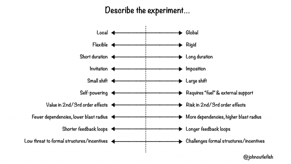
Scoping a pilot or experiment is often ignored and before you know it you have a production solution masquerading as a pilot. This article from John Cutler helps.

  1. Set aside ~90 minutes.
  2. Pick a problem or observation. 
  3. Read and discuss the dimensions described below. For each dimension, brainstorm example experiments representing the “extremes”. These don’t need to be real. Have fun.
  4. Optionally (as demonstrated with L+ and R+), chat about how the extremes could be considered positive.
  5. Return to the problem or observation. Ask individuals to brainstorm 1-3 candidate experiments to address that problem or observation. 
  6. Ask team members to individually describe each candidate experiment using the ranges below.
  7. As a group, discuss each experiment, and where each team member placed each experiment.
  8. Finally, ask team members to dot vote on the best-fit experiment (for the given context). Discuss ranking. Ideally, pick an experiment to try.

Local | Global

How containable (or localized) is the experiment?

L+: Localized impact, fewer dependencies, less visibility/oversight/meddling.

R+: Broader impact, more support, more visibility.

Flexible | Rigid

Will it be possible to pivot the experiment on the fly?

L+: May be easier to sustain. More adaptable to changing environments and new information.

R+:May be easier to understand, teach, support, and promote.

Short Duration | Long Duration

How long must the experiment last to provide meaningful information?

L+: Less disruptive. Easier to pitch. Faster feedback.

R+: More time to “simmer” and pick up steam. Commitment.

Invitation | Imposition

Will the participants be invited to take part in the experiment, or will the experiment be imposed?

L+: More intrinsic motivation. More vested in outcome. “Advocates for life!”

R+: Speed. Less need to “sell” change. 

Small Shift | Large Shift

Will the experiment represent a small change from how things currently work, or will it feel foreign and new? Perhaps different participants will experience different degrees of change.

L+: Easier. Less disruptive. More potential to “pick up momentum”.

R+: “Get it over with”. Less chance of getting stuck in local maximum.

Self-powering | Requires “fuel” & external support

Can the experiment sustain itself without outside support and resources, or will it require external support?

L+: Independent. Easier. Can be sustained indefinitely.

R+: Involves and “vests” broader group in the effort. 

Value in 2nd/3rd order effects | Risk in 2nd/3rd order effects

Second and third order effects are common when running an experiment. Is the experiment expected to “throw off” potentially valuable 2nd/3rd order effects? 

L+: Discover valuable things!

R+: Risk may be necessary to explore new areas of uncertainty.

Fewer dependencies, lower blast radius | 
More dependencies, higher blast radius

How independent/dependent is the experiment on other things (people, projects, systems, processes, etc.) in the org?

L+: Independent. More degrees of freedom. Less constrained.

R+: Potentially more impactful. Potentially more involvement and support.

Shorter feedback loops | Longer feedback loops

How easily and quickly can we get feedback?

L+: Can respond more quickly. Can pivot experiment more quickly.

R+: May be less noisy. May provide “deeper” or more cohesive information.

Low threat to formal structures/incentives | Challenges formal structures/incentives

Does the experiment represent a threat to formal power/incentive structures?

L+: Can fly under radar. Consider “safe” and non-threatening.

R+: May be less likely to test (and change) formal power/incentive structures.

From The Beautiful Mess – Better Experiments

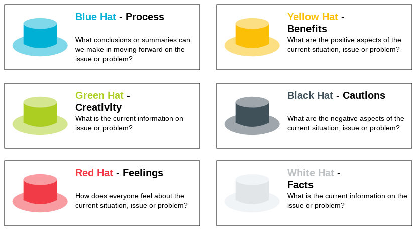
Six Thinking Hats

Six Thinking Hats was written by Dr. Edward de Bono. “Six Thinking Hats” and the associated idea parallel thinking provide a means for groups to plan thinking processes in a detailed and cohesive way, and in doing so to think together more effectively.

Although this can be used in groups to aid thinking assigning each person a role has felt restrictive for me. Better example – group assumes all roles at the same time so you move through the different hats together. Also find it useful if going through thinking on my own and avoids falling into favouring your own idea and focussing on yellow and blue hats while missing the others.

Technical Debt

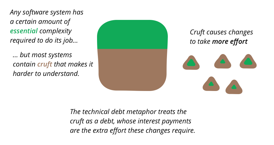
Software systems are prone to the build up of cruft – deficiencies in internal quality that make it harder than it would ideally be to modify and extend the system further. Technical Debt is a metaphor, coined by Ward Cunningham, that frames how to think about dealing with this cruft, thinking of it like a financial debt. The extra effort that it takes to add new features is the interest paid on the debt.

Martins Fowlers description of Technical Debt

The metaphor of debt is sometimes used to justify neglecting internal quality. The argument is that it takes time and effort to stop cruft from building up. If there new features that are needed urgently, then perhaps it’s best to take on the debt, accepting that this debt will have to be managed in the future.

The danger here is that most of the time this analysis isn’t done well. Cruft has a quick impact, slowing down the very new features that are needed quickly. Teams who do this end up maxing out all their credit cards, but still delivering later than they would have done had they put the effort into higher internal quality. Here the metaphor often leads people astray, as the dynamics don’t really match those for financial loans. Taking on debt to speed delivery only works if you stay below the design payoff line of the Design Stamina Hypothesis, and teams hit that line in weeks rather than months.

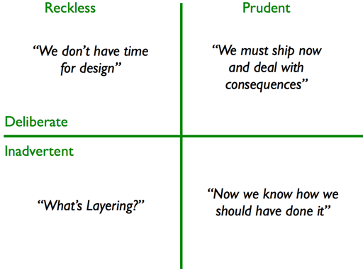
There are regular debates whether different kinds of cruft should be considered as debt or not. I found it useful to think about whether the debt is acquired deliberately and whether it is prudent or reckless – leading me to the Technical Debt Quadrant.

Technical Debt Quadrant

From https://martinfowler.com/bliki/TechnicalDebt.html.

See also The Human Cost of Technical Debt – the human side of the problem.  And, make no mistake — in business, all human problems are also business problems,viewed with a wide enough lens.  Unhappy humans are unhappy workers, and unhappy workers are less productive.  Yet, this angle of technical debt is seldom discussed, in my experience.

  • Unpleasant Work
  • Team Infighting
  • Atrophied Skills
  • The Hidden Business Cost: Turnover and Attrition

Brainstorming

So how do you hold a brainstorming session that does not suck?

  • Invite the right people: Get a good group of people that are from a diversity of departments that have experience in different aspects of your product, company and customers and can bring those view points to the table. Make sure the group is not too big and not too small 6–10 is about right. Avoid inviting people just because.
  • Find the right space: Find an open space with plenty of space to write on — white boards or walls to add sticky notes to do the trick. Make sure the setup is conducive to moving around preferable with a big round table in the middle so people can face each other or the presenter.
  • Send an agenda: Make sure people know the objective for the session
  • Assign roles: Most of the attendees will be the brainstormers, however, your meeting will be that much more structured if there is an un-objective person whose sole role is to keep it moving, and make sure that everyone’s voice is heard — this is usually the facilitator. Assign ahead of time the note taker whose role is to keep track of the top ideas by writing them on the board and then sharing out the learnings and next step as a wrap up of the conversation. 
  • Introduce Brainstorming rules:IDEO’s 7 rules are clear and to the point and will help level set the group on what is brainstorming. Although design and product might be used to the sticky note exercises others might not be.
  • Get a facilitator: To ensure the session is truly unbiased and to learn yourself get a facilitator. This person, as an outsider, will not have baggage with the company and will allow you to be a part of the process.
  • Kick it off right: Get the data qualitative or quantitative to ground the conversation and why you are taking the time out of your day to have it. Prepare the high level anchor question for the group that will set the stage for your session “How might we….”, and then articulate any sub-themes that you know are already focus areas.
  • Start with a simple exercise: Get people out of their comfort zone and into a brainstorming mood with an easy opening exercise. For example ask the people in the room to spend 5 minutes drawing 5 others in the room. You’ll get a few “I don’t know how to draw” followed by laughter and people getting open to the idea that it’s not about the drawing ability but expressing the idea. 
  • Use tons of sticky notes and sharpies: Sticky notes are effective because they are fun and not like work so it allows every person to get out of their day to day and start thinking creatively. Why a marker and not a pen? Because this is about high level themes and ideas the more the better and what ifs rather than solving the how. If it does not fit on a sticky note using a sharpie it does not belong in this meeting as you have slipped into solution land. Don’t do this electronically if you can.
  • Remote team members: Try to get them in the room if possible. If you have a team member that is remote make sure they are paired with a scribe in the room. Make an effort to let them be heard and get them to see the boards and ideas getting generated.
  • Time constraint: Set a clear time for the sessions and keep the tempo moving (back to the need for a facilitator). Make sure there are stretch breaks and people stand up and walk around during the exercises as much as possible or you will start to loose people.
  • Take care of the people: Make sure there are nutritional snacks in the room. Brainstorming consumes enormous amounts of mental energy and sucks us into itself because like a game it’s fun. Make sure to take care of the people in the room and their brains will remain productive.
  • Focus the second half on getting to decisions: It is easy to get into a flurry of things you can do and ideas. That is the point of a brainstorming session. However, set aside the second half on clustering, grouping and getting to the focus set of things you will act on.
  • Accountability and next steps: Assign who is taking the next steps and sharing out what you uncovered in this brainstorm and the next actionable steps. Make sure that follow up is sent the next day so the energy you uncovered in this session continues and the ideas that made it get the right start. Share your findings with the rest of the company to get the others focused on learning and aligned with you.

Alternative brainstorming approach

  1. Set the ground rules and goals
    • Quantity over quality
    • No critiques
    • Build on ideas. Replace “yes, but…” with “yes, and…”
  2. Distribute sticky notes, sharpies
  3. Pose a question, user need or topic.
  4. Participants have 5 min to get as many ideas on sticky notes as possible. 1 idea per sticky note. Sharpies help because they are nice and thick — legible at a distance, and they prevent fine detail work.
  5. At the end of the 5m mark, go around and have people share their ideas.
  6. Put the ideas up on the board.
  7. Do this for 3 rounds. Toward the later rounds, new ideas tend to emerge, synthesized from others already shared.
  8. Cluster ideas by theme, topic, approach.

From https://medium.com/@elena.luneva/brainstorming-sessions-that-don-t-suck-23b12e7ccbd7 and http://gordonbrander.com/pattern/brainstorming/

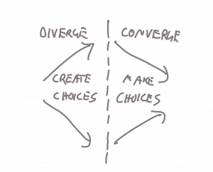
Create Choices, Make Choices

The creative process…

Divergent thinking:

  • Yields options and choices
  • Suspend judgement and analysis
  • Focus on breadth not depth
  • Test competing ideas against each other

Covergent thinking:

  • Eliminate options – trim and edit
  • Make choices – polish
  • Practical way to decide among existing choices
  • Not good at probing the future

These 2 stages also map to problem-solving methodologies used by design and engineering.

Design uses a range of strategies from both stages. Intuition, and creative strategies like moodboards, form finding, and brainstorming are used to create choices. Iteration, design reviews, critique are used to make choices.

Production engineering is typically a process of making choices for implementation. It uses a strategy of modularizing problems — breaking problems into smaller parts, then solving each part. It can also be exploratory. Prototyping can be a process of creating choices when you take the build to think approach.

Ten Principles of Simplicity

What does “simple” actually mean?

People can always tell when something is simple, uncomplicated, elegant, not overworked, or a number of other near-synonyms, but can rarely articulate why something is simple. Because simplicity is inherently subjective, achieving it pretty tricky.

Fortunately, the discipline of experience design has emerged as a means to help the world realize its need for simplicity and what it takes to achieve it.

  1. Meet expectations – If someone goes to your product or website for a specific reason, make sure that you know the reason for their visit and the user can confirm they are in the right place, instantly.
  2. Don’t overwhelm people – Humans can (consciously) only process small amounts of information at a time, so if you don’t quickly make your point, their attention wanders. My favorite technique for not overwhelming people is progressive disclosure. That’s a fancy way to describe showing only a tiny bit of information at a time so people don’t become overwhelmed and confused. Here’s a fantastic example.
  3. Only present a few choices at a time – This is directly related to #2. Studies show that if you give people too many choices, they will “make no choice at all. So, it’s often better to remove features rather than add them. Why not focus on creating the minimum viable product, get it to market, then improve on it (or trash it completely in favor of a better solution)? Constantly adding features only ensures your product will never be complete and you’ll run out of money, all while confusing the heck out of intended users.
  4. No jargon or compu-speak – Talk to people like they are human, and don’t mire yourself in jargon. For example, rather than just label a form “Email,” how about making the label a bit more personal or in-brand? Wufoo does a great job with their form labels: “Enter your email address so we can get a hold of you. Don’t worry. This info is sacred to us. We won’t ever sell or abuse it.”
  5. Consider the abilities of different users – Dr. Jennifer Romano-Bergstrom has done some fascinating research on differences in website usability performance based on users’ ages. One thing I found particularly interesting is that older users tend to ignore content that is located in the periphery of a website. Take into account these differences and make sure your product accounts for them.
  6. Visual clarity – Clarity in visual design is critical for simplicity. Users assess the credibility of something very quickly, so if there isn’t a clear visual hierarchy, people will get confused. But keep in mind, just because something looks simple, doesn’t mean it is simple.
  7. Understand the problem – Mads Kristensen put it best when he said, “… if you cannot take a step back and get a good feeling for the problem, then you don’t understand it enough to see a simple solution … If you don’t understand the problem you are trying to solve, then you probably cannot solve it.”
  8. It’s been tested – If someone doesn’t want to test something, that person is probably cowardly, lazy, or arrogant (and don’t let them play the budget card, you can test things for next to nothing). Creation and objectivity usually don’t go hand in hand. You have to test with users.
  9. Account for context – How you use something differs greatly depending on the time of day, your location, and your culture. For example, try to think how someone might use your product while in a hurry, or perhaps on an iPhone, or while sharing it with a friend. They might also use it completely differently the second time than the first. Time of day, repetition, cultural nuances, and location all drive the context of how your product will be used. Understand it, it’s important.
  10. It’s not just usable – Just because someone can complete a task, doesn’t mean it was a pleasant or easy experience. Be careful not to put too much emphasis on task completion at the expense of a good experience.

How can We Shoot for Simplicity?

Everyone wants stuff that’s simple to use, yet simplicity can be very elusive. To find ways to streamline and simplify, it helps to take a look at a project’s framework; controlling the expectations and processes makes achieving the desired outcome much easier.

In the video The ROI of User Experience” by Dr. Susan Weinschenk, she highlights three causes for project failure (she also breaks down the value of UX much more eloquently than I can, so be sure to give it a watch). I’ve cited these (and added a fourth) below, with recommendations on how to address such challenges.

1. Communicate clearly

Lack of clear communication breeds confusion. Establish a project leader and communication process at the onset, be diligent about following it, and keep track of decisions that have been made.

2. Visualize success

Take the time at the front end of a project to define what a successful launch will look like. Answer questions like these to help keep you on the right path: What is the business goal we’re trying to achieve? Who is the user, and what are their goals? What does the product actually do and not do?

3. Align your stakeholders
  • Make everything matter. It’s your job to care about every detail, because if you don’t, who will?
  • Remove technical debt. The time maintaining an antiquated or poorly constructed system can hamstring future efforts to create simple solutions.
  • Keep things from getting bloated. If the people using your product don’t need or want something, isn’t it just a distraction? Streamline!
  • Plan for executive buy in. Stakeholders need to be heard; involve them early on in the process. Good communication and alignment on goals will assure a better end result.
4. Seek outside opinions, because we can’t do it all ourselves

I make music, and often I’ll write a song that I’m initially thrilled with. After a day or two goes by, I’ll return to the song only to be completely underwhelmed with the original recording. Things are always more exciting when we experience them for the first time; as we focus on something, we have less of a visceral reaction to it, second guess ourselves, and lose interest. Get your idea into a prototype quickly, and show it to others.

Why?

Perhaps the easiest thing one can do to ensure simplicity is to constantly ask, “Why?”

  • Why are we adding this?
  • Why are we taking this away?
  • Why would users care?
  • Why would people share this?
  • Why will people do this?
  • Why can they do this?
  • Why will they still do this?
  • Why aren’t we testing this?

The smallest details can make the biggest difference. If you come to an impasse, ask the person who’s been designated as the leader to make a decision and move on. You can always test your hypothesis later.

That’s Simple

Complex is easy, simple is hard. But, with intense focus, good communication, clarity, and bravery, getting there doesn’t have to be so difficult.

Einstein said it best: “Any intelligent fool can make things bigger, more complex, and more violent. It takes a touch of genius—and a lot of courage—to move in the opposite direction.”

From http://uxmag.com/articles/the-complexity-of-simplicity