iPhone 4S

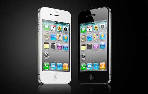
The new iPhone 4S is quite wonderful. It’s fast, the camera really is a step up over the iPhone 4 and Siri does indeed understand Glaswegian….mostly. It’s just a shame that Apple hadn’t mentioned before launch day that Siri in the UK wouldn’t support map or local business searching. No deals have yet been completed for the UK market although they expect it to be available in 2012.

I even (still) like the design of the iPhone. In many ways it just works for me. It’s slender, easy to hold and still looks great when compared to the many many smartphones that have launched in the last 16 month since the iPhone 4 came out. Coupled with the improved antenna design and being a truly world phone, it makes the iPhone 4S a bit of a no brainer.

Yes, I won’t be buying an iPhone 4S.

Now I said as much on the podcast last week, and until last Tuesday I was pretty much sticking to my guns. However I had a wobble and went out for a 4S on Friday afternoon thinking there would be plenty stock. That can only be described as a tactical mistake. The Apple stores had no stock and while O2 and Carphone Warehouse had plenty of iPhones, I didn’t want to commit to a contract or locked phone.

I didn’t order from Apple that night and in the cold light of a grey Glasgow Saturday I decided to stick with the iPhone 4. While the camera is a lot better, I don’t use it half as much as I expected. The speed would also be nice but in trying it in the Apple store it wasn’t that much faster, not to the same extent the iPad 2 was faster than the original iPad. Siri looks fantastic though and I would like to try it for real instead of in a store environment, but I have a niggle that without API support I’d be a bit miffed at only using it to interact with Apple’s official app’s. My twitter stream is also flooded with the great examples of what Siri can do…and there’s always Shit That Siri Says.

Don’t get me wrong, I think the 4S is a good upgrade from 4, but with other priorities right now and an iPhone 4 that is in perfect working order it makes sense to give this one a pass.

I must be getting old.

Steve Jobs

Despite the failing health, despite everyone knowing it was coming, it was still with shock and much sadness that Steve Jobs passed away today. Some amazing tributes online today from Google, Wired, Panic and Apple themselves. Stories from tech reporters, developers, CEO’s, competitors and the impact can be seen by how ordinary people, not just the geeks, are aware of who he was and feel a certain sadness. My favourite read was from Walt Mossberg – The Steve Jobs I Knew. RIP Steve.

Wither Safari?

Over the years I’ve moved between various browsers. Since moving to the Mac I mostly used Safari but towards the end of 2010 I made the switch to Chrome. It was fast, stable and had great extension support. But mostly it was fast. Safari had become really bogged down in day to day use. I partly blamed the browser and the hardware. Moving to a new machine meant a chance to try Safari again. Certainly performance was better but despite having lot’s of cores and 16GB of Ram at it’s disposal, Safari still felt sluggish from time to time or worse, would crash.

What was odd though was the lac of others reporting the same issues. Certainly I was using Saft with Safari to try and make it more usable but removing that on the old machine and not installing it at all on the new one meant that was eliminated. I’d installed flash blockers, removed Flash from my Mac and that didn’t help much either. Over the last few days though there’s been a few prominent Mac users expressing problems with Safari. Tim Bray discussed Safari’s re-architecture and how he expected that to be the root cause of Safari’s problems coupled with the heavyweight websites that we now know and love. John Gruber agreed with Bray and Marco Arment commented on seeing the same pattern, but putting it down to Safari 5.1 and not a Safari problem in general.

With Firefox 7 released this week (I do wish they stop with the version number games – almost 4 years covers versions 2-4 which came out in March 2011…and we’re now on 7. I blame Google.) I decided to do some of my own tests. Every browser release prompt’s speed tests, rendering tests etc and many many graphs, but does that reflect reality on my Mac? So I setup each of the browsers to be as similar as possible. Same amount of tabs looking at the same websites, same number pinned, as close to similar extensions on each browser too and compared Safari 5.1, Firefox 7 and Chrome 14.0.835.186. I rebooted the Mac and then opened each browser five times recording the time it takes to launch the app and refresh each of the tabs. Timings and thoughts on each of the browsers are below and for reference, the sites and extensions used are mentioned below.

Sites
The first 7 links are usually pinned in Chrome, the rest were the sites I was using when I did the test’s.
Google+
Facebook
Instapaper
Google Docs
Google Docs Shownotes
Runkeeper
Fitbit
HackerThings
AppsandOranges
The Big List of Video Game Documentaries
iand.net
Tim Bray
Daring Fireball
marco.org
PC Gamer
Supermodel

Extensions
The following are the extensions I use day to day in Chrome. I tried to match them in Firefox and Safari but ultimately Chrome had the most extensions enabled as a couple didn’t exist for the other browsers.

1Password
Adblock Plus
Clip to Evernote
Ghostery
Minecraft Wiki Searcher
Page One
Readability
Tweetright
XMarks
Youtube Options for Google Chrome

Safari
The default browsers for Mac is Safari. It always felt fast and snappy but was short on features compared with the other browsers on the market.

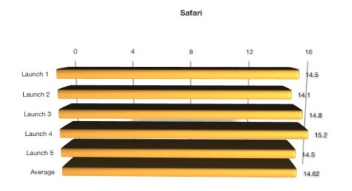
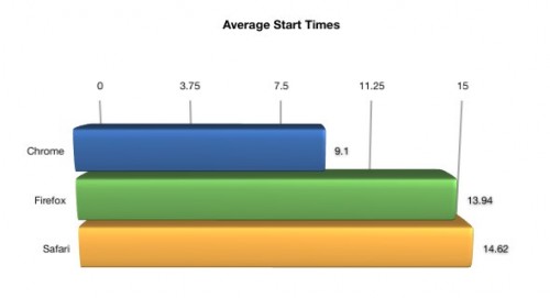
The look and feel of the browser has fell behind others, particularly Chrome. I miss not being able to pin tabs and also just see the favicons rather than the long tab names you see in Safari – just not as usable. Speeds have also deteriorated with each version. For my tests, the speeds are below.

There’s quite a few tabs being refreshed so the time isn’t too bad, but even in general usage Safari feels sluggish. Moving between tabs and refreshing an individual page all feels slower than it should be.

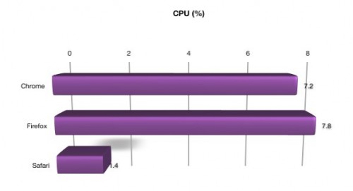
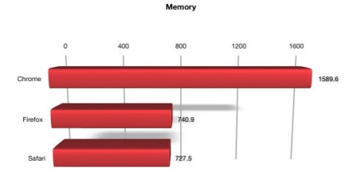
In it’s favour though, Safari is light on CPU and Memory usage but on my older machine I still preferred Chrome to Safari with less resources.

Chrome
Currently in third place in browser share behind IE and Firefox, Chrome is my default browser on the Mac and PC.

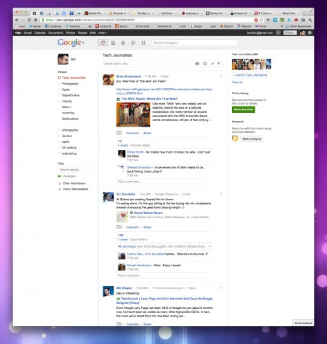
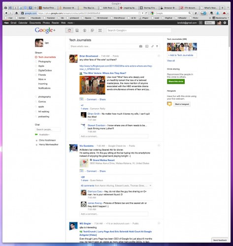
I like the ability to pin tabs and find the interface far more visually appealing than Safari or Firefox. It’s also fast and stable but while the browser itself never seems to crash, I am seeing more of the sad tab on certain sites, particularly Google+.

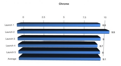
Performance is Chrome’s strong point alongside a fantastic amount of extensions. Even though it has the most extensions installed in this test it out performed the other two browsers by quite a margin.

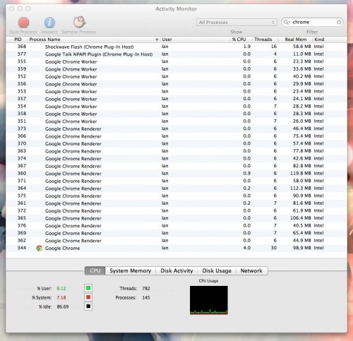
Chrome might be fast but it uses a lot more Memory and CPU. In practice it’s not something I notice but your milage may vary.

Firefox
Good old Firefox. Replaced IE when I was on Windows and helped break the mould on a variety of browser UI and functionality features.

On Mac’s however I’ve found Firefox to be quite crashy and slow. It suffered from feature creep as it’s popularity grew and with popularity came the race to add more which took it’s toll on the UI and overall performance. Firefox 7 doesn’t look too bad, although it’s almost a clone of Chrome now and still doesn’t look as clean.

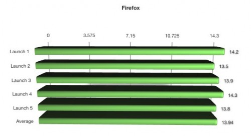
Newer versions have improved performance but for me it’s still a lot slower than Chrome as the above results show.

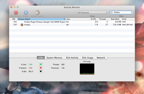
While Memory usage is low in comparison to Chrome, CPU usage was quite high.

Conclusions
So after comparing the three what are my conclusions? Chrome is still the faster browser followed by Firefox and Safari, and this can be summed up in the following charts.


Chrome is faster not just in start up but on general usage as well. Coupled with the cleaner UI it will still remain as my default browser. Firefox has made some improvements over the last few months and seems to be more stable coupled with improvements in performance. Safari on the other hand has worsened over the last year. I’m hoping that Apples focus on Lion and iOS 5 is the cause and that Safari will receive some much needed TLC. It reminds me of how IE felt in Windows – usable but far better alternatives available.

With such a reliance on the web for both desktop and mobile computing the browser competition is hotter than ever. If you’ve not tried Google Chrome it’s well worth downloading and giving it a spin. Competitors have improved to try and catch up but with Chrome’s aggressive development it’s hard to ignore. What will the next couple of years bring to the browser – Amazon Silk for the desktop?

Thoughts on Lion

Mac OS X Lion was released on July 20th 2011 so my write up is after a few weeks of use rather than a few days (although many were based on using the beta releases that developers have access too). It’s also on the back of a couple of great posts in a similar vein, Elaine Giles Lion – One Month On and Craig Grannell’s My review of OS X Lion: the good, the bad and the ugly. Both posts highlighted the good and bad to be found in Lion and this post will be in a similar vein. It’s now over 5 years since I switched to Mac and the iMac I purchased had OS X Tiger installed. Since then we’ve seen Leopard and Snow Leopard released and the iMac coped well with the updates. However I bought a new iMac this year and as it’s a good spec it’s hard to say if the Lion upgrade has made any difference to performance. Certainly when I moved to Leopard and Snow Leopard there was an initial feeling of slightly better performance but my gut feel is that with Lion the opposite is true. Indeed on my Mac Mini which acts as a media server (basically running Plex and that’s it) I’ve added a couple of GB of ram (it’s so cheap it was rude not to) and it certainly has benefited with some more breathing space.

The launch of Lion was different in that it was available only (initially) via the App Store. While all well and good for those on fast connections, for others it was a slow download especially on day one. Not only that, if you didn’t take action before installing then you wouldn’t be able to make a backup disc or save to a USB stick for future use. As I wanted to restart fresh on the Mac Mini a few weeks after installing it certainly has saved me a lot of hassle – hopefully Apple learn for future upgrades and provide an easy option during install to create a rescue disc or stick.

Install was fast though and after a reboot I was using Lion. So whats new? What did I like and dislike? How much is iOS influencing OS X?

Likes
One of the most used app’s on my Mac is Mail and Lion brings some good improvements. A conversation view similar to the iPad’s makes for a cleaner view of multiple replies. A favourites bar allows you to create shortcuts to different mail accounts which is great if you have many accounts and want quick access to an account or smart mailbox. The bar also supports keyboard shortcuts – here’s a great tip from Matt Gemmell on using the favourites bar. One snag – my mail rules run inconsistently which is a pain. I’ve not looked into it much apart from confirming on the Apple forums that it’s a fairly common problem so hopefully an update will address.

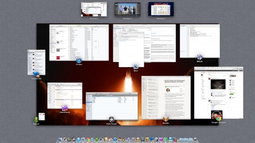
One of the features I loved in OS X was Exposé. I move the mouse to one of the desktop corners and I’d get a quick overview of all open applications that I could easily switch to. Mission Control expands on that feature to include Spaces and also helps knit a couple of other new features together – Gestures and Full Screen applications. The screenshot above is Mission Control showing a typical day on my Mac. Desktop 1 is my main workspace, Desktop 2 is Lightroom full screen and Desktop 3 is Windows 7 (via VMware Fusion) again running full screen. Mission Control now groups windows from the same app together, so if you’ve a few mails open or a few Chrome sessions it’s easy to identify and swap between them.

Spaces is now integrated into Mission Control so to create a new Desktop, enable Mission Control and drag an app to the top strip to either move the app to an existing Desktop or to create a new Desktop. You can also create a new Desktop by moving your cursor to the top right of the screen within Mission Control. New to spaces – you can now default an app to a certain Desktop. Desktop’s also get their own background but I wish you could rename your Desktop. Not essential but I’d rather see Lightroom or Windows instead of Desktop 2 or Desktop 3.

Overall, I love Mission Control. I’m using Spaces far more effectively and it makes it easy to control your app’s and desktop’s. Shifting an app onto a separate Desktop (or making it full screen) gives you instant focus away from the distractions of e-mail, Twitter and IM. On a 27″ iMac the Full Screen mode feels….overkill. Firstly an application needs to support it and if it does you get a small icon on the right of the app’s toolbar. One click and the app moves to Full Screen, hiding the toolbar and Dock filling the screen fully. For certain app’s it makes sense but for others it’s just too much on the big screen.

On a laptop however, Full Screen makes perfect sense especially on a Macbook Air. Coupled with a three finger swipe to move between Desktop’s and you have a great way of running app’s and switching quickly between them.

Mission Control also meant the return of the Dashboard. I’d disabled it a long time ago as it was unused and felt like a waste of resources. It now gets pride of place in the top row alongside other Spaces and a three swipe to the right from Desktop 1 shows the Dashboard. Mmmmm. I could understand this if there were lot’s of great widgets available but the Dashboard has been stagnating for some time. Look at Apple’s own website and the last new widget was published in Feb 2011. If the Dashboard was important surely you could download and install widgets via the App Store? Thankfully it can still be disabled in Mission Controls preference pane.

I’d mentioned Gestures and Lion really has pushed their use throughout the operating system, so much so that if you have a desktop Mac I’d almost say a Magic Trackpad is essential. When I bought the new iMac instead of a mouse I ordered the trackpad and use it, the keyboard and my Logitech mouse to control Lion. Easy to switch between Desktops, enable Mission Control, show the desktop – love it. Just a shame that the trackpad costs £60.

Lion brings some practical improvements that as a whole make for a faster and more secure environment. Resume if supported by an app will launch your applications exactly the same way you left them after a reboot. Sounds simple but makes such a big difference to close an app and when you open it again the toolbars are in the same place and the document you were working on is still open at the same point where you were making changes. Auto Save has been added – you never have to worry about saving again as Lion will auto save your changes as you work. This should hopefully be the end of forgetting to save or losing work if your Mac crashes. Yes, Mac’s crash as I’ll explain later! Coupled with these feature’s is Versions. Click on the title bar of an app and you can browse all versions of the current document. If you select browse you are taken to the familiar Time Machine interface and you browse through the different versions of the dock. You can see changes and easily restore to a previous version. A bit over the top, but then they are making backup and versioning interesting via the animation.

The animations aren’t restricted to just Versions. Throughout Lion you see animations especially in Finder in Mail that on first or second run are fine….the 50th time you see it starts to grate though and frankly gets in the way. One way to disable these is to download Lion Tweaks. This free tool lets you tweak some of Lion’s features – some more annoying than others. Anyway, this is the Likes of Lion so let’s crack on.

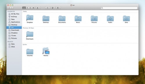
Finder has seen some small upgrades. All My Files groups your files from anywhere on your drives and displays them in the one Finder window allowing you to sort by date, name, application. A small step in making the Finder easier to understand and use. You can now navigate files using gestures and sort tokens have been added to make for a far stronger search. What’s probably the most noticeable change is the colour changes made to the sidebar. More accurately the removal of colour. I like it but many don’t but it should be no surprise as iTunes made the same change recently and the trend is continuing. The latest Evernote update moved to monochrome as did Google Docs. Nice.

Dislikes
Thats the end of the lovefest though. There are a couple of jarring features in Lion. One of the most annoying is the UI changes to iCal and Address Book. iCal has a couple of nice feature changes but it’s the UI that I find really distracting.

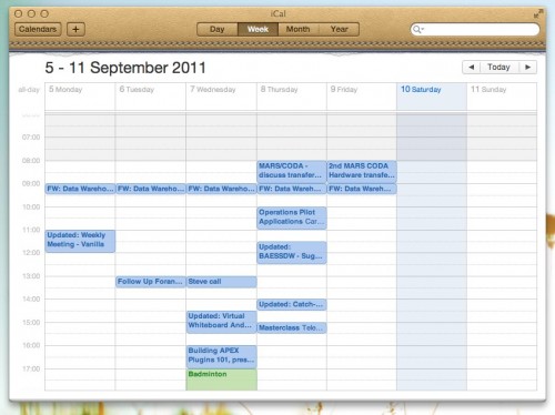
In total contrast to the move to monochrome, iCal now has a faux leather toolbar and a tear off graphic added underneath. The toolbar is ugly. The tear off meaningless – with a gesture can I tear off a page in the calendar? Of course not. It just stands out like a sore thumb…or it would do it if wasn’t for Address Book.

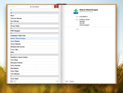
At least iCal has improved it’s functional use with year view and a decent day view. Address Book looks ugly and is more difficult to use than it’s Snow Leopard predecessor. It’s been made to look like a real book…but doesn’t act like one either using the mouse or via gestures. It’s got a horrible graphic at the top acting as a marker…which does nothing. I don’t even think it’s syncing has improved to Google/Yahoo. Disappointing.

Another annoyance is a feature that I used in Snow Leopard has been dropped. I used to love moving the cursor over a window that wasn’t the frontmost selected window and scrolling through the content without bringing the window to the fore. Very handy when scrolling webpages, documents….and Twitter of course. Well, that feature has gone. Why? No idea. See update below – feature is there after all.

Thankfully my biggest fault with Lion was fixed when the first update was released. As mentioned I had a new iMac and there was a horrible bug in Lion that caused the machine to freeze (requiring a switch off and on again) when playing a video after a sleep. Amazed that one got through testing and was part of the final release and it took around 3 weeks before a fix was issued. Years of having bulletproof stability gone in one fell swoop. Since the update though it’s been 100% reliable.

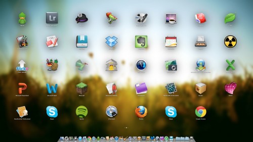
My final groan goes to LaunchPad. This groups applications together and displays them in a view similar to iOS devices. You can create folders by dragging one app over another just like in iOS. When you download an app from the App Store it also animates to install in LaunchPad. But is it any use? Common app’s will launch from the dock and most folk will use Spotlight, an app launcher like Alfred or Launchbar or just navigate to the app’s folder. It feels like an app for a touch screen Mac, not the current gesture driven devices we currently use. Maybe it’s a sign of technologies to come but it doesn’t really fit in Mac OS X. At a push I could see it as useful when launching app’s on my TV connected Mini, but thats a stretch. I also hate that applications from the App Store are installed to LaunchPad and that it pops up on the screen. Only slightly better than installing to the dock but not by much.

One More Thing
Natural Scrolling also known as ‘lets reverse scrolling as you know it and mess with your head’. Basically, current scrolling on Mac and Windows moves the scrollbar – push up, the scrollbar moves up and you move up the page. Natural Scrolling reverses this. Push up to move the page up (not the scrollbar which is often hidden in Lion) and hence move down the screen, exactly as you do on any iOS device. It is optional so you can change the default to work as it did before but I’ve stuck with it and the brain is retrained. I even altered my work Windows setup to do the same. It’s no big deal really although it garnered a lot of press and my gut feel is that it’s been switched for a reason, so why not stick with it?

Closing Thoughts
So that’s Lion. It’s cheap and easy to install but overall this has been the Mac OS X update with least impact for me. Some of the changes are minimal and in some ways a step back. One aspect that has been good is third party app’s have been super stable for me in Lion. Leopard and Snow Leopard upgrades caused me some pain especially with the podcast but I’ve had very little issue with Lion. I’d still say it’s worthwhile upgrading, but if you haven’t already I’d wait now for 10.7.2 which may bring you a little iCloud goodness as well as improved stability. You also really do need a trackpad to take best advantage of Lion – fine for laptop owners but a potential upgrade cost that’s hidden to desktop users. It will be interesting to see how Lion compares with Windows 8 which I have running via VMware so thoughts on that soon.

Update 24/09/2011
A couple of quick updates to the post. Firstly, you can scroll in background windows without selecting them first. I’m sure that wasn’t there when I first installed Lion so maybe the 10.7.1 update enabled it? Not sure. Secondly is another customisation tool for Lion that is free – Deeper from Titanium Software. It has lots of options to change the look and feel of Lion and many of the default apps. Addictive Tips has a great review of Deeper which highlights the many customisation options.

New Toys

It’s 4 years and 8 months since I bought an iMac and moved to Apple. The 24″ model has done me proud over that time but I’ve been wanting to upgrade for a few months now. The latest upgrades saw me finally pushing the button. So what did I order?

The works basically. A 27″ iMac will be winging it’s way to me shortly with an SSD, i7 CPU, fast graphics card and instead of a mouse (Logitech wins over Apple every time) I’ve went for a trackpad as with Lion coming soon I can see gesture support being heavily used throughout the OS and third party app’s over the coming year. I really can’t wait to see just how fast this thing is. The SSD will make a massive difference but that quad core CPU should chew through tasks. The only thing I didn’t upgrade was the RAM. Comes with 4GB, but Apple want £120 for another 4 – I can buy 16GB of Crucial RAM for the same price.

There’s only one snag. Ordered almost two weeks ago but the delivery date is still over 4 weeks away – June 24th. I hate waiting especially as Apple have grabbed the cash already. Grrrr. Still, nice toys on the way so can’t complain. Interestingly when I check on the status today the Apple page say’s come back tomorrow for more functionality – linked to rumours of Apple store updates on May 22nd?

Only downside to new toys is getting rid of the old iMac. Will probably sell on eBay but I never really like the eBay experience for a variety of reasons. It’s still worth a few hundred pounds though so needs must.

Another new toy soon – a car. No idea what I’m buying or when apart from ‘soon’. Need to consult with my friendly car geeks as I’m useless when it comes to cars. Looking forward to it though – the Focus is coming up for 10 years old. Showing it’s age and I’m getting bored with it.

Fitbit

I’ve cast envious eye’s on a Fitbit for around a year now. Since it was first announced and got traction amongst many bloggers and podcasters I’ve wanted one. The only snag is that despite saying it would be coming to the UK soon, it never has. In January I decided enough was enough and I’d import one. That quickly turned to three as a couple of friends were also interested. Thanks to another friend, Lewis, he kindly picked three up on a business trip to the states and since the beginning of February I’ve been using one constantly.
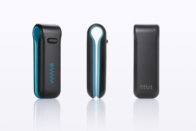
So – what is a Fitbit?
At first glance it’s a posh pedometer. It tracks your steps, can track activity during the day and at night will also track your sleep. However the hardware is secondary to the online logging and analytics service. I’ll describe more on that later. First up, lets talk about what you get in the box for $99. The Fitbit device itself is basically a large clip with one button. Clip it onto your belt, trousers or just place it in your pocket (woman are advised to clip it on their bra – doesn’t sound right but there you go). If you click on the button then four different stats are displayed on the OLED screen, which is a rather lovely blue. The stats are number of steps walked, number of calories burned, miles walked and then finally a flower. All the stats run from midnight to midnight.
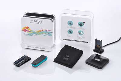
Also in the box is a USB charge/sync unit for your PC or Mac, a holder to allow you to attached the Fitbit to thicker belts or straps and a wrist band that you attach the Fitbit to while sleeping. First impressions are of a well made piece of kit that is durable and I just adore the screen. The flower mentioned above is a graphical representation of your activity level over the last few hours. Sit at your desk for a morning and you’ll see a a short stem and flower. Do some exercise for an hour and you’ll see a longer stem and some leaves representing your activity. I’ve only ever seen up to 10 leaves but seemingly it can go to 12. Thats a target to aim for.

Sleep tracking is pretty easy. Attached the Fitbit to your wrist strap then hold down the button until you see START. Then sleep. In the morning hold the button down again until you see STOP. Fitbit will know when it syncs that this was a sleep period and will track hours slept and also the number of times you were awake. Thankfully it’s easy to add sleeps manually as I do forget to press the button from time to time.
Fitbit Crack

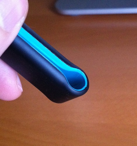
Now that I’ve had the Fitbit for three months I’m a bit concerned about the durability of the Fitbit tracker. I can’t recall any time that I’ve dropped or put any undue pressure on the Fitbit but during that time it’s developed a crack in the underside plastic. It’s not affected the performance of the Fitbit but I do wonder what condition it will be in a few months from now. It’s also picked up a couple of scratches in the softish rubber that the outside is coated in. If it was only mine cracked I put it down to a clumsy incident but Brian who picked up one at the same time as me also has a crack in the same place. I’ll contact Fitbit support to see if this is a known flaw or just coincidence.

On the other hand, Chris has managed to wash his Fitbit tracker and it survived to live another day. He’s not sure that the screen is as clear as it once was but just pleased that it survived the ordeal.

Syncing
To sync the Fitbit you need to install the tracker software on your Mac or PC, plug in the USB charge/sync unit, create an account on the Fitbit site and then place the tracker on the charger. The tracker is then authenticated to your Fitbit online account and your good to go. Charging doesn’t take too long and a full charge lasts me around a week. The tracker also holds a lot of data – up to 7 full day’s worth of data and in total up to 30 days but not in the same detail as the last 7 days. Handy if your travelling and not able to sync although now that I’ve used it for a few months I’d be making sure that I could sync every few days if I was on holiday. Yes, I’m an addict!

Syncing is quick but I’ve had a couple of problems getting syncing to work and still have to resort to a workaround to get sleep’s sync’d properly. On first getting the Fitbit I plugged it into my main computer, a 4 year old iMac. No matter what I did I couldn’t get the Mac to see the Fitbit when placed on the sync unit. Visited the Forums and help pages and couldn’t get it to work. I was also a bit concerned at some of the advice given to get it working. Opening terminal, typing in unix commands to capture output from the Fitbit. Nasty. This is supposed to be a wear and forget type device. How many people are really comfortable visiting terminal, capturing verbose output and deciphering whats wrong?

Luckily I had a Mac Mini in the house – plugged the sync unit into the Mini and the Fitbit worked first time. Another issue I had was that the firmware version that shipped with my Fitbit has a bug that means if activity is logged before syncing a sleep, then the sleep isn’t captured. As I’ve mentioned already, sleeps can be manually added but that’s a pain that I want to avoid. However the instructions for updating the firmware (on Mac at least) are pretty nasty:

For Mac users:
1. Downgrade the Mac client by going to http://cache.fitbit.com/uploader/Fitbit-Uploader-for-Mac-1.0.2.dmg
2. Install client version 1.0.2
3. Close the Fitbit Tracker Set-up page
4. Update the firmware

a. Open a Finder window.
b. Navigate to Applications > Utilities.
c. Double-click on the Terminal application to open it. A terminal window appears.
d. Now enter: FB_OPEN_MODE=”userFirmwareUpdate” /Applications/Fitbit.app/Contents/MacOS/Fitbit
e. The Fitbit application will launch and upgrade your firmware
f. Do not close the terminal window until after you have quit the Fitbit application.

5. Unplug the base station
6. Upgrade the Mac client by going to http://d290v5wu4xgrh.cloudfront.net/scratch/Install-Fitbit-1.8.2-2011-01-27.dmg
7. Install client version 1.8.2

After the update, reset the Fitbit. Place it on the base station then press the button on the bottom of the base station using a toothpick, pen tip, or paper clip.

Worse – that comes from a user and not the Fitbit staff. I followed the instructions but couldn’t get the firmware to update so my solution is to put the Fitbit on the sync unit when I wake in the morning. Gets the sleeps updated correctly but that 10-15 mins on the sync unit each day keeps the charge topped up. Hopefully at some point there will be a far easier way to reliably update the firmware.

Fitbit Website
The Fitbit website is the real core of this service. The website is free, in fact you can sign up for an account without having a Fitbit tracker. Fitbit will estimate your daily burn based on age, sex, weight etc and you can manually track activities, food and sleep but it’s obviously far more effective if you have the tracker.
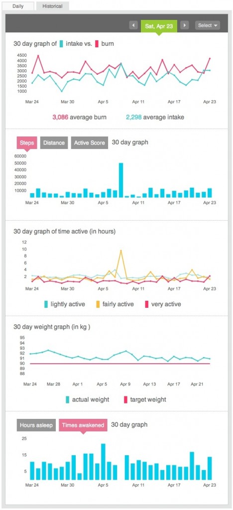
Once you login you have four main tabs – Home, Tracker, Community and Analytics. The first three are available for all while the Analytics tab is a $50 a year subscription service. More on that later. First up is the Home tab. This gives you a daily or historical view of your calories consumed vs calories burned, steps and distance you’ve walked, how active you are, your weight and finally your sleeps. Daily will just show you the current day with the ability to pop up a calendar and select an individual day. Historical will show you the previous 30 days from the date selected in the calendar. It’s a great view showing everything you need to see around your statistics.
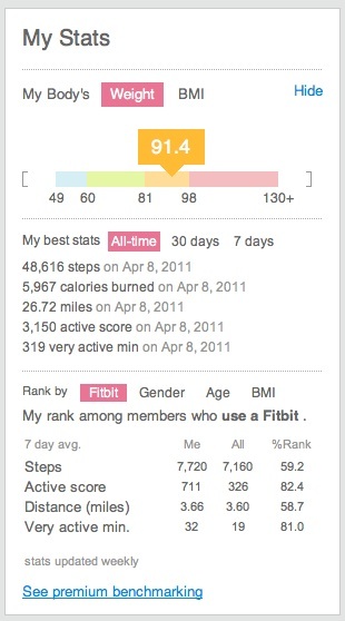
To the right of the main statistics are two other important panels that highlight the more social aspects of the site – My Stats and Friends. My Stats, shown above, highlights your individual records. Most steps taken, most calories burned etc. It also compares your stats with others using Fitbit and allows you to filter to show how active you are compared to others of the same sex and/or BMI.
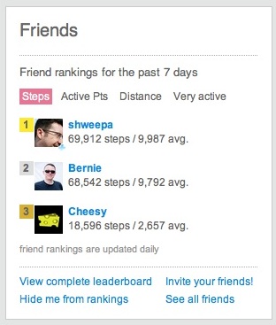
Fitbit also allows you to follow friends and there is an area on the Home tab that shows you a leader board so you can see how your doing compared to friends but also allows you to jump quickly to their profile or see how your compared in a specific area – steps, distance or activity. It shouldn’t be underestimated how seeing friends doing well spurs you on. Gamification of weight loss and being healthy has given me a real kick this year.

The Home tab also lets you quickly log Food, Activity and Weight but really these are shortcuts to the second tab – Tracker.

Tracker
This is where the Fitbit website allows you to add real value to your statistics and results. You can track the following attributes using a very intuitive front end that allows you to quickly add values:

  • Food – Fitbit allows you to track your diet. There’s a built in food database but it is very US centric. However you can add your own food’s and manufacturers so despite there being an initial pain it generally takes me 20 mins at the weekend to capture all my foods for the week. Something I’d like to see is for Fitbit to link to something like MyFitnessPal which has a great food database rather than build it’s own.
  • Activities – track your biking, hiking etc using this section. Captures the date and time and also the calories burnt. Fitbit can estimate your calorie burn or if you are using equipment to track calories you can enter them manually.
  • Weight – capture weight and body fat. Fitbit have added Withings integration so for me the weight automatically updates daily. Another nice touch – you can track physical body changes as well – Neck, Bicep, Forearm, Chest, Waist, Hips, Thigh and Calf. Phew. I don’t track body changes and despite the Withings site also displaying my weight it’s great to see weight changes alongside food intake and activity.
  • Sleep – track the amount you sleep and also the amount of times you wake up.
  • Journal – track mood/energy and if you have an allergy how mild or severe it is. Very useful to compare with sleep and food – I’m not updating this section yet but intend to from now on. There is also a journal entry area. I do my journalling elsewhere but it’s very handy to have the entries alongside all your other stats.
  • Heart – capture heart rate
  • Blood Pressure – track your blood pressure blood pressure
  • Glucose – capture levels in the morning, afternoon and evening.

Quite a list but that’s not all. You can add one custom tracker that allows you to define and then measure something close to you. For me that would be migraines so I track when I have one and the severity – has an interesting correlation with sleep patterns. If you pay for Fitbit Premium then you add an unlimited amount of trackers so I also track the migraine drugs I take as well.

Both the Food and Activity sections have favourite and most logged lists so those foods that you have all the time can be saved as favourites and added by clicking on them, setting the amount and picking the time of day that you ate something. Very easy.

One question that you may have – how accurate is the Fitbit tracker? On the whole I’ve found it to be very accurate but it does depend on the activity. If I look at one of my hill walks, Fitbit will estimate a far greater distance than actually walked. A just under 10 mile walk was estimated as around 16 1/2 by Fitbit. I think it’s assuming a greater stride length than I take on a hill walk, hence the difference in distance. Another walk I was on which was more flat was accurate when compared to the actual distance tracked in RunKeeper.
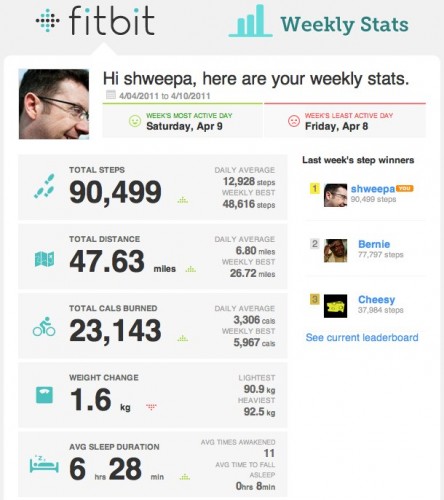
One nice new feature that Fitbit has recently added – a weekly progress e-mail. Simple but very effective, it shows you the main stats from the week and displays a simple green up or red down arrow next to the stat to show if you’ve improved from the previous week. It’s another way of prompting you to keep up your progress or step up and do a bit more.

Community
I think this is the weakest area on Fitbit. These are the Fitbit forums – where users can post their hints and tips, their suggestions for the future and also seek technical help.
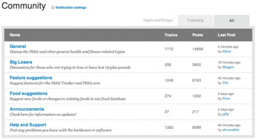
Until recently you couldn’t do much more than view the forum topics and search for a topic. An update in the last month now allows you to follow topics so you can keep track of updates. You can also se forum members, click through to their profiles and add them as friends but it all feels a bit clunky.

You can also create and see other public groups. There are groups which have their own leaderboards and discussion topics but you can’t search them…and there are now over 480 public groups. It feels like Fitbit have rolled out half a feature which needs a bit of polish to finish off.

Sharing and Privacy
Fitbit allows you to share your results easily on Twitter, Facebook and WordPress. There’s an option within your settings that allows you to setup a daily or weekly tweet showing just how good…or bad your doing. This can also be sent to Facebook or WordPress. I send my Fitbit tweets to the same account as my Withings scale – howfatisian. Keeps my normal twitter account from being polluted by weight and health tweets.
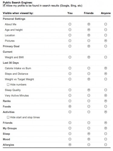
One area that is maybe worrying you as you read this review is what about your privacy? Many people won’t feel comfortable with sharing stat’s like weight, food eaten or exercise taken and thankfully Fitbit has given you full control on what is visible to others. As you can see from the screenshot above you can chose to share virtually nothing with others or be fully open with just friends. I’m very impressed with this as there are some things I’m happy to share like weight and exercise but I wouldn’t want to share mood and journal.

Fitbit Premium
For $50 a year you can subscribe to Fitbit premium. Although you can get a free trial for a week I waited until I’d built up a month worth of stats before commencing the trial and I’m glad I did as it made the stats more worthwhile and hence better to gauge it’s value.
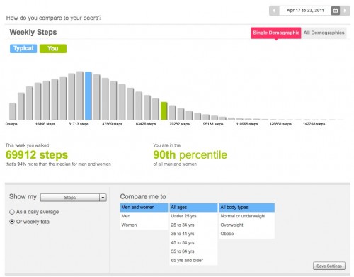
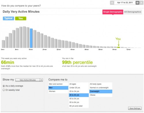
Benchmarking allows you to dig into your stats and see how you compare with others on Fitbit. The default display can be seen above but you can change from steps to compare around 20 different statistics across different age groups and weight ranges. Another example is below looking at ‘very active minutes’. Looks like I’m doing pretty well.
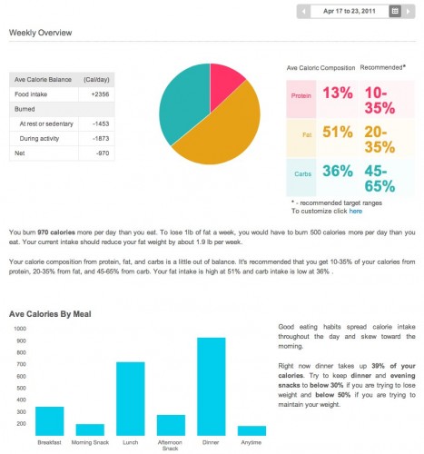
The Food report highlights the protein, fat and carb content of the food you’ve consumed in a given week and also what you should be aiming for. Looking at mine it’s less fat and more carbs which is something to aim for in the coming months. It also breaks down intake over the day which again is quite interesting.
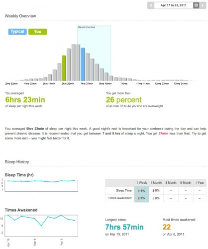
The Activity report breaks down your burned calories and the activities that you take part in. The Sleep report compares your sleep totals to your peers. I find this report very interesting – it highlights that I’m not getting enough sleep but to be honest no matter how much I try I find it difficult to sleep more.
The Trainer analyses your current Fitbit statistics and creates a 12 weeks plan that encourages you to gradually increase your excercise over the term. Quite effective but after a couple of weeks it suggested that the plan was too easy for me which indicates that the analysis of my statistics wasn’t as thorough as suggested in the advertising material.

A couple of extra’s are also included in the Premium pack. You can export any of your data to CSV or XLS format – shame this isn’t included when I actually buy a Fitbit. Secondly, in the tracker tab you can setup an unlimited amount of custom trackers which is very handy.

API’s and Mobile
Fitbit have recently launched a set of API’s – more detail can be found on their developer website. So if you want to develop an application around Fitbit or use the data from your Fitbit account elsewhere this is the place to visit. In April Fitbit announced that RunKeeper and About.me amongst others will import user data from Fitbit via the API. Fitbit are also developing mobile app’s, firstly for iOS followed by Android. Until then you can make use of the mobile website that Fitbit have developed.
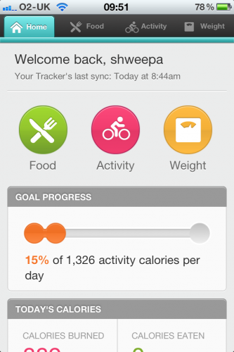
This allows you to add activities and foods on the go. It’s functional, works on any mobile platform but you really miss the speed of an app and the extra features that an app can deliver when compared to the web.

Final Thoughts
This review is a lot longer than expected but that show’s how much I love Fitbit. The physical hardware for me is just 10% of the overall product and despite the doubts on durability and the setup issues I had, the website features and overall statistics that can be pulled from Fitbit are excellent. Highly recommended but please remember that it’s not available in the UK yet which hopefully will be addressed this year.

Even if all you do is place the Fitbit in your pocket everyday the service will deliver lot’s of long term value. To keep up to date on my progress you can visit my public Fitbit profile here.
2010 – Favourite New Things

It’s been quite a year for new tech and as usual I’ve spent more than my fair share on new software and hardware. Thought it was worthwhile listing my favourites and updating on purchases now that I’ve used them for a few months. So without further ado, my top tech of the year.

1. Apple iPad
Before it was even announced I doubted how useful the iPad would be. I didn’t expect it to succeed especially with so much hype. Yet I stood in the queue at the Glasgow Apple store near the end of May and picked up a 64GB 3G iPad. By far it’s been my best purchase of 2010. It’s introduced a new genre, tablet computing, which despite years of talking from Microsoft and hardware from a variety of manufacturers had so far failed to take off. It’s become the goto device around the house (partly due to my laptop failing) and is a great device for consuming all sorts of content. I’m not totally sold on it as a content creator and with hindsight, 32GB would have been plenty for me but apart from that it has very few negatives.

Apple have had this market to themselves for 6-9 months, competition is limited to the Galaxy Tab at the moment but next year will see many, many devices from Microsoft, Google and RIM and the many OEM’s that will use Windows or Android. Scarily, they’ll be competing with the iPad 2 – apart from camera’s what will the new device bring?

Also have to mention InstaPaper, Flipboard and Reeder. Fantastic app’s for the iPad and are my goto app’s alongside Safari, Mail and Twitter.

2. Mac Mini with Plex 9
Picked up a Mac Mini at the start of the year and I love it. It sits quietly under the TV and acts not only as my media library but my media playback machine as well thanks to Plex 9. Plex, based on XBMC, came out with anew version in the middle of 2010 and it’s a great update that really improves the media library management of Plex. I just love flicking on Plex, picking a movie or TV series and just watching – no worrying about codecs, file management or broadband speeds. Brilliant.

The Mini also takes care of grabbing the content as well, from newsgroups, streams etc. My own Tivo box in other words and it requires hardly any management – it just works. An expensive solution compared to an Apple TV or Boxee Box but a lot more flexible. It’s not even the latest Mac Mini which I think is an even better buy – if only it came with a Blu-ray player.

3. Canon 550D
My first foray into the world of DSLR’s. I had no real preference between Nikon or Canon and for my budget at the time this was the best camera that could be bought, hence I’m now a Canon guy. Really please with my first eight months of usage. Downsides? I’ve quickly realised that:

a) Photography can be an expensive hobby.
b) There’s always a better lens than the one you’ve got.
c) It’s not easy.

Pro’s outweigh the cons though and I’ve a big list of goals for the coming year and a slightly shorter lists of potential lens purchases that I’m finding impossible to whittle down. Help.

4. iPhone 4
Silly to describe this as a phone now as it’s so powerful. It’s also further down the list for me as it’s lost that new tech feeling from a couple of years back. The shape is familiar, the software is familiar but it feels wrong to be so blasé about technology so powerful. The screen is amazing, the camera now truly good enough to replace pocket camera’s for many and the addition of the front facing camera plus the processor jump made this a great upgrade.

The antenna issue that seemed to be such a big problem has, with hindsight, been nothing more than a tech soap opera. There’s an itch though when I look at the current crop of Android phones. Something fresh, new, different and of equal footing. 2011 will be very interesting to see what incremental upgrades Apple add while the rest of the industry tries to leapfrog.

5. Withings Scale
I love this. A set of scales that cost £100 but they are so geeky it makes me smile. The Withings scales came out at the end of 2009 but it took a few months until I made the purchase. They are wifi enabled, automatically uploading your weight and fat measurements to a cloud based tracking system. The software can auto tweet your weight (howfatisian) but that’s not the appeal for me.

It’s the start of a more connected range of tech. Devices that will be wifi enabled and offer so much more to the end user. There’s a price premium at the moment but that will change over time. I see my weight fluctuate daily, I can’t hide my weight anymore so it’s an incentive to manage it better (and variances are pounced upon by Shakeel) but it’s made tracking easy while connecting to other sites like RunKeeper so that training and weight variations can be seen together…with no manual updating involved. Fantastic. Also, they look great as well.

The One That Got Away
The new Macbook Air’s look amazing. They’ve come out at the wrong time for me so I’ve held off on purchasing but that is the future of Apple laptops. Flash based, thin and light and no dvd drives. Only thing missing – backlit keyboard. If it had that it would be a perfect laptop for me. Maybe 2012 for that purchase as next year it’s time to replace the iMac.

Looking at those five purchases, three weren’t even considered at the start of the year. I wonder what 2011 will bring?

4 Weeks with Virgin Broadband

It’s more like 5 weeks now but I thought I would do a quick update on how I’ve found Virgin Broadband since joining at the start of November.

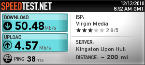
Raw speeds are still very good. Take for example the speedtest from this morning.

Generally I get that kind of speed so the service is definitely delivering. However there is a lot of throttling of peer to peer and newsgroup traffic. This varies from day to day depending on, I guess, the traffic levels locally. On certain days it makes little difference, on other days you can see download speeds of a few k/s instead of the usual few Mb/s.

However this isn’t new and is applying to more and more ISP’s. Downloading out of peak times is breathtakingly fast. 7-8Gb files are taking 30mins or so. Uploading to Amazon S3, Flickr etc has also been very quick now that the 5Mb upload speed has been applied. The uploads are the only part of the service (on 50Mb) that are subject to caps and if you go over the cap your speed is throttled to a still usable level but it’s worth baring in mind. I’ve scheduled backups to non peak times and it’s working well.

Overall I’m pleased with the service so far. Quick and reliable with no noticeable drops.

Fibretastic

So I’ve switched back to Virgin Media. Back in 2008, frustrated by some IP issues and throttling, I moved from Virgin Media to O2 broadband. There was also the issue of cost. O2 were offering up to 16Mb for £10 a month, Virgin at the time were 20Mb for £37 a month so quite a difference. So after two years why switch?

The main reason is speed. The image above is a test on my new connection this morning. A true 50Mb down but more importantly, 4.6Mb upload. Wowsers. Since leaving, Virgin Media’s XXL package has been upgraded from 20Mb to 50Mb. Nothing else on the market at the moment can touch this for download speed. Speedtest’s are all well and good – how’s the real world performance? Very good over the last week. Video’s, podcasts and, ermmm, ‘other’ large downloads are all delivered in record breaking time. I did some testing with DNS and I’ve kept with OpenDNS as I still find them the fastest option comparing them with ISP’s own DNS and also Google DNS.

One of the issues with faster download speeds though is that upload speeds have never kept pace and so much of what I do, and want to do more of, is dependant on uploading. Uploading podcasts, uploading photo’s and HD video from the 550D and cloud backups. All take a considerable amount of time when you’ve only got 1Mb upload speeds. Virgin earlier this year announced an upgrade for everyone’s upload speeds so the XXL package now comes with 5Mb upload. Looking at the speed test above I am very nearly getting that and it is making a tremendous difference. Cloud backups and photo uploads are now four times faster. Considering some of the Flickr set uploads can take over an hour you can see how much a difference it makes. It also makes cloud backup a more realistic option. If your using Virgin Media, visit http://192.168.100.1/CmOpConfig.asp (your modems configuration page) to find out what upload and download speeds your modem is currently operating at.

All this speed though comes with conditions. Firstly, £35 a month is a lot more than the £10 a month I was paying to O2. However O2 have recently changed their broadband tiers so I was likely to move to £20 a month with O2. Secondly, all tiers on Virgin have traffic management. During peak periods p2p and newsgroup traffic is throttled to protect other services. A lot of people cry fowl over this but I’d rather have that than a broadband service that is ruined by people stealing content which if we’re honest is the vast vast majority of p2p and newsgroup traffic. I know the complainers point to legitimate reasons for p2p and newsgroups but that just doesn’t wash. I’d rather have fast web, video , voice and game traffic over a totally unmanaged service.

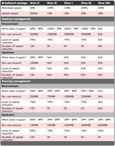
Another aspect of Virgin’s traffic management is that your connection speed can be throttled depending on how much you download and now also upload. The table above is taken from Virgins current traffic management help page. Downloads on XXL aren’t throttled at all but if you have the new upload speeds they are. However it’s only after you’ve uploaded 6GB that the speeds is temporarily throttled back to 1.5Mb. Pretty generous and not going to be an issue for me. Any backups that I do will be scheduled for times when I’m not likely to be using the connection.

Another reason for moving was a deterioration in the service from O2. Not only were average speeds starting to drop but connections were being lost every couple of days. I can accept slow but I hate when the service goes down. The internet connection is used for so much now that I hate unreliability.

Overall I’m delighted with the service but as with all things it’s early days. Over the next 12-18 months Virgin are rolling out 100Mb down, 10Mb up for £43 a month. I’ll see how the cloud backups progress before deciding if it’s worthwhile moving as the speed at the moment is plenty enough for me. It’s interesting looking back to when I first got broadband and it was 1/2Mb down and that was plenty fast. Times change – i wonder what speed (and provider) I’ll be with in 2012?

Drobo and Mini

It’s been a while since I’ve blogged on my tech and latest purchases. Over Christmas I picked up a Drobo and a Mac Mini. Recently I’ve been running out of disk space so wanted something that will grow with time. I also wanted an easy way to watch my ever growing media library. The PS3 and 360 just weren’t cutting it when streaming from the iMac.

I’d considered an Apple TV for a long time but this would just be another compromise. Closed format viewing isn’t for me and even though you can hack it to install Boxee, HD playback looked to be an issue. I thought about some cheaper options but in the end went for a Mac Mini. This gives me the choice I was looking for in a quiet neat unit. The only hardware it’s missing is Blu-Ray which I’ll use the PS3 for.

Disk space was a more difficult choice. I considered a variety of NAS units but I kept coming back to the Drobo. I bought the normal Drobo with 2 x 1.5TB drives. It’s worked flawlessly hooked up to the Mini via firewire. My only doubt, and I hope it doesn’t come back to bite me, is that the disks are now in a proprietary format. If the Drobo dies I can’t use the disks in another device – it has to be a Drobo. Ouch. Despite the worries I’m really pleased with the new toys.

If your interested in how I’ve setup the Mini and what software I’m using you’ll find more details in a series of blog posts at DigitalOutbox. I’ve been through the hardware setup and also the installation of Plex and Boxee. Future posts will look into running the Mini as a server, downloading media and remote access to the Mini and home media.

The next purchase on my list is a replacement for the iMac and Macbook Pro. I just can’t work out what to buy though…and how to afford it. Options at the moment are…

  • 27″ iMac and iPad
  • Macbook Pro and monitor
  • Straight replacement new iMac and Macbook Pro

Favourite at the moment is the Macbook Pro and monitor. Easier to manage, everything on the one machine and increased real estate. Makes most sense and is least costliest option.

Then again, when did I ever follow that route?