Small Steps

Apple released iOS 9, watchOS 2 and OS X El Capitan over the last couple of weeks. What’s remarkable about the updates, and it looks to be the same for the upcoming version of Android, is the lack of much new in iOS or Mac OS X. There’s much under the hood but for end users there’s little to get excited about.

El Capitan
A couple of the biggest changes are really for laptop users – split view and mission control. Split view lets you focus on two apps easily at the same time. Nothing you couldn’t do before but maximises focus on the job in hand. Mission control makes it easier to work with multiple screens and desktops and the changes are much welcomed – it’s far improved over Yosemite.

Spotlight improvements are OK but won’t replace Alfred for me. Notes is much improved and really is quite the credible competitor to Evernote which is something I need to look at going forward and Photo’s finally add’s some much needed editing features plus support for extension. For me the best new features are a couple of the smallest.

Pinned tabs but oh so drab

Apple have stolen pinned tabs from Chrome and also the ability to see which tab is currently ‘speaking’ and allowing you to quickly mute Safari. However the pinned tabs are so drab looking – why Apple? Also it’s criminal that Safari updates, and many of the App updates, are now tied to a yearly OS update from Apple, especially when the App updates are so small. I doubt Apple will change that strategy as it’s the same across all their platforms. It’s also criminal that Safari really feels like the new IE.

Anyway, it’s free and it’s been stable for me so far so it gets a grudging thumbs up.

iOS 9
I didn’t take part in any of the open beta’s or put on a developer build this year so iOS 9 is relatively new for me but again there is very little to get excited about. It says it all when much of the talk was of a new system font, San Fransisco, which is nice but isn’t really ‘a feature’.

Notes see’s a good upgrade and there is also now a News app but only in the USA right now, seemingly 9.1 will bring that to the UK. Passcode is now Wallet which makes more sense although there still isn’t much support for it.

The iPad updates are probably the most interesting. Slide Over allows a second app to be running at the same time as a main app is visible. It works well but I have a couple of issues with it. You can’t search for an app so you need to scroll through a list of apps that support Slide Over which is only going to grow. I also tend to launch Slide Over when I’m reading on the iPad accidentally. I’m sure it’s just muscle memory but it niggles.

Split View is an extension of Slide Over and allows two apps to run concurrently. For app’s that support it this is excellent but I’m surprised at how many Apple app’s don’t currently work in this mode. The final iPad nicety is picture in picture meaning iPlayer can run in a small window while you work on a document. Works well but again not all apps support it.

Siri has seen a few new features but I still struggle to get into the habit of using it, mostly due to it not working reliably. When it does it can be quite magical but when it doesn’t I just feel frustrated.

The best new feature for me so far has been app linking and slightly behind deep linking. App linking shows when you jump to Safari from an app, say Facebook. In Safari you get a link to jump back to Facebook so rather than double tapping home you just click the link and back to the app you go. Makes for far quicker navigating through iOS. Deep linking is for certain app developers only like Twitter. A tweet link will now open in the main Twitter app rather than in Safari. Better experience although I’d have preferred there to be an option to pick third party apps like Tweetbot instead of the main Twitter app.

So lots to like in iOS 9 but quite an incremental update. If it allows Apple to focus on stability and improving iCloud then all the better.

watchOS 2
This was probably the most anticipated Apple release – could watchOS 2 unlock third party apps and make the watch more usable? Kind off.

Watch faces have a few new options. There are now time lapses which do look great but don’t support any complications. Equally you can now pick a photo or photo album to be used as a watchface background. These can look great but again lack complications. The photo option has also spawned Apple Faces which has a great set of custom photos that can look really good on the watch. I really like the see through watch.

The other tweak to watchfaces is to add some colour. Utility now shows activity rings with colour and I love that change. However it’s caused much angst among some Apple fan’s due to the lack of control they now have in setting the colour in the Utility watchface. I’m surprised Apple didn’t add a multicolour option so that everyone would be happy – maybe watchOS 3. Speaking of complications we’ve now got third party complications which means I can now have Dark Sky instead of the default weather app and I’m sure there will be more from other dev’s going forward.

I’m really liking Nightstand – turn your watch onto it’s side and it turns into an alarm clock. The watch will display the time and alarm then switch off the screen. Touch/move the watch through the night and the screen lights up for a few seconds. Simple but effective.

Other features like Time Travel and improved Siri are welcome but the most anticipated, app’s running natively, has proven to be a bit of a false dawn. Certainly Dark Skies and PCalc now run a lot faster. PCalc in particular is a handy app to have on the watch now that it runs so quickly. Many others though are still relatively slow and I’m not sure if this is as good as this hardware will allow or wether we’ll see further improvements.

So some nice updates but I’m left wanting more. I’d love to see custom watch faces, I’d love to have fuller control over a watch face as well. I want better performance. But the watch for me has been really useful as a notification device and for that alone I wouldn’t want to lose it. watchOS 2 is a definite step up and hopefully we’ll see some more from dev’s over the coming months.

Spring Forward

Last nights Apple event was interesting for a number of reasons. Firstly they were finally detailing the Apple Watch and it’s been five years since Apple launched a new product category and it always fascinates me how Apple pitches and shapes their message. Secondly, so many people predicted that the keynote was all about the watch….wrong! Finally, no one predicted that Tim Cook would start with the Apple TV. Here are my quick thoughts on the products and message from last night.

Apple TV

  • No one expected Apple to lead with the Apple TV but the HBO Now announcement was a big deal. Exclusively launching on Apple TV for the first three months and in time for the new season of Game of Thrones this was what many users were wanting for years although $14.99 a month seems a bit high compared to Netflix.
  • Apple TV drops to £59. Thats it. No new hardware, no app store. I’m not the only one that was disappointed with that. Surely the hardware will see an update this year? Surely?

ResearchKit

  • Following on from puff pieces on CarPlay and HomeKit I wasn’t expecting much on health but ReasearchKit was afforded 15 minutes on the big stage and afterwards it was clear why.
  • This is a massive opportunity that started with the M7 processor in the iPhone 5S. Data is being captured and while it’s mostly seen as steps, it’s only going to get richer and help with medical research and diagnosis.
  • Apple Will Not See Your Data – clear message to customers and competitors on what differentiates Apple. Apple will need to be repeat this again and again along with the security message that they have been playing out recently.
  • Cynical view – we’re about to sell a $10000 watch so contrast it with a good news story but I don’t believe that to be the case.
  • Apple will open source ResearchKit so it can be run on any platform.
  • 5 apps already available and more on the way – this will be very interesting to watch over the coming years as the technology packed within phones and watches gets ever smarter.

MacBook

  • My favourite part of the whole event. The new designs shown throughout the new MacBook were impressive.
  • The new keyboard mechanism looked great although early feedback seems mixed.
  • The force touchpad shows so much invention…apart from it’s name.
  • 12 inch and Retina but so light and thin.
  • USB-C. One port. £69 adapter to get a data, video and power connector at the same time. If I look at my MacBook Air usage now though, that one port is enough.
  • CPU is a bit stingy looking but…Fanless! How will I tell when Flash is running? (clue – it’s not installed cause it’s a piece of shit)
  • All day battery is good but you are basically buying a battery with a screen and keyboard.
  • I’ll wait for reviews to see what playback looks like but assuming it’s OK, I’ll be buying a MacBook this year to replace the current Air and probably the iPad too. Next year, an iMac Retina to replace the five year old iMac. I do think the MacBook is the future of laptop design and the only other niggle is that this is rev 1.0 of the MacBook and the next version is probably the one to buy. But thats too much like common sense.

Apple Watch

  • Strange intro as Tim Cook recapped all the features.
  • Christy Turlington Burns was on stage to enthuse about the Apple Watch, running marathons and blogging about it at Apple.com. Felt totally false.
  • Kevin Lynch took to the stage to demo the Apple Watch in a real world scenario. Flawlessly done but pretty dull including the ubiquitous airport gate change demo.
  • 18 hour battery and the news that it’s replaceable still feels a 1.0 target being met. Like the heavy first iPad Retina which was updated after 6 months. I don’t think we’ll see a 2.0 watch that quickly but I do expect next years product to be much better.
  • It was then onto pricing which was pretty much in line with much of the speculation including the expensive Edition pricing.
  • Apple never really sold a compelling reason as to why I need an Apple Watch. I found this part of the event underwhelming and pretty disappointing compared to other product launches. Will I buy one? Probably not although there is a bit of me that feels I should have one to try. I bought and instantly sold a Pebble and if the Apple Watch had a GPS I’d find it a more compelling product. It’s a wait and see right now.

IMG_0333

Misc

  • Apple has mastered rolling out their products around the world quickly and efficiently. The same can’t be said for their services. Apple Pay, iTunes Radio, Beats, HBO Now and the initial batch of ResearchKit app’s are all US only. It’s only getting worse and becomes a bigger issue when the services are being used so heavily to promote the product. I hope they start to take this more seriously and while licensing is a complex issue, money helps and they have a lot of money so if anyone can fix it I expect it to be Apple.
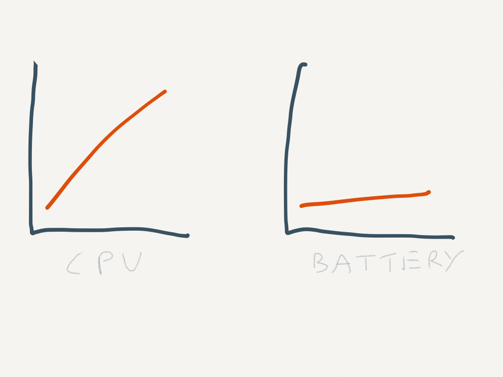
  • Battery technology is becoming more of an anchor compared to the rest of the technology in our products. There’s clearly no Moore’s law for batteries.
  • Did anyone else expect more from Apple when it comes to their stores and promoting the Apple Watch than a new…table.

Overall a great keynote and one of the most interesting for years. The watch will sell millions but ResearchKit and the MacBook were the stars of the show. No one predicted that.

Mac Apps 2015

A recent post from Gordon on his current Mac App’s spurred me to look back at my last post on this in 2012. Has much changed?

Well Safari is now my browser of choice, iTunes still where my music is but podcasts are now in Instacast. A couple of smaller app’s have been eaten by Mavericks and Yosemite but I still look to third party app’s for most of my day to day needs. When Yosemite came out I nuked the iMac and dropped a few app’s so there are a few changes in the list. Hopefully there are one or two gems in the list that are new to you.

Alfred
http://www.alfredapp.com/
Free, PowerPack for £15

For a longtime I used Quicksilver and then Launchbar as a keyboard launcher but around three years ago I moved to Alfred and I just can’t let it go despite Spotlight catching up in Yosemite. Alfred allows you to drive your Mac fully from the keyboard – launch app’s, search the web etc. Buy the PowerPack and you can extend via scripts from the Alfred community or ones you write yourself, control iTunes and access a full clipboard history and also snippet library. A lovely app that will become your most used app if you let it. With Alfred Remote now out for iOS you can launch apps, scripts, URL’s etc from your iPad or iPhone. Already I have a podcast tab setup in remote so I can quickly setup or jump to app’s I need while podcasting. Despite having two screens, launching app’s quickly via touch is very useful.

Dropbox
http://www.dropbox.com
Free with paid options

I think everyone has a Dropbox account so there’s not too much to say with this one. I store all my documents in Dropbox so I can get them anywhere – Mac, iOS or on the web. Its great for sharing podcasts and files with the folk I work remotely with. Although there is only 2GB free, you can earn up to 18GB free and with so many app’s plugged into Dropbox via it’s API’s it’s a great way of sharing between desktop and mobile. It’s also reliable unlike iCloud.

SuperDuper!
http://www.shirt-pocket.com/SuperDuper
$27.95

Still my goto app for backups. What do you mean you don’t backup? Criminal. SuperDuper! creates a fully bootable backup on a drive of your choosing that should your drive or computer fail allows you to fully restore from that point in time. As it’s a bootable backup you can also boot from it should you find yourself in trouble. I’ve certainly needed it a couple of times and it’s never let me down. Backups can be scheduled and once the first backup is complete daily/weekly incrementals take no time at all.

backblazeBackblaze
https://www.backblaze.com
$5 a month

I use Backblaze for online backup of my computers. Unlike the other online services I tried, Backblaze is quick and reliable to upload data and supports unlimited amount of data. You can easily retrieve individual files and if the worst happens and you need everything you can download it all slowly or send of a disk to get your data more quickly.

evernoteEvernote
http://evernote.com/
Free, Premium account £35 per year

Evernote is my digital filing cabinet. Notes, images, pdf’s, web pages, receipts, bills, contacts, recipes, lists etc etc etc all go into Evernote. The client allows for rich enough text editing, images are OCR’d to allow for some great searching and there are good options for notebooks and folders. The web clipper works really well too. I upgraded to Premium which allows for 1GB of uploads per month, secure notes, collaborative notes and also a history of changes. One niggle – exporting from Evernote still not great so I’m tied into the service more than I’d like. The iOS apps are excellent too so my digital stuff is available everywhere.
Continue reading “Mac Apps 2015”

Apple has lost the functional high ground

Great post from Marco Arment on the quality of Apple software:

We don’t need major OS releases every year. We don’t need each OS release to have a huge list of new features. We need our computers, phones, and tablets to work well first so we can enjoy new features released at a healthy, gradual, sustainable pace.

Apple’s OS X and iOS releases have become quite unreliable over the last couple of years and the issues that I still have with iTunes, iTunes Match and iCloud give me no confidence that they will ever work without an issue at some point. For music it’s making me look seriously at Google Play and Spotify. Apple are lucky in that their major competitor on the desktop is Windows 8.

Apple’s hardware is hard to beat from a design and function perspective but their software has got disappointing. It wasn’t always the case and I hope they can get of the treadmill and focus on quality and reliability.

*Update* – it’s a year to the day since I posted about Apple’s poor software quality and hoped for a change in 2014. I didn’t realise when I read Marco’s post tonight and it was only when looking at today’s Timehop that I saw a link to the post. A year on and many of the issues are still present. Apple really needs to address this.

Mac at 30

I first used a Mac at university in the early 90’s. It was in the university library and I’m pretty sure it was a Macintosh Plus. While it worked fine, it was a bit slow and nothing grabbed me about it so my first home computer was an Escom 486 and for years I was a Windows and PC user. It was my main games machine as the FPS market took off and the PC platform served me well for years.

The seed that started my move to Mac was in 2001 when the first iPod was announced. I’m pretty sure it was late 2002 or early 2003 before I finally picked up an iPod and suffered using Real software to sync my music on Windows. I loved the iPod. From the packaging to the ease of use, everything about it felt special compared to the competition. I still remember the button lights slowly fading – never got old.

Roll forward to 2006 and it was time to upgrade my PC, not to a newer model but making the switch to Apple. I bought a 21″ iMac and it was such a step change to what I had before. Quiet, fast and an amazing set of applications. A few months later and I bought a Macbook Pro. I was hooked.

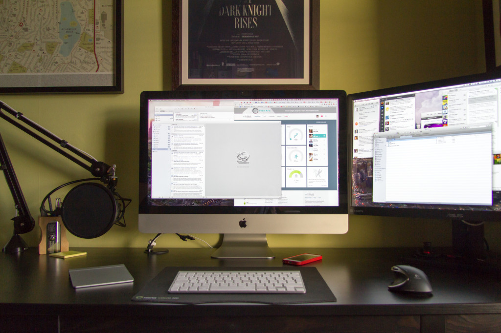
Home Office
Home Office

Now I have a 27″ iMac, a Macbook Air, iPhone 5S, iPad Air and an Apple TV. Overkill but I still love Apple’s product design and software despite my recent moans. I didn’t expect much from Apple to celebrate that today was the 30th anniversary since the Macintosh was introduced but I was wrong. I guess time’s have changed since Steve Jobs passed away.

A beautiful website with a great interactive timeline showing the history of the Macintosh. It also wouldn’t right to not have a video from Apple celebrating the event.

There’s also an easter egg on the Apple site.

A custom font that shows each of the Macs from the last 30 years. Nice.

Despite the iPhone and iPad eating into it’s usage, I still wouldn’t be without one. Happy 30th Macintosh.

Apple in 2014

I use Apple products every day. iMac, Macbook Air, iPad and iPhone with a little bit of Apple TV thrown in for good measure. I love the hardware, it’s design and performance and the surrounding application ecosystem. As a combination they still can’t be beaten in my opinion. There is a growing problem though – Apple’s own software and services. The software isn’t as good as it used to be, the cloud services are buggy and unreliable and Apple seems to be doing very little to address the slide in quality over the past 2-3 years. This has to change.

A quick list of issues that have affected me over the past few months include:

iMessage
– Inconsistent as to which device will receive a message.
– Read once, mark everywhere – worked at the start of Mavericks but now only works sometimes.
– Sometimes slow delivery, sometimes none on a certain device. No pattern and easiest way to fix is sign out and in again on the affected device. That isn’t a solution.
iCloud
– Reminders – sometimes syncs properly and other times it feels like I have two separate todo lists and have to mark off completion of tasks in two places. Then a few days later they are back in sync.
– No faith that contacts and calendars are actually being synchronised correctly.
– Third party dev’s moving away from iCloud as a sync platform.
Mavericks
– Mail is awful. So many Gmail issues compared to Snow Leopard. The new fixes issued by Apple have addressed some but not all of the issues. Every few days I need to stop and start Mail just so I can receive new Mails that are flowing in fine on the iOS devices. Part of that may be down to Google not using standard IMAP?
– I want to use Safari as it’s fast and thanks to App Nap it will save battery life on the Macbook Air but it’s so fucking crashy. I can’t believe how unstable it is.
– Reminders, iCal, Contacts – still a poor usability experience from these core app’s.
– iBooks was new to the Mac and moved books from iTunes to iBooks but only those that you’ve purchased. Anything added manually has disappeared. Nice update.
iWork
– Updated across iOS and Mac by removing key functionality so that all platforms are in sync. I don’t have a problem with that approach, more the lack of any updates for 3-4 years and then someone hit’s a reset button this year. But don’t worry, some of the old features will return. Some? Any?
iLife
– Lot’s of love on iOS but hardly any on the Mac. The new Garageband also removed Podcast functionality.
iTunes
– Crashes often, library easily corrupted and I’ve no faith that it won’t happen again.
– Moved podcasts to Instacast which syncs properly across all devices and has had the side effect of improving iTunes.
iTunes Match
– A paid for service from Apple that when it works is brilliant but I’ve had a handful of issues since starting the service that requires me to stop the service on all devices and restart.
– Album art on iOS corrupted. Different covers for different albums. Small beer when I write it down but it frustrated the hell out of me. The only known solution – switch off iTunes Match, wipe any music from your iOS device and start again.
– Duplicated playlists – fine on the iPhone but duplicated 10 times over on the iPad. Solution – switch off iTunes Match, remove any downloaded music and start again.
– iTunes Match will randomly switch off on the iMac. No notice, it just does.
iOS
– Springboard in iOS 7 is really unstable. I see frequent Springboard restarts when I use the iPhone and the iPad has a couple of no icon app’s that work fine but don’t display the icon. It feels like an iOS beta on the iPhone at the moment rather than an OS that has been out for months.
– Apple really need to address some fundamentals like inter app operability as URL schemes aren’t a scalable solution. Let me choose my defaults app’s too. Mailbox and Chrome would be better iOS app’s if they could be treated as the default app’s for Mail and Web Browsing. Android is becoming a far more appealing option.
– iCloud backup doesn’t scale. The most you can buy is 50GB for £70 per year, yet I can buy a 128Gb iPad. Cloud backup should come free with each device and not be tied to an iCloud account. Buy an iOS device, get complementary cloud backup for free. Keep it simple.
– Newsstand – some magazine issues will auto download, some won’t. I see the badge indicating a new issue but opening Newsstand I see nothing against any of the news applications. Apple should kill Newsstand and publishers should just have their own stand alone app’s. Newsstand is broken.
– App Store – doesn’t scale, reviews are an issue and Apple seem to be doing very little about that.

Quite a list. Everybody wants Apple to launch a new product category in 2014 – a true TV solution, a smart watch, a larger iPad. I’d rather see them address the software quality issues that can be seen throughout their portfolio before they jump onto something new and I’m not alone. Unfortunately it will never happen – the market demands new hardware and software rarely gets attention, but it’s critical. It’s the lifeblood of the platform and it’s disappointing that Apple’s are often the poor option on a given platform. I look at the Verge investigation into webOS and what could have been with envy. Not just a striking similarity to the visual leap that iOS 7 made but real forward steps with usability on a mobile platform. Maybe in iOS 8 but I doubt it.

What stung the most in all this was a blog post about Evernote. Jason Kincaid posted a couple of days ago on Evernote, the bug-ridden elephant. As an Evernote user myself I’d noticed a dip in quality too particularly with the browser snapshot extensions. The next day saw Evernote’s CEO, Phil Rubin, reply on the Evernote Blog – On Software Quality and Building a Better Evernote in 2014. Time will tell if Evernote’s quality will improve but it was a great response in public acknowledging and committing to resolving software quality. If only Apple were as open and honest.

I used to tell people ‘it just works’ when discussing Apple products. Not any more.

iPad Air

When the iPad was first announced I scoffed at it. Who’d want a bigger iPod Touch? More fool me. I loved the first iPad and jumped on the first retina iPad when it came out in March 2012. I loved it but as time went on it was obvious that it was underpowered and was struggling to throw all those pixels around. October 2012 saw Apple release a fourth generation iPad with a better CPU but that was too soon for me to upgrade. iOS 7 didn’t help and only highlighted the third gen’s performance problems. They also released an iPad Mini but that was non-retina so I always knew my iPad upgrade would probably be this year and involve a choice between a new iPad and a retina Mini.

So in late November after much deliberation I plumped for an iPad Air. I love it.

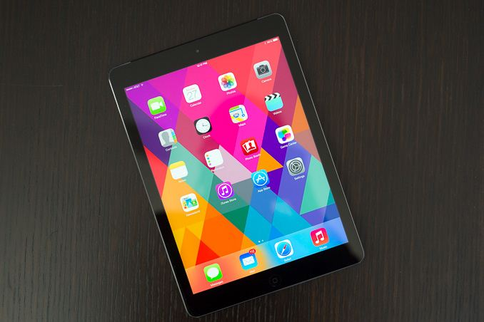
iPad Air
iPad Air

The iPad Air and Retina Mini are more similar than I expected. They have the same processor, memory, M7 chip, come with the same capacities and both have 4G options. They even have the same pixel count – the only difference is size and weight which made the choice a difficult one.

Ultimately what swung it for me was the usability of the larger screen over the smaller one. Reading both books and comics was better on the Air and the virtual keyboard was easier to use for me on the Air. A part of that is probably just me being used to the size so your mileage will vary. What was surprising was how close the weight of each device felt. The Air weighs 478g against the Mini’s 341g but in practice they felt closer. The Mini felt denser and ultimately I preferred the feel of the Air in my hand. It was much lighter than expected especially as I was used to the third gen iPad weight at 668g’s.

Heavier than the Air
Paper notebook now heavier than the Air
The A7 chip and the power it delivers felt more noticeable on the iPad against the iPhone 5s. Again that might be because I’m used to the third gen performance but iOS and app’s felt so snappy on the iPad Air. App’s loaded quickly, game performance was so much better and swapping between app’s made iOS 7 feel far more complete on the Air. All combined, the Air has been a great upgrade for me. One surprising aspect hit me a few days after use. The drop in weight of the iPad Air has now made it lighter than my usual work notebook which weighs in at a mighty 580g. Thats for a 200 page A4 paper pad. I can now swap that for a lighter iPad Air that can do everything a paper pad can do plus so much more. The iPad Air feels like the iPad that matches the ambition that Apple had when Steve Jobs showed it for the first time in January 2010. A lot has changed in 4 years – that original iPad looks massive now yet much remains the same. 9.7″ screen, physical home button and a familiar design. The only feature I miss is Touch ID. I am constantly trying to unlock the Air by touching the home button. Damn you Apple.

Logitech Ultrathin Cover
I say Touch ID is the only feature I miss. This isn’t strictly true. There are times that a physical keyboard would be great for taking notes or updating documents on the go. Yes, I could use a laptop but I can do 95% of my work on an iPad so for those infrequent times I want a physical keyboard I’ve picked up a Logitech Ultrathin Keyboard Cover. This acts as a screen protector when carrying and does increase the weight but includes a great physical keyboard that works over bluetooth. I’m OK at using the virtual keyboard but still feel more comfortable using physical keys that I can touch. The keys are smaller than a full size keyboard and initially I’m finding some letters are constantly being missed – A is always an S at the moment. However it’s been working well and the keyboard shortcuts that you can use on iOS especially for selecting blocks of text are great when compared to their touch equivalents. The logitech matches the ipad colour eactly but feels a bit plastic in comparison. Also, it’s another device that needs to be charged although a charge seemingly lasts for around 3 months assuming a couple of hours use per day which is good. Definitely a niche requirement but I’d wanted one for around a year and waited until I swapped to a newer iPad design. It will be interesting to see how my usage fairs over the coming months.

I can’t recommend the iPad Air strongly enough. Fast, light with a great screen and an amazing software library. I’m looking forward to developers pushing the A7 chip to see what the Air and iOS can really deliver.

iOS 7 and those new iPads

It’s been a few weeks since Apple released iOS 7. Has it caused much change?

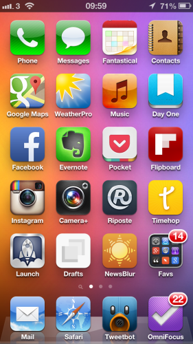
My iPhone home screen using iOS 6
My iPhone home screen using iOS6
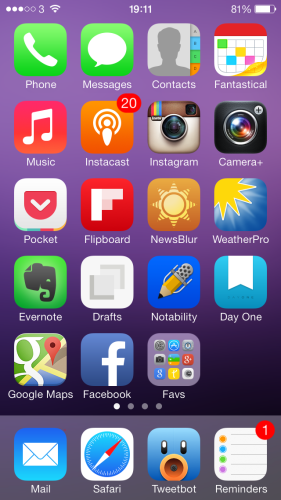
Home screen on the 5s on iOS 7
Home screen on the 5s

It surprises me in that short time how dated the iOS 6 screenshot looks. Not sure if thats down to familiarisation from day to day usage of iOS 7 but it just screams ‘old’ when I look at it. On the surface many app’s look the same but most if not all the home screen app’s have seen updates over the last 6 weeks with some bringing considerable new functionality.

Take Fantastical for example. A new version came out with not only an updated look for iOS 7 but integrating reminders alongside appointments. A small change but one that has led me to using Apple Reminders rather than Wunderlist which I’d moved to from Omnifocus as it was over the top for my needs. iOS 7 has kickstarted a simplification of my app’s and services I use.

Next was removing my reliance on Apple for podcasts and switching to Instacast – should have done it months ago as listening to podcasts is a far better experience and iTunes is more stable now that I’ve removed podcasts from it. Coincidence?

Unfortunately there are still some ugly aspects of iOS 7 that irritate all the time. That Safari icon is one of them. It annoys me so much that I may switch to using Chrome on iOS as that’s what I use on the laptop and desktop. iOS 7 is also quite crashy, especially on the iPad. Hopefully a 7.1 update will remove the stability issues if not the ugly icons (agreeing with Shak that Contacts is ugly too).

Overall though I’m happy with iOS 7, the updates it’s made and the new direction it’s taking alongside the many many great app updates from third parties.

iPad

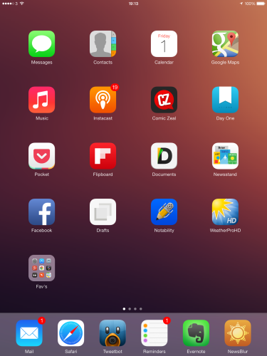
iOS 7 on the iPad
iOS 7 on the iPad

Alongside the crashy nature of iOS 7 on the iPad there’s something about it’s look that just doesn’t feel right. There is so much space and the app’s look lost on the bigger screen. Why not a fifth row? Why do folders only show 9 app’s at a time – it feels like a toy town O/S in some of the views which I’d never say about iOS 6 or the current versions of Android. Performance on my third gen iPad is also spotty so I’ve disabled most of the animations which helps but I still notice keyboard lag and stutter from time to time.

Of course, the iPad Air is now out and performance of the new device is amazing thanks to the new chip’s being used. I popped into the Apple store at the weekend and what stood out the most was the weight of the new iPad Air. More to the point, the lack of weight.

Not the screen, not the smaller design, the thinner design or the lack of Touch ID. The weight difference compared to my gen 3 iPad was more than I expected. I was convinced that a Mini Retina would be my next iPad but it will probably be an iPad Air. Yes, probably.

I’m not yet 100% that I need to replace the iPad right now. While I may want to replace it, need is something entirely different. So I will hang fire for the time being, compare it to the Mini Retina to make doubly sure and wait and see what app updates will come over the next few months that take advantage of the new chipset. Once I do decide I will definitely pick up one of these Logitech keyboards for the iPad – I think they are awesome.

Making the most of an Apple TV

I picked up an Apple TV a few months ago and I’ve got far more use out of it than I expected. The following are some app’s and tricks that I’ve found handy in that time.

PlexConnect
The sole reason I picked up an Apple TV was PlexConnect. PlexConnect is a hack to allow an Apple TV to playback media from you local Plex library. It works by routing requests from the Apple Trailers app on the Apple TV to your Plex install and sending back results that the Apple TV expects that is really your Plex library. A clever hack but as with all hacks at risk of Apple making changes to disable it in the future.

An update a couple of months ago to add new channels changed the trailers app to only work with https. This was enough to break PlexConnect. Bad Apple. A few days passed before a fairly straightforward work around was published that looks worse than it is. Follow the steps and PlexConnect was back up and running.

At this point I found some issues with playback – stutters, frame drops. I was convinced that PlexConnect was no more and I would need to move to another solution – Roku or perhaps invest in a Mac Mini. It turns out my network switch was at fault so a swift replacement later saw PlexConnect returned to it’s former glory. I love it, all my movies available on the Apple TV without having to worry about converting to a compatible format.

Beamer
If Plex and PlexConnect seem like hard work but you want the flexibility of playing back any media on your Apple TV without converting to a compatible format then Beamer for Mac is a great option. Install and launch Beamer on your Mac and you are presented with a small window. Drop a movie of any format (AVI, MKV, MOV, MP4, WMV, FLV) on to the window and a few seconds later it will playback on your Apple TV all via Airplay.

Like any other movie on the Apple TV you can control playback via the Apple remote and Beamer supports 1080p and also 5.1 surround sound, both Dolby Digital and DTS. Subtitles are also supported.

On the movies I tested there was no issue at all. Smooth, quick and great sound. Considering this removes the need to convert films, jailbreak older Apple TV’s or mess around with PlexConnect the £12 cost is trivial.

iOS Setup
Setting up the Apple TV can be painful. Typing in the wi-fi password is an exercise in frustration with the remote. One shortcut is to use your iOS device. Switch on the Apple TV, connect it to your TV and touch the Apple TV with your iOS device. The Apple TV (once you zap in a password) will then copy wifi settings and automatically configure itself. Smart, and the touch isn’t really necessary as it’s not done via NFC but it’s just Apple’s way of ensuring that you get the iOS device in close enough range for bluetooth to work effectively.

Apple Remote for iOS
If you do have an iOS device, download the Apple Remote and use it to control the Apple TV. It makes for a far better experience and if you’ve used the physical Apple remote to search for music in a large library you will find the iOS version infinitely better.

Wrap-up
For £99 the Apple TV is good value and I’m getting a lot of use out of it. However I think I’d point people to the Roku 3 that has finally come out in the UK as it offers a lot more for the same money and a store where you can pick up app’s like Plex to further improve the Roku. Hopefully the tips above thought will make for a better Apple TV experience…and maybe one day Apple will bring an App store to it’s TV platform.

Note 3’s benchmarking “adjustments” inflate scores by up to 20%

I shouldn’t be surprised as they have form in this area but after reading that Ars Technica have found that Samsung are cheating on benchmarks it makes you wonder just how low they will go? I mean, would you trust a proposed industry standard benchmark created by Samsung? Yeah.

Samsung copies much of what Apple does, right down to the S4 being released in Gold, but in so many ways I’m glad they are polar opposite of everything that Apple does.

Sleazy.