On November 19th (just three short days away) all Xbox 360 owners will get a new dashboard delivered to them – the strangely titled New Xbox Experience. I was selected in the latest round of previews so I’ve had the dash since Friday. So what can you expect later this week?
The dash does a quick install followed by a reboot. You then download the new dashboard which took me under two minutes. You then watch a swanky video before your presented with the avatar creation screen. Microsoft are chasing the Wii market so everyone has to create an avatar. The creation options are pretty varied – a lot more than I remember on the Wii but I found it harder to get a character that was a look alike despite the greater options. It’s no surprise that an avatar specific store is also on it’s way which would explain why the clothing options were underwhelming. They had lots of options but you couldn’t change the colour of any of your choices. Cha-ching! The avatars can be used within games but I’d expect to see that in Arcade titles only. With the avatar creation out of the way your dropped into the new dashboard.

Instead of blades and moving right to left through options you move through a vertical list. The animations are very quick and it’s easy to get around. It’s a lot more visual than the previous dash so it’s good to see the speed is there with all the extra gloss. The first, erm, folder (not sure what the proper name is) is Welcome which introduces the new dashboard – this menu can be disabled – as far as I can see that’s the only one that can be removed or customised in any way. These folders look as if they are based on Coverflow as seen in OS X. The other menu’s are as follows:
My Xbox – For me the hub of the system and will become the most used menu. Access the current game, access other games installed on your hard drive, media libraries and your 360 settings.
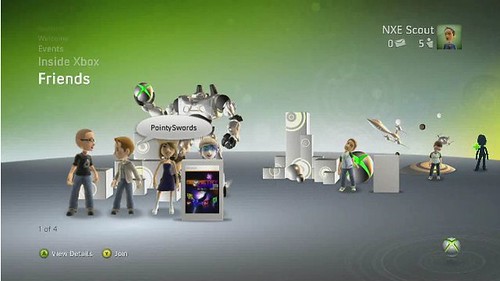
Friends – Shows your friend list. This is really well animated and highlights the avatars well. However it is slower to see who is online as you can only see a few friends at any one time. However it display friends parties really well and it looks easy to join parties from here (based on the Microsoft video detailing the party feature as I don’t know anyone else with the new dash).

Inside Xbox – shows you stuff from Microsoft – behind the scenes videos and other stuff like that
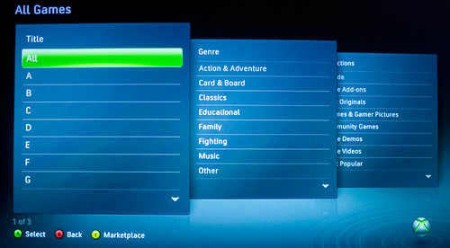
Game and Video Marketplace – A really nicely animated menu for the marketplace content but you can also browse via a three screen system which makes finding content in these large folders a lot easier. At the dashboards official launch you can also browse the marketplace content from the xbox.com website and seemingly tell your Xbox to download any content you select.

Events – For special one off type events and more social gaming
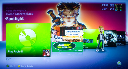
Spotlight – Combines bits from other menu’s and shows you the game in the disc drive, lets you access your gamercard, see achievements – all standard stuff. You also get to see adverts and not just for games – anything could appear like the Subway advert in the above screen.
There’s also a couple of missing menu’s for Europeans. We don’t have Netflix here so don’t get any of those features and also Primetime is missing, rumoured to be delivered next Spring. Primetime is where Microsoft hope to provide more social gaming akin to the Wii with games like 1vs100. Not a big miss for me and something to look forward to next year.
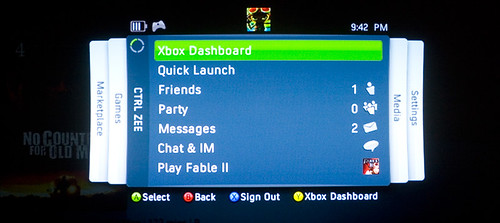
I had reservations before getting the dash but I really like the new system for everything apart from the friends list which feels slower to access the same information as before. However the blades haven’t gone away entirely. Hit the guide button from the dash or in a game and you access a blade based menu that gives you quick access to…well, everything. Friends lists, messages, party setup, media playback, marketplace and system settings. So the best of both worlds.

This menu is called the Quick Launch Bar and is really snappy to use. However a couple of times I’ve had issues getting back out of the QLB. Pressing B should take you back a page but I’ve had it hang for 5-10 seconds a couple of times. Not sure if that was due to the game running in the background or not but it was a bit annoying.
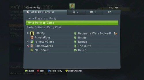
This update doesn’t just change navigation options – there’s a few new features that should have a big impact on how I game. The first is Parties. You and up to seven other friends can create a party. The party can then move from game to game as a group or just chat privately while each group member does there own thing – play different games, watch movies etc.

You can set the party up so that you need to invite friends or just allow friends to join without invites. The party feature is a godsend as the amount of swearing, screaming, shouting and singing on Live can be intolerable. Certain games seem to attract a higher amount – Fifa for example. It will be great to setup a party and then play Fifa as our club without constant interruption. This is another feature I couldn’t test as no one I know has the dash.
The second new feature is game installs. You can now install a game fully to the Xbox hard drive and play from there rather than the disk drive. This allegedly makes the game quicker to run but without a stopwatch I couldn’t tell. The biggest impact is on noise – the disk drive on the 360 is noisy as hell and not having that spin makes the 360 a lot quieter and allegedly less hot too. This is such a big deal for me, so much so that I bought the 120GB hard drive so I can take full advantage of installing. So far it’s been excellent. I’ve installed Fifa, Gear of War 2 and CoD:World At War and all work well. The installs take anything from 5 to 15 mins depending on game size. While installing though you can still access the guide menu which is nice.
I noticed a few other things in the last couple of days. Launch a game and you’ll get a pop-up telling you that friends are also playing the same title. I also turned off auto playing of games when inserted so that I could play the game from the hard drive – even though the game in installed you still need the disk to verify that you own the game. One other issue is with NAT settings. After installing I had some issues getting into Fifa games. Only a couple worked out of 20 or so attempts. On checking my NAT settings, which were previously Open, they had moved to Strict. The advice was to reboot my router which I thought strange but that worked so I’d advise you to reboot your router after upgrading or at the very least check your NAT settings. The check was also a lot faster than on the old dash. Thankfully video and music playback from the Mac still works as does selecting custom soundtracks in game.
So overall a very nice upgrade. The dash looks a lot nicer than the old one and if your put off by it’s looks you’ve still got the old blades available via the guide button. In fact the guide button is a lot more useful than it is today. I would have liked to see some more new features like the ability to take pictures in game rather than each game providing it’s own functionality, take video’s in game and upload to Youtube or a Microsoft site.
What’s surprising is that we are getting this new look and extra features without having to buy a new console. Usually this type of upgrade would only come with new hardware so it’s nice to see Microsoft not resting on it’s laurels and trying to innovate and improve the dashboard further. On improving the dashboard it also widens the lead that it already had on the PS3. Sony really need to take a long hard look at it’s own dashboard system and hopefully learn from the 360’s better features. Here’s hoping that the upgrade goes well for all on Wednesday and we don’t experience any Live issues which would be a real shame.
