A new site has launched for Shift Happens, an upcoming book on the history of keyboards. The book looks amazing and the site is a great advert for the kickstarter. The 3D exploration of the book is wonderful.
Tag: kickstarter
Pebble Dashed
The Pebble was the first campaign I backed on Kickstarter. It was April 2012 and the Pebble was a breath of fresh air. A watch that would talk to your phone, iOS or Android, that was updatable, not too large, had a good battery life and was affordable at around $100. There wasn’t much not to like so I backed it without much hesitation. It was geeky but I love geek toys!
Despite missing a couple of delivery dates the Pebble team have delivered on their oversubscribed Kickstarter and on Thursday my watch finally arrived. Kudus to the team as they have kept everyone up to date on progress their problems and issues of scale that I’m sure they didn’t expect just under a year ago. So after a couple of days how does the Pebble deliver?
The Good
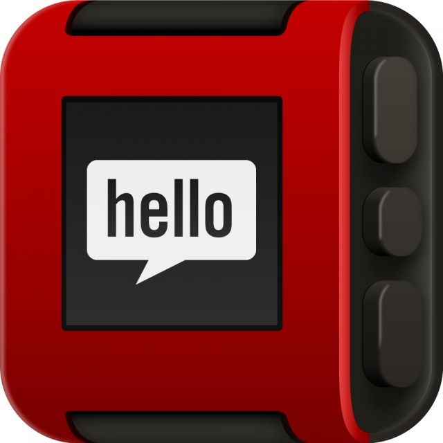
The watch itself is light and feels good in the hand. It has one button the right hand side and three buttons on the left. The buttons are used to navigate around the menus, dismiss notifications, turn on the backlight etc. The buttons need a firm press to operate which I’d expect to ease over time but gives confidence that the watch is well made.

The Pebble has to well made as it’s waterproof hence the contact power connector. Powered via USB the cable attaches via magnets and powers the Pebble quickly. Battery is rated at 7 days and as I haven’t had it that long it’s hard to know if it’s accurate – it’s still going strong after three days so the signs are good.
The Pebble is easy to connect to your phone on iOS or Android. Via Bluetooth you pair the phone with the Pebble and…thats it really. On iOS you need to make sure that Notifications are enabled and setup properly. For me it’s worked well but it’s a bit of a pain and not the best setup experience. That’s not Pebble’s fault – iOS is more locked down than Android so you won’t get everything you expect. It can also disable if the devices go out of range which I’ve seen once. Pebble have a useful page to help with iOS setup. The music app worked really well – skip tracks, pause – all good.
On Android the Pebble app works differently in that everything routes through the app and it runs permanently. More seems to flow through on Android but it does feel a bit of a hack to get the most out of Pebble.
Speaking of hacks to get all iOS notifications then you can jailbreak your iPhone and from Cydia install BTNotificationEnabler by Conrad Kramer. So instead of just Messages, Phone and Music you will get Tweets, mails – everything. It’s an impressive hack and with the recent evasi0n jailbreak it’s an easy method of improving the Pebble on iOS.
The Not So Good
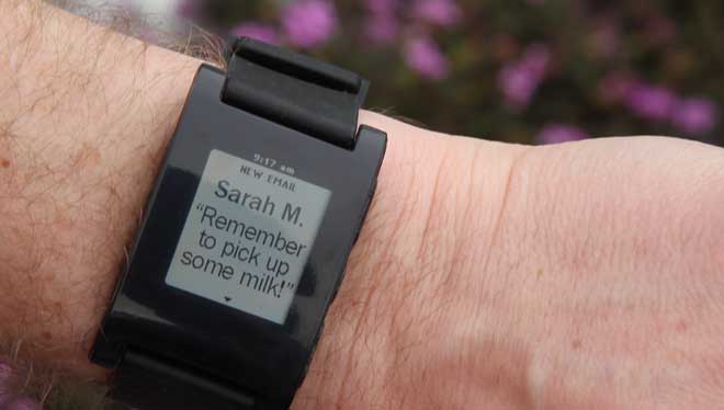
The screen is clear but duller than I expected. The backlight helps but switches off quickly. It’s also quite blue with the backlight on but thats not a biggie. The viewing angle is narrower than I’d expected but really is fine, just not great.
The strap is a bit industrial but as it’s a standard size it’s easily replaced. Also industrial is the Pebble itself. While not massive like some of the GPS walking/running watches it’s quite tall. Certainly on my wrist I found it quite uncomfortable especially under a work shirt finding it awkward to see the full notification and then clear it.

Pebble gets it update via the software installed on the phone. With an update every couple of weeks planned by the Pebble team you can be sure of a watch that will only get better. That doesn’t get away from the fact that at the moment it’s use is limited. The one feature that really appealed to me was RunKeeper support which unfortunately isn’t yet available. In fact from the Pebble front page it’s only notifications and Music that is available.
The menu on the Pebble itself is at best utilitarian but is in need of updating. Clock faces are listed in the top menu alongside Music and Settings. The faces really need their own menu as adding a new clock face clutters up the menu.
One last software issue is that there is no battery indicator. While the watch lasts for seven days without an indicator you have no real option but to charge more often than is probably necessary. Seemingly the battery only appears when it needs charged, but thats no use if you are away for a couple of days and it appears on the second day. For Pebble to succeed it has to be trusted and I can see a future update enabling a visibile battery indicator, or at least a way of checking it in the menus.
Verdict
The Pebble is a great watch. It has so much potential and for a first product the team should be rightly proud. However now that they are shipping hardware in volume they need to focus on delivering app’s and polishing the software. Without that users will quickly tire and the danger is an Apple, Google or Samsung will come along and almost instantly kill their product.
For me the Pebble in it’s current form has parallels to the first iPhone. It was clearly a wonderful phone but without 3G and app’s it wasn’t enough for me to buy…and thats how I feel about the Pebble. Right now the form factor and usability coupled with the lack of app’s means it’s not for me so I’ve sold mine on eBay. However I wouldn’t rule out picking up a future Pebble or smart watch from another provider. Imagine a watch that could do everything that the Pebble does coupled with a Fitbit and a slightly better screen. Add in a touch screen and I’d be first in line. It will be interesting to see where the wearables sector grows to over the next 2-3 years and whether it’s a market just not for geeks. Is the smartphone good enough for the majority of users?