 Mac OS X Lion was released on July 20th 2011 so my write up is after a few weeks of use rather than a few days (although many were based on using the beta releases that developers have access too). It’s also on the back of a couple of great posts in a similar vein, Elaine Giles Lion – One Month On and Craig Grannell’s My review of OS X Lion: the good, the bad and the ugly. Both posts highlighted the good and bad to be found in Lion and this post will be in a similar vein. It’s now over 5 years since I switched to Mac and the iMac I purchased had OS X Tiger installed. Since then we’ve seen Leopard and Snow Leopard released and the iMac coped well with the updates. However I bought a new iMac this year and as it’s a good spec it’s hard to say if the Lion upgrade has made any difference to performance. Certainly when I moved to Leopard and Snow Leopard there was an initial feeling of slightly better performance but my gut feel is that with Lion the opposite is true. Indeed on my Mac Mini which acts as a media server (basically running Plex and that’s it) I’ve added a couple of GB of ram (it’s so cheap it was rude not to) and it certainly has benefited with some more breathing space.
The launch of Lion was different in that it was available only (initially) via the App Store. While all well and good for those on fast connections, for others it was a slow download especially on day one. Not only that, if you didn’t take action before installing then you wouldn’t be able to make a backup disc or save to a USB stick for future use. As I wanted to restart fresh on the Mac Mini a few weeks after installing it certainly has saved me a lot of hassle – hopefully Apple learn for future upgrades and provide an easy option during install to create a rescue disc or stick.
Install was fast though and after a reboot I was using Lion. So whats new? What did I like and dislike? How much is iOS influencing OS X?
Likes
One of the most used app’s on my Mac is Mail and Lion brings some good improvements. A conversation view similar to the iPad’s makes for a cleaner view of multiple replies. A favourites bar allows you to create shortcuts to different mail accounts which is great if you have many accounts and want quick access to an account or smart mailbox. The bar also supports keyboard shortcuts – here’s a great tip from Matt Gemmell on using the favourites bar. One snag – my mail rules run inconsistently which is a pain. I’ve not looked into it much apart from confirming on the Apple forums that it’s a fairly common problem so hopefully an update will address.

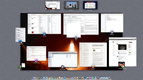
One of the features I loved in OS X was Exposé. I move the mouse to one of the desktop corners and I’d get a quick overview of all open applications that I could easily switch to. Mission Control expands on that feature to include Spaces and also helps knit a couple of other new features together – Gestures and Full Screen applications. The screenshot above is Mission Control showing a typical day on my Mac. Desktop 1 is my main workspace, Desktop 2 is Lightroom full screen and Desktop 3 is Windows 7 (via VMware Fusion) again running full screen. Mission Control now groups windows from the same app together, so if you’ve a few mails open or a few Chrome sessions it’s easy to identify and swap between them.
Spaces is now integrated into Mission Control so to create a new Desktop, enable Mission Control and drag an app to the top strip to either move the app to an existing Desktop or to create a new Desktop. You can also create a new Desktop by moving your cursor to the top right of the screen within Mission Control. New to spaces – you can now default an app to a certain Desktop. Desktop’s also get their own background but I wish you could rename your Desktop. Not essential but I’d rather see Lightroom or Windows instead of Desktop 2 or Desktop 3.
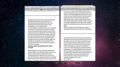
Overall, I love Mission Control. I’m using Spaces far more effectively and it makes it easy to control your app’s and desktop’s. Shifting an app onto a separate Desktop (or making it full screen) gives you instant focus away from the distractions of e-mail, Twitter and IM. On a 27″ iMac the Full Screen mode feels….overkill. Firstly an application needs to support it and if it does you get a small icon on the right of the app’s toolbar. One click and the app moves to Full Screen, hiding the toolbar and Dock filling the screen fully. For certain app’s it makes sense but for others it’s just too much on the big screen.
On a laptop however, Full Screen makes perfect sense especially on a Macbook Air. Coupled with a three finger swipe to move between Desktop’s and you have a great way of running app’s and switching quickly between them.
Mission Control also meant the return of the Dashboard. I’d disabled it a long time ago as it was unused and felt like a waste of resources. It now gets pride of place in the top row alongside other Spaces and a three swipe to the right from Desktop 1 shows the Dashboard. Mmmmm. I could understand this if there were lot’s of great widgets available but the Dashboard has been stagnating for some time. Look at Apple’s own website and the last new widget was published in Feb 2011. If the Dashboard was important surely you could download and install widgets via the App Store? Thankfully it can still be disabled in Mission Controls preference pane.
I’d mentioned Gestures and Lion really has pushed their use throughout the operating system, so much so that if you have a desktop Mac I’d almost say a Magic Trackpad is essential. When I bought the new iMac instead of a mouse I ordered the trackpad and use it, the keyboard and my Logitech mouse to control Lion. Easy to switch between Desktops, enable Mission Control, show the desktop – love it. Just a shame that the trackpad costs £60.

Lion brings some practical improvements that as a whole make for a faster and more secure environment. Resume if supported by an app will launch your applications exactly the same way you left them after a reboot. Sounds simple but makes such a big difference to close an app and when you open it again the toolbars are in the same place and the document you were working on is still open at the same point where you were making changes. Auto Save has been added – you never have to worry about saving again as Lion will auto save your changes as you work. This should hopefully be the end of forgetting to save or losing work if your Mac crashes. Yes, Mac’s crash as I’ll explain later! Coupled with these feature’s is Versions. Click on the title bar of an app and you can browse all versions of the current document. If you select browse you are taken to the familiar Time Machine interface and you browse through the different versions of the dock. You can see changes and easily restore to a previous version. A bit over the top, but then they are making backup and versioning interesting via the animation.
The animations aren’t restricted to just Versions. Throughout Lion you see animations especially in Finder in Mail that on first or second run are fine….the 50th time you see it starts to grate though and frankly gets in the way. One way to disable these is to download Lion Tweaks. This free tool lets you tweak some of Lion’s features – some more annoying than others. Anyway, this is the Likes of Lion so let’s crack on.

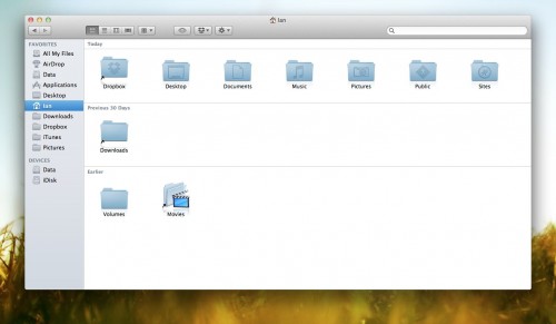
Finder has seen some small upgrades. All My Files groups your files from anywhere on your drives and displays them in the one Finder window allowing you to sort by date, name, application. A small step in making the Finder easier to understand and use. You can now navigate files using gestures and sort tokens have been added to make for a far stronger search. What’s probably the most noticeable change is the colour changes made to the sidebar. More accurately the removal of colour. I like it but many don’t but it should be no surprise as iTunes made the same change recently and the trend is continuing. The latest Evernote update moved to monochrome as did Google Docs. Nice.
Dislikes
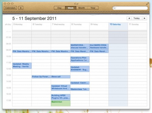
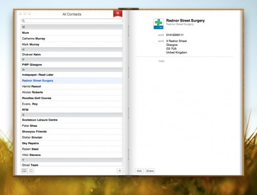
Thats the end of the lovefest though. There are a couple of jarring features in Lion. One of the most annoying is the UI changes to iCal and Address Book. iCal has a couple of nice feature changes but it’s the UI that I find really distracting.

In total contrast to the move to monochrome, iCal now has a faux leather toolbar and a tear off graphic added underneath. The toolbar is ugly. The tear off meaningless – with a gesture can I tear off a page in the calendar? Of course not. It just stands out like a sore thumb…or it would do it if wasn’t for Address Book.

At least iCal has improved it’s functional use with year view and a decent day view. Address Book looks ugly and is more difficult to use than it’s Snow Leopard predecessor. It’s been made to look like a real book…but doesn’t act like one either using the mouse or via gestures. It’s got a horrible graphic at the top acting as a marker…which does nothing. I don’t even think it’s syncing has improved to Google/Yahoo. Disappointing.
Another annoyance is a feature that I used in Snow Leopard has been dropped. I used to love moving the cursor over a window that wasn’t the frontmost selected window and scrolling through the content without bringing the window to the fore. Very handy when scrolling webpages, documents….and Twitter of course. Well, that feature has gone. Why? No idea. See update below – feature is there after all.
Thankfully my biggest fault with Lion was fixed when the first update was released. As mentioned I had a new iMac and there was a horrible bug in Lion that caused the machine to freeze (requiring a switch off and on again) when playing a video after a sleep. Amazed that one got through testing and was part of the final release and it took around 3 weeks before a fix was issued. Years of having bulletproof stability gone in one fell swoop. Since the update though it’s been 100% reliable.

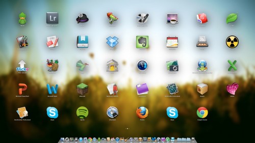
My final groan goes to LaunchPad. This groups applications together and displays them in a view similar to iOS devices. You can create folders by dragging one app over another just like in iOS. When you download an app from the App Store it also animates to install in LaunchPad. But is it any use? Common app’s will launch from the dock and most folk will use Spotlight, an app launcher like Alfred or Launchbar or just navigate to the app’s folder. It feels like an app for a touch screen Mac, not the current gesture driven devices we currently use. Maybe it’s a sign of technologies to come but it doesn’t really fit in Mac OS X. At a push I could see it as useful when launching app’s on my TV connected Mini, but thats a stretch. I also hate that applications from the App Store are installed to LaunchPad and that it pops up on the screen. Only slightly better than installing to the dock but not by much.
One More Thing
Natural Scrolling also known as ‘lets reverse scrolling as you know it and mess with your head’. Basically, current scrolling on Mac and Windows moves the scrollbar – push up, the scrollbar moves up and you move up the page. Natural Scrolling reverses this. Push up to move the page up (not the scrollbar which is often hidden in Lion) and hence move down the screen, exactly as you do on any iOS device. It is optional so you can change the default to work as it did before but I’ve stuck with it and the brain is retrained. I even altered my work Windows setup to do the same. It’s no big deal really although it garnered a lot of press and my gut feel is that it’s been switched for a reason, so why not stick with it?
Closing Thoughts
So that’s Lion. It’s cheap and easy to install but overall this has been the Mac OS X update with least impact for me. Some of the changes are minimal and in some ways a step back. One aspect that has been good is third party app’s have been super stable for me in Lion. Leopard and Snow Leopard upgrades caused me some pain especially with the podcast but I’ve had very little issue with Lion. I’d still say it’s worthwhile upgrading, but if you haven’t already I’d wait now for 10.7.2 which may bring you a little iCloud goodness as well as improved stability. You also really do need a trackpad to take best advantage of Lion – fine for laptop owners but a potential upgrade cost that’s hidden to desktop users. It will be interesting to see how Lion compares with Windows 8 which I have running via VMware so thoughts on that soon.
Update 24/09/2011
A couple of quick updates to the post. Firstly, you can scroll in background windows without selecting them first. I’m sure that wasn’t there when I first installed Lion so maybe the 10.7.1 update enabled it? Not sure. Secondly is another customisation tool for Lion that is free – Deeper from Titanium Software. It has lots of options to change the look and feel of Lion and many of the default apps. Addictive Tips has a great review of Deeper which highlights the many customisation options.


