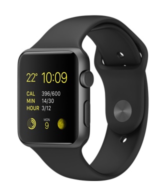
So Apple did come through for a lot of people on Friday and many got their hands on an Apple Watch, myself included. I hadn’t seen one in the flesh until Friday when I popped into the Apple Store and got quite the surprise – the watch is much smaller than I expected. It comes in two sizes and I went for the larger 42mm, but even that wasn’t the brick I expected and the 38mm looked really well sized for a smartwatch. I was also pleased with the decision to stick with the basic Apple Watch Sport model. The Apple Watch version did look really nice but overall I wasn’t sure on any of the straps outside of the default Sport band. That’s not quite true – I hated the look of the Milanese Loop and the Leather Loop. Anyway, it was the evening before I finally got to play with my watch and then put it through it’s paces over the weekend. Thoughts below.
Packaging
I expected good packaging from Apple but not quite the monolith I received through the post. The Sport comes in a long white box and inside is a long white heavy duty plastic case holding the watch along with the magnetic charger, plug and small/medium strap that can be swapped for the default medium/large strap.
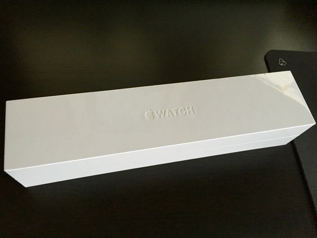
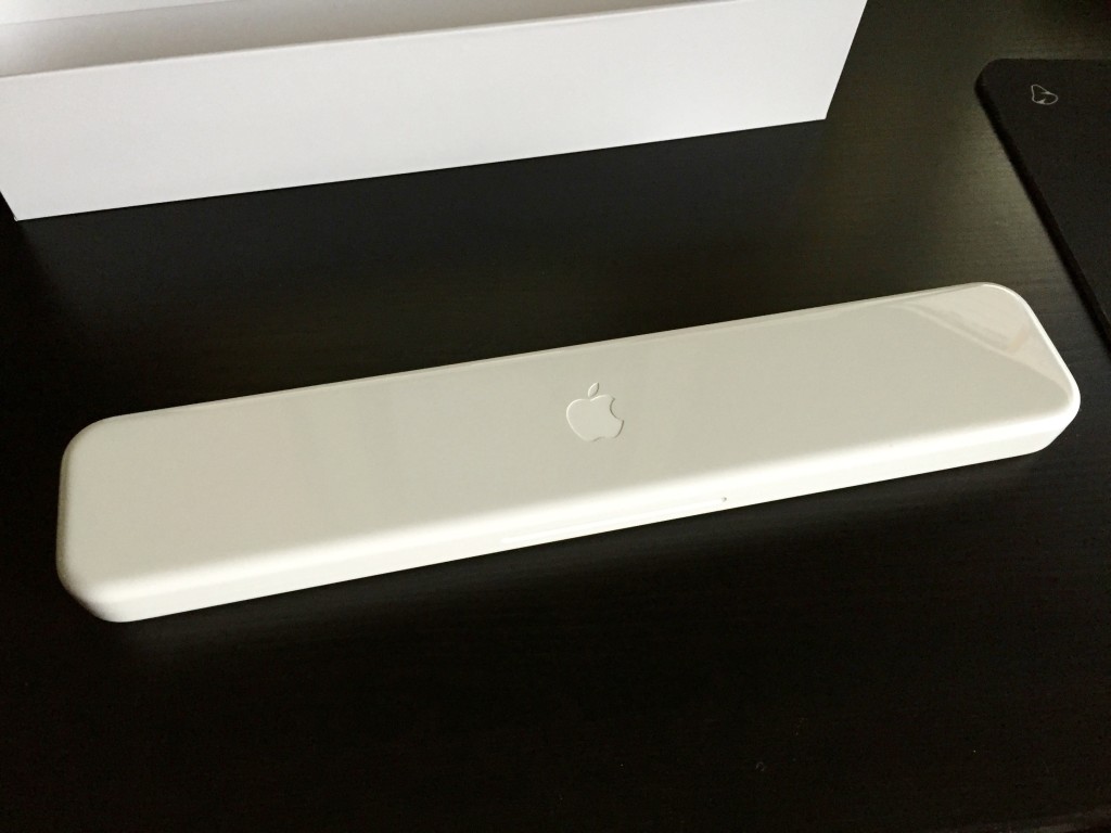
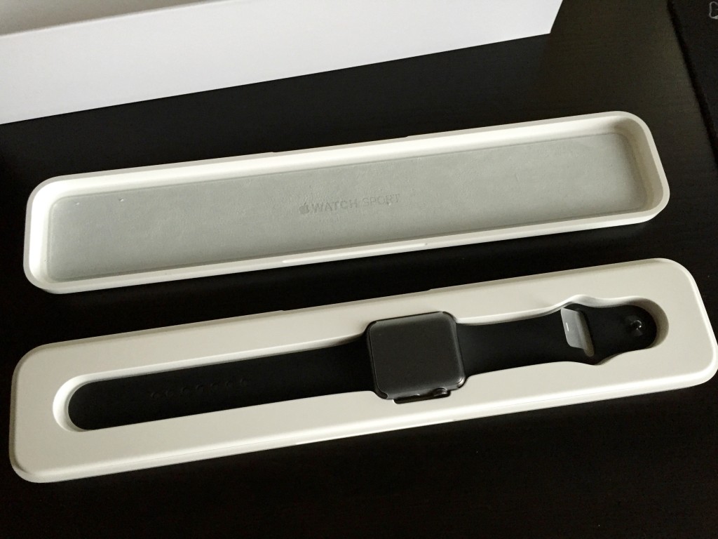
The case is in total contrast to iPhone and iPad packaging – almost nothing is recyclable and it is huge in comparison to the tiny box the iPhone comes in. I know the watch is a different market but still quite surprising. The other thing I like – the delivery box for the watch fits the sport box, the lid of the sport box slips off with just enough friction, the case itself separates nicely. Design. It shows throughout the Apple product line and not just the final product – everything. Speaking of which…
Design
The watch is lighter than expected and fits my wrist well. The curved glass screen fits well with the body and feels seamless. It’s rounded, it feels nice in the hand, it feels more touchable than a phone or tablet. Is that the route to making a wearable that people actually want? The digital crown on the right hand side is an infinite scroll wheel and a button and the main way of interacting with the watch aside from the touch screen. It feels nice to use and I’ve had no real issues with it. Below that is the side button – couldn’t there have been better name? It’s used to launch your favourite contacts (and a double tap for Apple Pay in the USA) but it feels like a sleep button more than anything else.
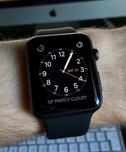
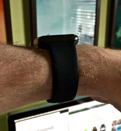
The screen itself is excellent. Apple call it a Retina display and it’s hard to argue as you don’t see the pixels and it’s hard to determine the screen edge at all. It’s night and day compared to the Pebble I tried a couple of years ago. It was also pretty clear outside in the sun yesterday while running. On the back of the watch you find the heart rate sensors and the inductive charging system. This is the first Apple product to support inductive charging and as expected it’s easy to use as it uses magnets, so you place the watch on the charger and it aligns. Also underneath are two buttons to release the bands as they are interchangeable. I guess third party bands will come out soon but there is a fairly good, if expensive, range available from Apple. I can see these being big Christmas sellers.
I had a niggle that the band, made from high-performance fluoroelastomer, would feel quite rubbery but it’s actually soft to touch and is comfortable on the wrist. During normal use I haven’t found it to get sweaty underneath the band but during exercise is does become a sweat collector especially where the band loops within itself. The watch is waterproof despite the mixed messages from Apple which is strange – I’ve showered a couple of times with it now and it’s fine, but I’ll be removing it after runs purely due to the sweat issue.
One last point – the UK now has a folding plug included as standard. Happy days! Far more practical for travelling and nicely designed but it’s £25 for the folding plug against £15 for the standard 5W plug from the Apple store. I’m hoping that this will be the standard plug for iPhones and iPads in the future but the price difference makes me suspect not.
Setup and Controls
Setting up the watch was smooth – a credit to Apple. Switch on the watch and to pair it with the iPhone was a simple case of taking a picture of a pattern on the watch face. Boom. You then enter your iCloud credentials and the iPhone then started to install supported applications on to the watch. This took quite a while to complete but once done it was time to play.
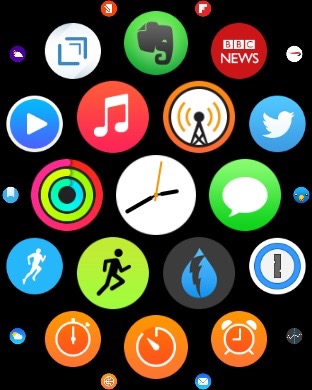
The side button takes you to your favourite contacts and from there you can message, call or digital touch them if they have a watch. This feels a waste of a button and it would be great if you could map this to something more useful, like take you back to your watch face. It feels like a home button – let me use it as one.
The screen itself supports touch but not multitouch, hence the digital crown for zooming in and out. Touch has worked OK but there’s a few times now where a touch isn’t registered – not sure if it’s just aggressive touch zones or v1 software but it is annoying. The watch also supports a force touch gesture – tap normally and then press a bit harder. You get a nice bit of haptic feedback when this works and is used almost like a right click. It lets you customise watchfaces, clear notifications and many apps also support it but you won’t know until you try. Discoverability!
Swiping up on the watch will display Glances. These are like widgets and there are default ones like power, heartbeat and also third party app’s can add their own Glances. Apple’s own Glances have worked well for me but third party ones are generally slow and a bit buggy right now. Finally you can swipe down for notifications with the all important force touch to clear them.
As I said, lots to get your head around and very different to iOS. Time will tell if it becomes second nature but it’s been quite confusing to navigate between apps and the watchface so far.
One last note on the display – it’s off 90% of the time. It only displays when you lift up your wrist and it then switches on for a few seconds…and then it’s off again. I did have a worry about how reliable this would be and some early reviews said it took a while to display but I’ve had no issues although I would like the display to stay on for a few more seconds sometimes. I also don’t have many false positives – switching on when I didn’t expect it – so this goes down as a success so far.
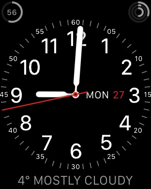
Watchfaces and Complications
Glimpses and Notifications
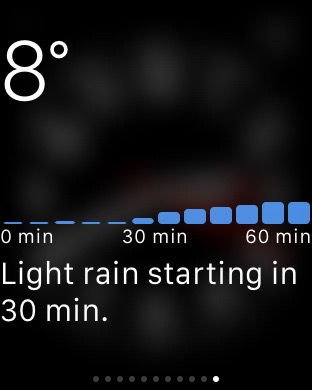 Glimpses let you access information via small widgets that are only one screen tall. Default ones allow you to switch to do not disturb or airplane mode easily, control your music, take a heart beat measurement, see the current battery levels, get a quick update on todays activity level, see todays calendar, your current locations weather, your current location on a map and also world times. I also ended up with a lot of third party Glimpses but most were slow and I’ve turned them off. Glimpses are really running on your iPhone and the third party ones offer little or no value right now.
Notifications at first were overwhelming. I never really worried too much about notifications on the iPhone but the watch displays all the iPhone notifications and it was far too invasive to see and hear them buzzing on the watch. This isn’t the watches fault though – it’s down to me as the user to take control of this and manage them more effectively which I’ve now done. I only get the messages that are important to me and I’m happy now with the information I receive and can act upon. It’s also easy to clear old notifications with a simple force touch, something that iOS desperately needs.
Applications
I’m sure we will see lots of iteration over the coming weeks and months as developers actually use their apps on a physical device rather than the simulator but I expect, like the original iPhone, we won’t see a good third party application experience until developers can write an app thats runs on the watch rather than on the iPhone. Next year perhaps as I can’t see this being dropped in at WWDC?
Phone, Messages and Digital Touch
A lot was made of using the Apple Watch to make and receive calls, message your friends or send a Digital Touch to folk that also have an Apple Watch. So far I’ve been pretty disappointed with most of these features.
The watch hardware, speaker and microphone, work well and it does allow for calls to be made and received. In fact it’s far better than I expected. However the software leaves a lot to be desired and I’ve found the experience buggy. As for messaging, the dictation via Siri has been really good and exceeded expectations. You can also setup stock answers so you can quickly reply to messages and again this works well. However the new animated emoji is horrible. What were they thinking?

Digital Touch also seems superfluous. You can send a fellow Watch owner a series of taps, a sketch or your heartbeat. While it works I find it a bit annoying in practise and always default back to messaging. I’ve also found audio messaging far more reliable on the watch than on the iPhone. Is this due to an improvement in Siri or something the watch is doing – hard to tell.
Health and Activity
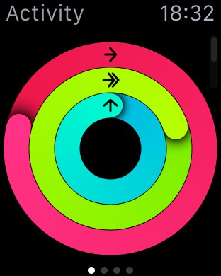
The Apple Watch will also track your heartbeat throughout the day and you can take a reading at anytime. This has matched the readings from elsewhere so I’m happy to say this is accurate as long as the watch has good contact with your skin and isn’t too loose. It seems to take a reading every ten minutes but during an activity will read every five seconds, using up far more battery. This can be toggled off but I’d only do that on something like a hill walk over a few hours. Hour long runs and cycles won’t kill it too much.
You also get an Activity app on the iPhone and this shows you your activity in more detail. I love the app and it completes and complements the Health app. Overall the Health and Activity aspects of the watch have been excellent and I look forward to further improvements with the software over time…like easily extracting individual workouts, sharing of heart rates etc.
Battery
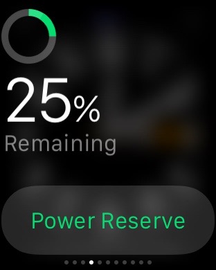
Battery on the iPhone however is impacted slightly. Your phone is connected permanently to the watch, you setup much of the watch from the phone and third party apps all run from the phone so some impact is expected but it’s something to keep an eye on.
Performance and Bugs
Before wrapping up there are a couple of niggles to share. Firstly there is definitely some spotty performance when using the watch. It’s not consistent and I can’t narrow it down to a certain app or function, but from time to time first and third party app’s will stutter more than expected. I also find touch inputs aren’t recognised sometimes. Not sure if it’s me pressing too hard and the watch is confused between a touch and a force touch or that the touch area isn’t quite right but I’ve noticed it a few times now in different apps. The good news is that I haven’t seen any lag when lifting my wrist and the screen switching on – worked 100% for me so far.
There are also issues when you are on the edge of bluetooth connectivity. The watch will still be connected to the phone but performance is so poor that you may as well not be – app’s fail, you can’t answer calls but the watch thinks it has. I’ve also had issues with answering and placing calls in general. When it works it’s great in a ‘from the future’ kind of way, but when it fails it’s just frustration. However I have faith that these can all be addressed with updates over time – there’s no showstopper issue that I’ve found so far and it is v1.0.
Conclusions
Firstly, you don’t need an Apple Watch. It’s arguable that no smart watch or wearable is required right now. At this point in time it’s not essential and the third party app’s leave a lot to be desired. It has some bugs and it does feel like an iPhones second screen at times. So if like me a few weeks ago you have some FOMO on the Apple Watch then don’t worry – next years model will be so much better and there’s no desperate reason to jump on this version!
However the foundations are great. The hardware is really solid and the bugs and issues I’ve mentioned are all easily fixable in software. If you are all in on the Apple platform then the Apple Watch, even this early version, makes far more sense than the Pebble. I’ll continue to use it day to day and so far I’ve found it to be an enjoyable experience rather than a frustrating one. I’ve got no regrets and look forward to seeing how the platform evolves over the comings months and what developers start to deliver once they can actually write app’s for the phone. The true test will be if it’s still on my wrist in six months time. If it is, then Apple are really onto something. Again.
