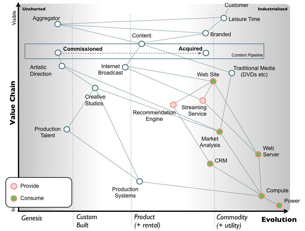
A Wardley map is a map of the structure of a business or service, mapping the components needed to serve the customer or user. Wardley maps are named after Simon Wardley who claims to have created them in 2005. This form of mapping was first used in Fotango (a British Company) in 2005, within Canonical UK between 2008 and 2010 and components of mapping can be found in the Better For Less paper published in 2010.
Each component in a Wardley map is classified by the value it has to the customer or user and by the maturity of that component, ranging from custom-made to commodity. Components are drawn as nodes on a graph with value on the y-axis and commodity on the x-axis. A custom-made component with no direct value to the user would sit at the bottom-left of such a graph while a commodity component with high direct value to the user would sit at the top-right of such a graph. Components are connected on the graph with edges showing that they are linked.
Much of the theory of Wardley mapping is set out in a series of 19 blog posts and a dedicated wiki called Wardleypedia. As use of the technique has broadened to new institutions and been used to map new things the application of the technique in practice has drifted from the original vision.

Links